In regards to the press release that seemed to contradict the National Weather…
Nathan Yau
-
NOAA chief scientist highlights the forecast contradiction
-

A sim to show self-driving car challenges
On the surface, driving a car might seem fairly straightforward. Follow the rules…
-

All of the plastic bottles purchased in a day, Eiffel Tower for scale
Millions of plastic bottles are purchased every day around the world. What does…
-
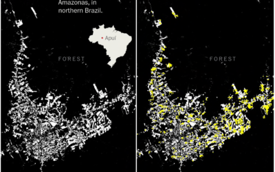
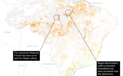
Looking at the Amazon fires wrong
For The Washington Post, Sergio Peçanha and Tim Wallace use maps to show…
-
Quiet Observer
I’ve always been a quiet person who prefers to observe and slowly think…
-
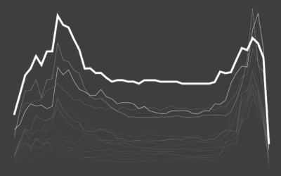
Restless Sleep With Age
It seems like no matter what I do, I cannot sleep through the night. Will it ever let up? According to the data, the answer is no and it will only get worse.
-
Members Only

Straying from the Blue-Pink Color Scheme to Represent Gender in Visualization (The Process #55)
The blue and pink color scheme for boys and girls, respectively, used to be the norm. Now, not so much.
-
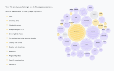
Bird’s-eye view of D3.js
D3.js can do a lot of things, which provides valuable flexibility to construct…
-
Useful and not so useful Statistics
Hannah Fry, for The New Yorker, describes the puzzle of Statistics to analyze…
-
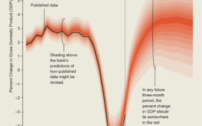
Gallery of uncertainty visualization methods
It must be uncertainty month and nobody told me. For Scientific American, Jessica…
-
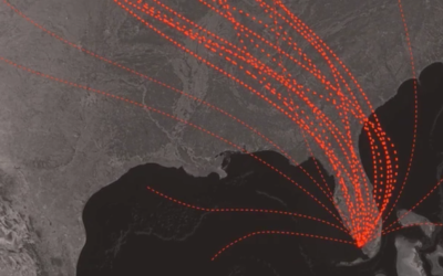
What that hurricane map means
For The New York Times, Alberto Cairo and Tala Schlossberg explain the cone…
-
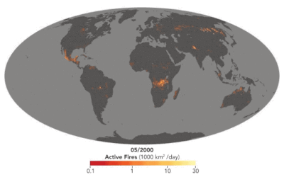
Map shows long-term record of fires around the world
For the NASA Earth Observatory, Adam Voiland describes about two decades of fires:…
-
Where salaries stretch the farthest
Salaries are higher in big cities, but it also cost to live more…
-
Members Only
Visualization Tools and Resources, August 2019 Roundup (The Process #54)
Every month I collect visualization tools and resources that you can use for or improve your work. Here’s the good stuff for August 2019.
-
Optimizing a Pokémon team with simulation
Emily Robinson recently took up Pokémon on Nintendo Switch:
I recently started playing… -
The Most Gender-Switched Names in US History
We use some names mostly for boys and some mostly for girls, but then there is a small percentage that, over time, switched from one gender to another. Which names made the biggest switch?
-
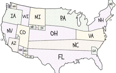
Cartogram of where presidential candidates campaign
Presidential candidates campaign harder in some states more than others. National Popular Vote…
-
Where and why the Amazon rainforest is on fire
For Bloomberg, Mira Rojanasakul and Tatiana Freitas discuss why the Amazon rainforest is…
-
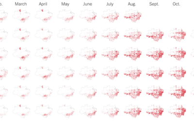
Detected fires in the Amazon rain forest, monthly
The New York Times goes with monthly small multiples to show detected fires…
-

History of slavery in America
USA Today looks at some of the numbers on 17th century slavery in…
Recently for Members
Second Edition
 Visualize This: The FlowingData Guide to Design, Visualization, and Statistics (2nd Edition)
 Visualize This: The FlowingData Guide to Design, Visualization, and Statistics (2nd Edition)
New tools, refined process.
Browse by Chart Type See All →


