A couple of weeks ago, The Washington Post visualized 13,000 school districts using…
Nathan Yau
-

Animating a lot of dots with WebGL and REGL.js
-

Diverging line plot as the perfect comic
This is perfect. Willikin Wolf made characters out of two dots moving along…
-

Pixelation to represent endangered species counts
In 2008, the World Wildlife Fund ran a campaign that used pixelation to…
-

Detailed generative art in R
Thomas Lin Pedersen has been sharing his generative art pieces as of late:…
-
Members Only

Visualization Tools and Resources, September 2019 Roundup (The Process #58)
Every month I collect the latest visualization tools and resources on how to make the most of your data. Here’s the good stuff for September.
-
Street suffixes show the organization of cities
The suffixes on street names can say a lot about a neighborhood. A…
-
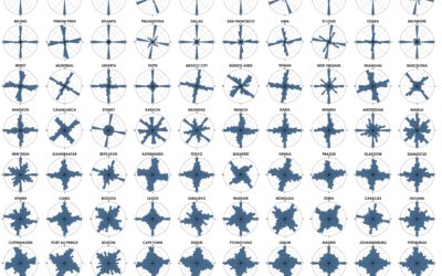
Analysis of street network orientation in cities
Continuing his analysis of street grid-iness in cities around the world, Geoff Boeing…
-
Statistical fallacies in the news
For UnHerd, Tom Chivers, talks about David Spiegelhalter’s new book and why every…
-

Jewelry based on your GPS traces
GPX Jewelry by Rachel Binx lets you turn your GPS traces into jewelry.…
-

AI-generated faces as stock photos
The Generated Photos project is a work in progress to provide realistic AI-generated…
-
History of Tetris randomizers
Tetris is a game with foundations in randomness. Pieces are distributed randomly to…
-
AI-generated voice used to fake phone call and steal money
Reporting for The Washington Post, Drew Harwell describes the case of the fake…
-
Members Only

Reddit Follow-up; Chart Like Nobody’s Looking (The Process #57)
Consider your audience. Yes. But at some point in the visualization creation process, you have to disregard all of the feature requests and design suggestions.
-
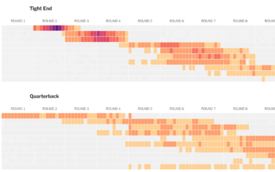
How well players drafted in fantasy football
For The Upshot, Kevin Quealy used a heatmap to visualize fantasy football draft…
-
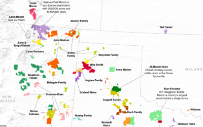
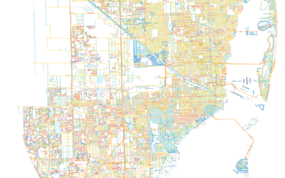
Who owns the most land in the U.S.
Bloomberg News mapped the land owned by the largest owners:
The 100 largest… -
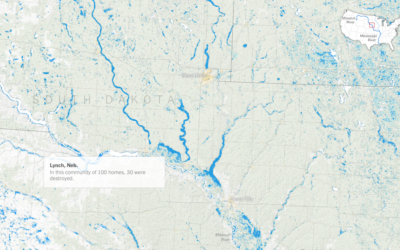
Sprawling flood waters across the Midwest and South
The New York Times mapped the slow, wide-reaching flood waters this year so…
-
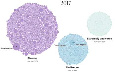
School diversity visualized with moving bubbles
The Washington Post visualized 13,000 school districts to show the change in diversity…
-

Sleep Schedule, From the Inconsistent Teenage Years to Retirement
From the teenage years to college to adulthood through retirement, sleep is all over the place at first but then converges towards consistency.
-
Members Only

That Time My Chart Was on the Reddit Front Page and Everyone Hated It (The Process #56)
Something I made was on the front page of Reddit. Cool. The problem: thousands of people downvoted it. Here’s what I learned.
-
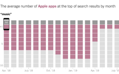
Stacking Apple apps in the App Store
For The New York Times, Jack Nicas and Keith Collins stack up app…
Recently for Members
Second Edition
 Visualize This: The FlowingData Guide to Design, Visualization, and Statistics (2nd Edition)
 Visualize This: The FlowingData Guide to Design, Visualization, and Statistics (2nd Edition)
New tools, refined process.
Browse by Chart Type See All →


