For The New York Times, Keith Collins and Josh Holder look at the…
Nathan Yau
-
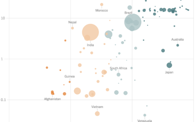
GDP and vaccination rates
-
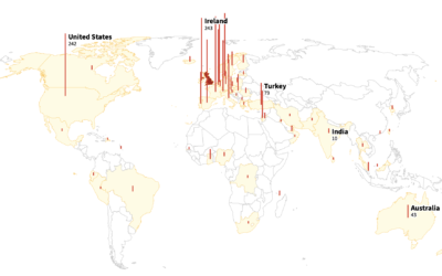
Rise of a variant in the U.K.
As you likely know, there are coronavirus variants around the world. Reuters mapped…
-
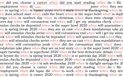
Exploring your Google search history
Search history can say a lot of about a person, like where they’re…
-

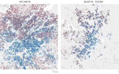
Guess who the neighborhood voted for
NYT’s The Upshot has a quiz that puts you in a neighborhood via…
-

Make the Ever Given get stuck anywhere
The Ever Given got stuck in the Suez Canal. It was refloated. So…
-

Steer through the Suez Canal
To better understand the challenge of steering a giant container ship through the…
-
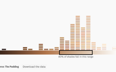
Analysis of color names used with makeup
For The Pudding, Ofunne Amaka and Amber Thomas looked at shades, words, and…
-

What if a giant banana was orbiting Earth
yeti dynamics imagined if a giant banana were orbiting Earth from the same…
-

The Data Journalism Handbook
The Data Journalism Handbook: Towards a Critical Data Practice now has a second…
-
Members Only

Visualization Tools and Learning Resources, March 2021 Roundup
Here’s the good stuff for March 2021.
-

Income in Each State, Adjusted for Cost of Living
A dollar might not buy you as much in one state as it does in the other.
-
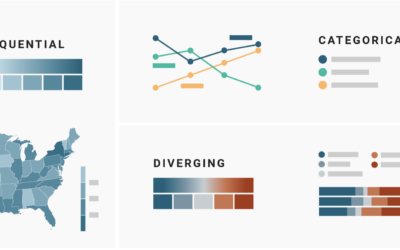
Which color scale to use for your charts
On a superficial level, color scale selection seems like a straightforward task. Pick…
-
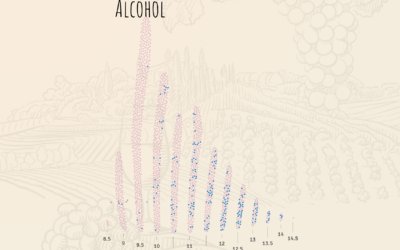
Teaching statistical models with wine tasting
For The Pudding, Lars Verspohl provides an introduction to statistical models disguised as…
-
Statistical limits
Reviewing Deborah Stone’s Counting and Tim Harford’s The Data Detective, Hannah Fry discusses…
-
Inadequate hate crime statistics
For ProPublica, Ken Schwencke reports on a poor data system that relies on…
-
Career Timelines for Every Basketball Player Who Has Played an NBA Game
I was curious who played for a single team over their entire career, who skipped around, and how the patterns changed over the decades.
-
Members Only
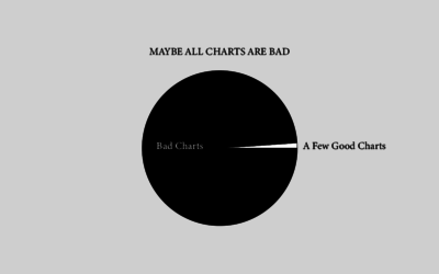
Maybe All Charts are Bad – The Process 131
But probably not.
-
Mapping all of the voters
In what seems to have become a trend of making more and more…
-
Rising number of anti-Asian attacks
Russell Jeung, chair of the Asian American Studies Department at San Francisco State…
-
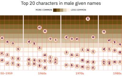
Evolution of Chinese names
For Kontinentalist, Isabella Chua took a dive into the evolution of Chinese names:…
Recently for Members
Second Edition
 Visualize This: The FlowingData Guide to Design, Visualization, and Statistics (2nd Edition)
 Visualize This: The FlowingData Guide to Design, Visualization, and Statistics (2nd Edition)
New tools, refined process.
Browse by Chart Type See All →


