OpenAI released Sora, which lets users easily generate videos with a prompt. The videos present in a TikTok-like feed and provides us with another source of endless scroll. Thank you, internet gods for your benevolence. Casey Neistat, known for his YouTube-ing, voices his concerns.
Read More
-
-
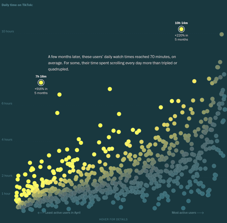
As many of us have learned first-hand, TikTok (and its scrolling video ilk) is addictive and can pull people in to stare at their phones for hours. However, TikTok is secretive about how their viewing algorithm works. So the Washington Post recruited readers to track usage and send the data, which gave WaPo a sample of how the infinite scroll kept people watching over a six-month period.
New users start with general music videos and the feed grows more specific. A few minutes per day can easily increase to hours. Your brain craves the dopamine all the time. It gets harder to interact with others. You can’t concentrate on bigger tasks. All in all, pretty amazing.
Check out the full project, and then maybe delete TikTok.
-
Dell Cameron, for Wired, on the system currently in its planning phase:
Throughout, ICE has leaned on Palantir’s Investigative Case Management system to combine disparate streams of data into a single investigative platform. Recent contract updates show the system lets agents search people using hundreds of categories, from immigration status and country of origin to scars, tattoos, and license-plate reader data. Each surveillance contract ICE signs adds another layer—location trails, social networks, financial records, biometric identifiers—feeding into Palantir’s hub. ICE’s new initiative is about scaling up the human side of the equation, stationing analysts around the clock to convert the firehose of data into raid-ready leads.
I hope people really are realizing that our gift of data and attention to social media is not in our best interest.
-
Suzanne Smalley reporting for The Record:
Social media giant LinkedIn on Thursday filed a lawsuit against a company which it says operates a network of millions of fake accounts used to scrape data from LinkedIn members before selling the information to third parties without permission.
ProAPIs, a software company, and its CEO Rahmat Alam allegedly run an operation which LinkedIn says charges customers up to $15,000 per month for scraped user data taken from the social media platform.
Millions.
I drop in to LinkedIn sometimes, and it often feels like bots talking to bots or people using bot-generated “content” to fill the void. I wonder how much data ProAPIs scraped was bot-generated, which was then flipped for a monthly fee so that other bots can push more “content” into the LinkedIn machine. That seems like a terrible feedback loop to get stuck in.
-
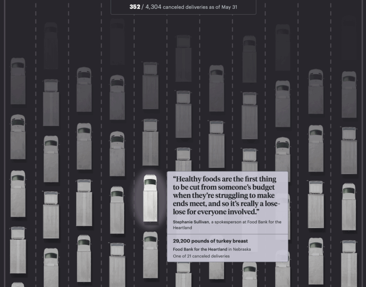
The administration cut $500 million of aid to U.S. food banks earlier this year, which amounts to 94 million pounds in 4,300 deliveries. This is based on data from the Department of Agriculture. For ProPublica, Ruth Talbot and Nicole Santa Cruz illustrated each canceled delivery with a truck.
The data is itemized down to pounds of food and where it would’ve gone, so each truck represents something tangible. A counter on the top shows how many cancellations you’ve scrolled through.
-
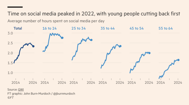
As we descend towards slop-based social media, where the videos are fake and the people are bots, we might be rounding up our time with algorithmically generated feeds. For Financial Times, John Burn-Murdoch shows time spent on social media over the past decade.
The key signal seems to be in young people’s usage. It looks like usage plateaued for 16- to 24-year-olds and has been inching its way down. Although usage over two and a half hours per day is still a lot. Also when broken out by continent, North American usage still looks like it’s going up.
So I guess we’ll see. Bookmarked for later.
-
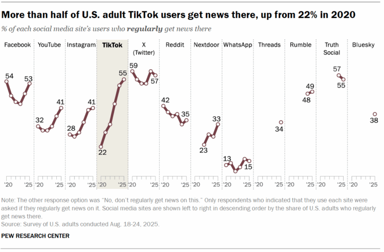
Pew Research surveyed U.S. adults about news consumption on social media and found a steep increase for TikTok users.
When looking at adult TikTok users specifically, news consumption has also increased sharply in recent years. More than half of TikTok users (55%) now say they regularly get news on the platform, up from 22% in 2020. TikTok is now on par with several other social media sites – including X (formerly Twitter), Facebook and Truth Social – in the share of its adult users who regularly get news there.
From 22% to 55% is indeed a big jump. I wonder how much of that jump is from TikTok users’ shifting preferences and how much is from a shifting TikTok feed algorithm.
-
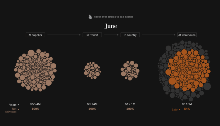
Earlier this year, the administration halted USAID shipments of antimalarial and HIV medical supplies. Medicine already paid for just sat in warehouses. The Washington Post charted the timeline for the disrupted supply chain.
A Post analysis of internal data from the first half of the year shows that supplies valued at more than $190 million were scheduled to arrive at distribution warehouses by the end of June. Instead, the analysis found, shipments worth nearly $76 million were not delivered, including the majority of medication needed to combat severe malaria. Some medicines never left the places where they were manufactured, and others were stranded in ports or customs facilities near the cities and villages where they were needed.
One part of the larger piece is a set of circles that represent shipments. Circles are sized by value and colored by shipment status during a given month. Position represents shipment location and changes as you scroll.
The mechanics remind me of the 2019 piece on school diversity, also by the Post.
-
Just under half of adults in the United States said they had an alcoholic beverage in the past 30 days. Does this change for various groups? If so, by how much?
-
Members Only

Hi everyone. Nathan here. I write to you from the United States, where…
-
Merriam-Webster is about to release the next edition of their large language model in November. No hallucinations, hundreds of thousands of well-defined parameters. I’m excited.
We are thrilled to announce that our NEW Large Language Model will be released on 11.18.25.
— Merriam-Webster (@merriam-webster.com) October 1, 2025 at 7:38 AM
-
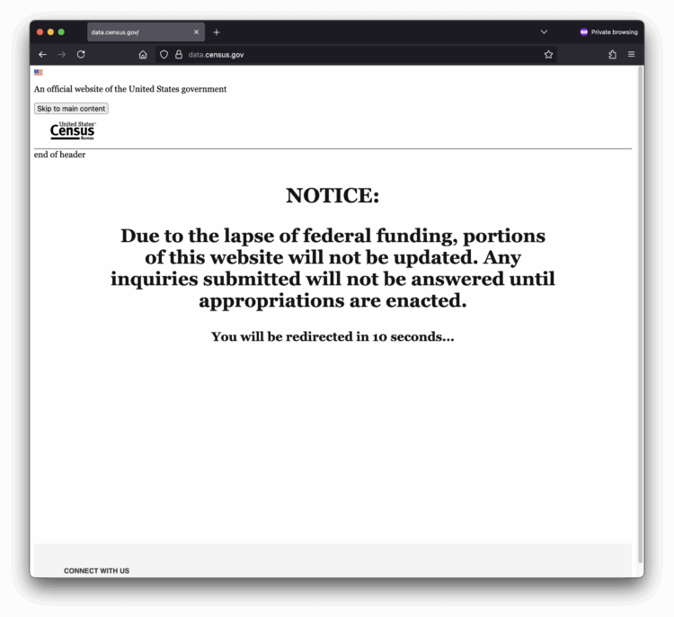
Due to the government shutdown, parts of the Census Bureau site, where you should be able to access data, are currently offline.
-
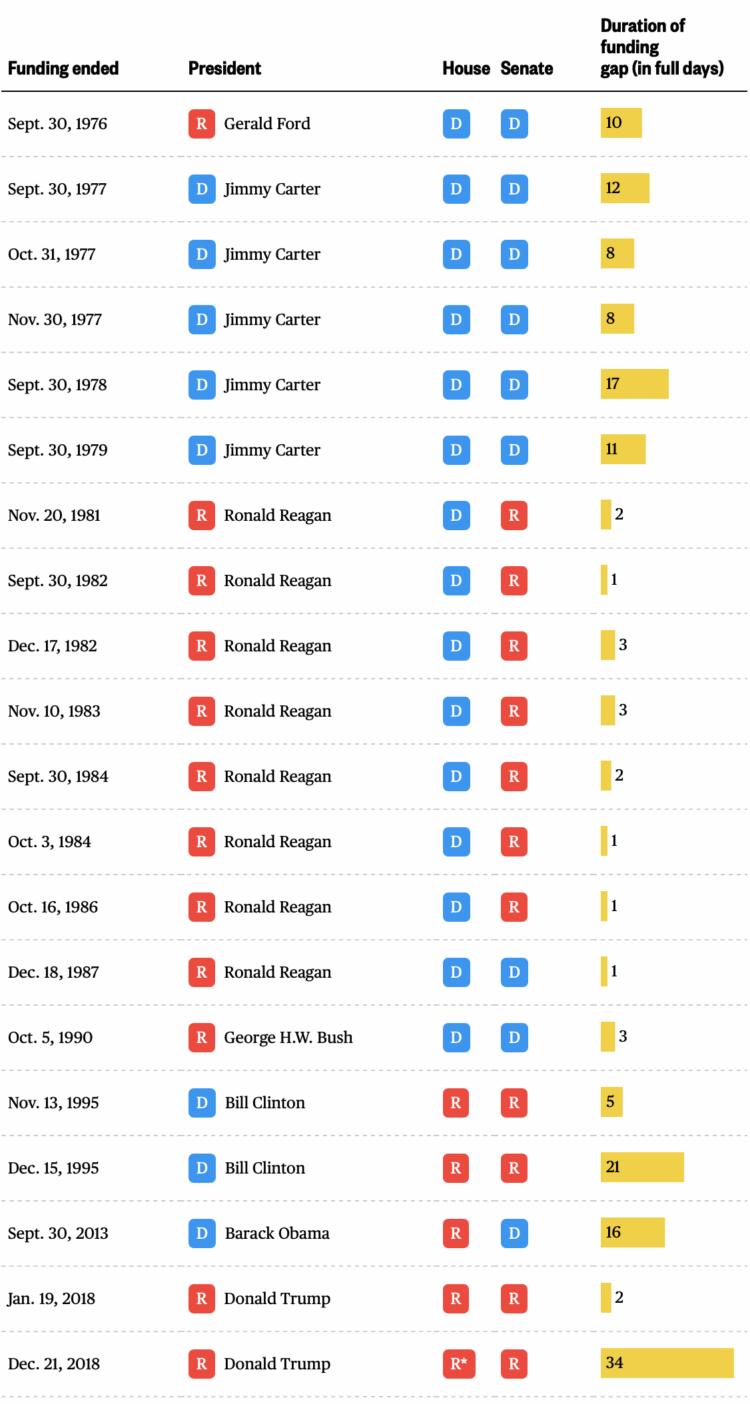
The government shutdown of 2025 begins. Here is a quick table by Nigel Chiwaya for NBC News showing the congressional parties and the length of the funding gaps. Not all gaps include shutdowns and furloughs for federal employees, but the last six have, and the last shutdown in 2018 was the longest.
-
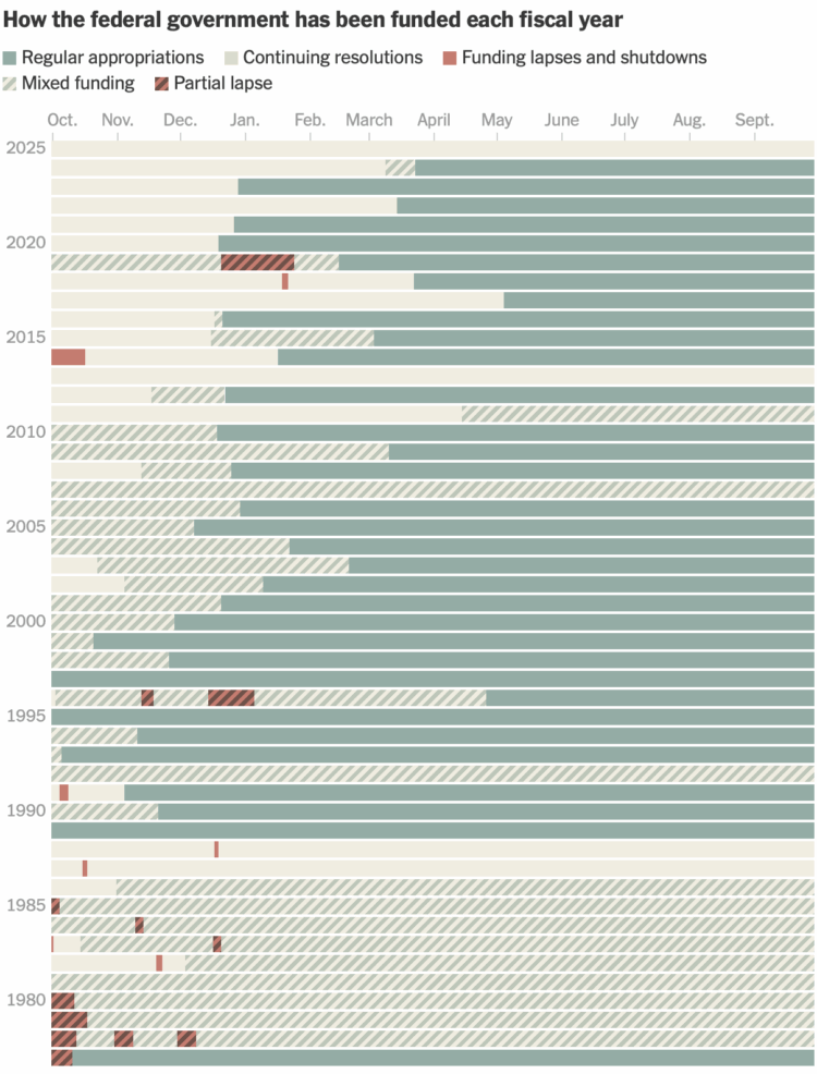
As one might expect, Congress is having trouble figuring out how to fund the government, which is likely headed towards a shutdown. For the New York Times, Lazaro Gamio charted the history of funding, lapses, and shutdowns.
Congress is supposed to pass 12 spending bills every year before October 1, and they’ve only been able to do it five times since the rule began in the 1970s. They don’t seem to be getting better at it.
-
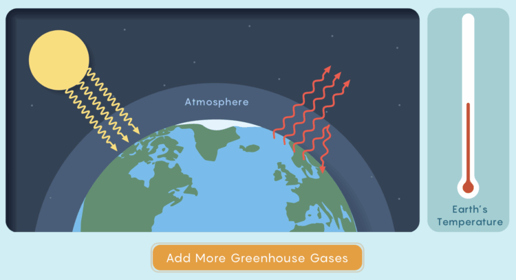
For Quanta Magazine, Joseph Howlett and Mark Belan explain the mechanics of how greenhouse gases lead to a hotter planet.
Earth will eventually settle into a new, hotter equilibrium, but only if its atmosphere stops changing. As long as we keep adding more greenhouse gases, the planet will keep getting hotter, chasing an equilibrium it can never reach.
Simulations and interactive animations throughout the piece keep things spicy.
-

You can find rhythms and patterns when you look closely at the activities of daily life. Cars move across a freeway, a ping pong ball hits back and forth, and clouds float across the sky. Matthew Wilcock translates these rhythms to music and ambient sounds. It is surprisingly calming.
Read More -
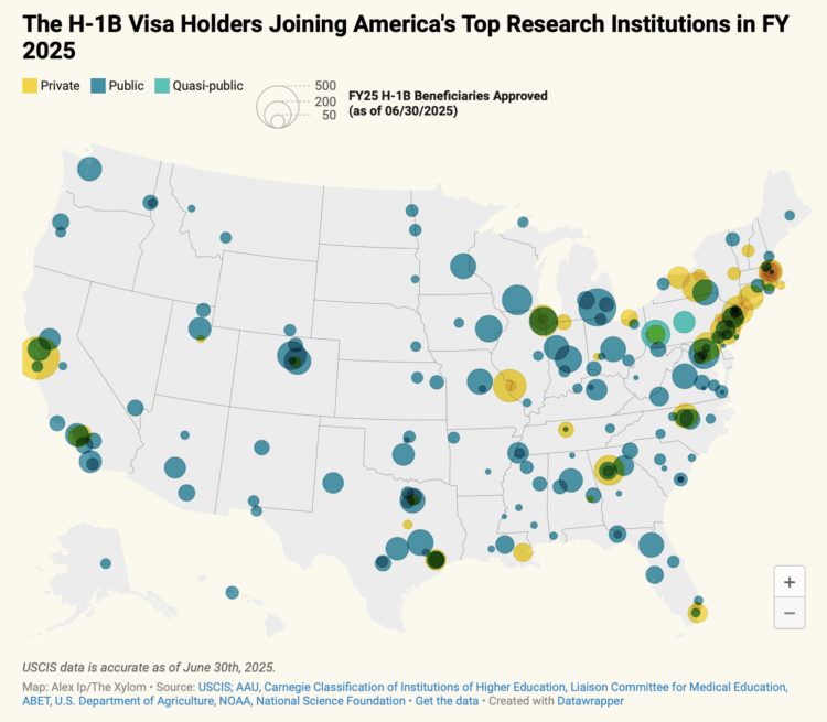
Most of the H-1B attention has been on companies, but many visa holders are at research institutions studying topics that might be of use to society. From Alex Ip for The Xylom:
The Xylom’s analysis of data from the U.S. Customs and Immigration Services (USCIS) identified more than 13,000 H-1B workers who have joined over 200 four-year or postgraduate-only land-grant, sea-grant, and R1: Very High Spending and Doctorate Production institutions so far this fiscal year.
-
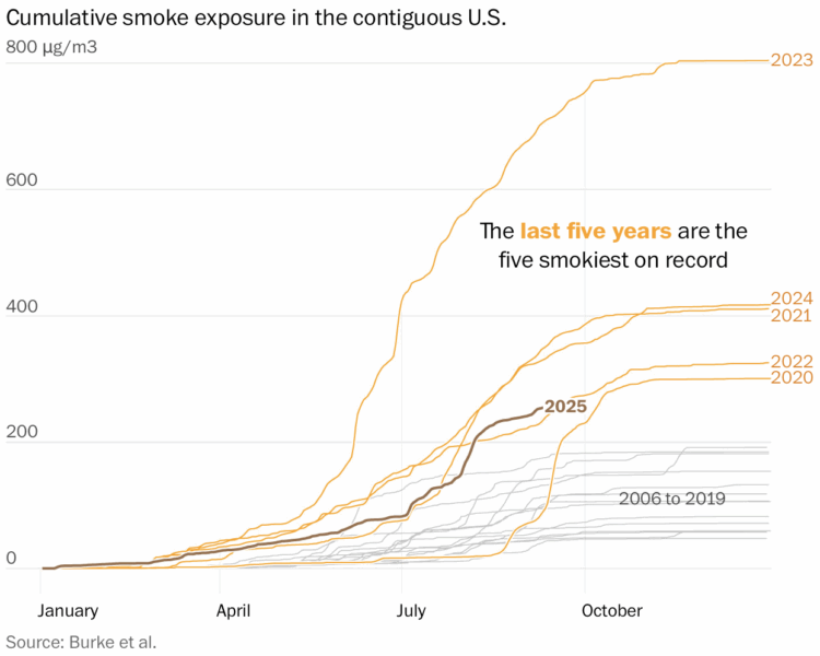
The wildfires keep coming, and the smoke pollution keeps filling the air. It seems to be getting worse. For the Washington Post, Shannon Osaka, John Muyskens, and Daniel Wolfe have the charts and map to show the increases.
-
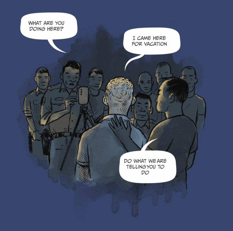
This is quite a visual story from Reuters. In a comic format, they illustrate and describe the story of travelers tricked at the airport in Thailand. The travelers are abducted and forced into scamming others out of savings, or face consequences.
-
Members Only

Here are tools you can use, datasets to poke at, and resources to learn from.
Recently for Members
Second Edition
 Visualize This: The FlowingData Guide to Design, Visualization, and Statistics (2nd Edition)
 Visualize This: The FlowingData Guide to Design, Visualization, and Statistics (2nd Edition)
New tools, refined process.
Browse by Chart Type See All →


