Our World in Data is a hub for research and reliable data to…
2024
-
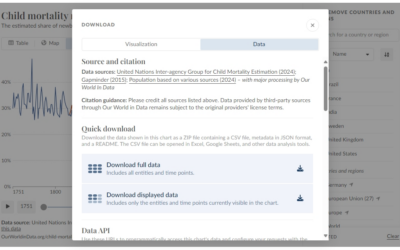
Our World in Data wants you to use their data with improved export and API
-
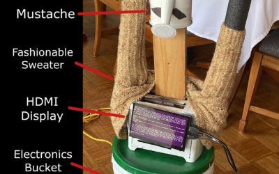
LLM-driven robot made of garbage
We like to imagine a world of autonomous robots that take care of…
-
Foursquare open sources location data
Foursquare, which I thought was still a location sharing app but is a…
-

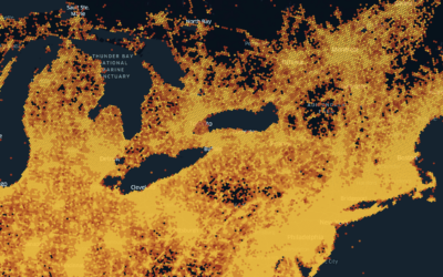
Tree blanket color-coded by local temperature
Speaking of data blankets, the knitting club in the area I live has…
-
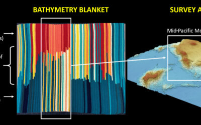
Bathymetry blanket crochet
Jesse Gwinn, from NOAA, was at sea on a mapping expedition and to…
-

Emoji rain and Bluesky Matrix
Bluesky firehose fun continues. Jared Short shows emoji usage as rain drops that…
-

Stream of deleted Bluesky posts
To demonstrate how easy and cheap it is to access the Bluesky firehose,…
-

Tunnel through the live Bluesky firehose
Bluesky has a relatively easy-to-use firehose that lets you dip into the stream…
-
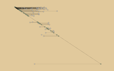
Mike Tyson Fights Against Age
A timeline showing the age difference between Mike Tyson and his opponents, over his career that started in 1985.
-
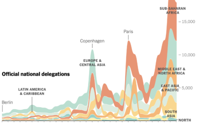
Participation in the annual United Nations climate conference
For the New York Times, Mira Rojanasakul visualized annual participation in the United…
-
Members Only
Make the Chart: Interactive Line Chart with Ghost Trails
Using faded lines to show the overall changes in a time series and to provide a point of reference for the present.
-
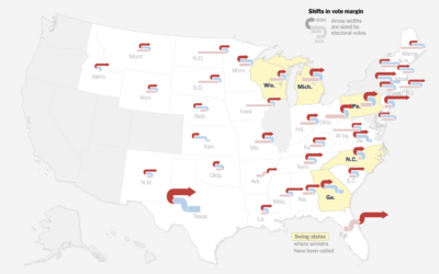
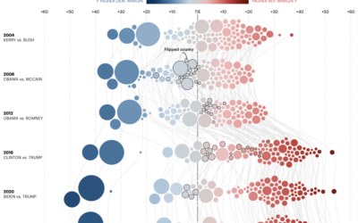
Swooping vote margins
The New York Times used swooping arrows to show vote swings left and…
-
Margin of victory over past elections, in Minnesota
For the Minnesota Star Tribune, Yuqing Liu and C.J. Sinner show how the…
-
Members Only

Connect the Charts
This week we look at connecting multiple charts explicitly and implicitly to provide a cohesive narrative or visual metaphor around a dataset.
-

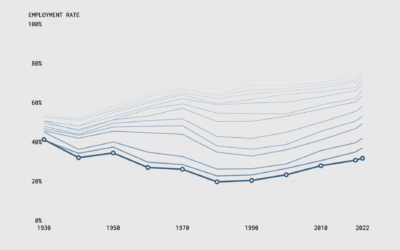
Employment Rates and Age, More Work and More Years
We can see the changing scales of who works and for how long through employment rates by age and time.
-

Evolution of the love song
For The Pudding, David Mora and Michelle Jia examine the death of the…
-

See you on Bluesky
Bluesky, maybe best pitched as a place for those who liked Twitter and…
-
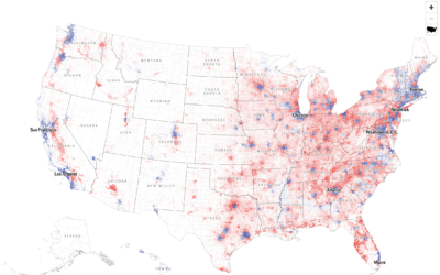
Dot density map for election results
With what is now a common mapping method, The Economist used a dot…
-

Mapping every voter as a grain of sand
To show the mix of votes across the country, the Washington Post used…
-
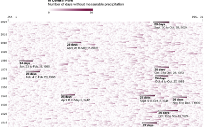
Days without rain
New York City recently issued a drought warning because of an abnormally dry…
Recently for Members
Second Edition
 Visualize This: The FlowingData Guide to Design, Visualization, and Statistics (2nd Edition)
 Visualize This: The FlowingData Guide to Design, Visualization, and Statistics (2nd Edition)
Browse by Chart Type See All →


