xkcd poked fun at the sometimes questionable color choices of researchers.…
2021
-
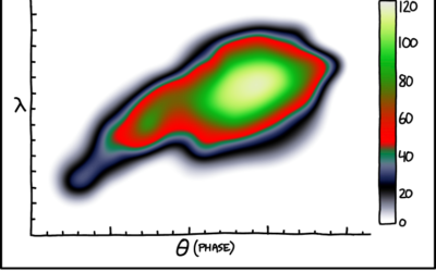
Painbow color scale
-
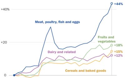
Rising prices of everything
Using Consumer Price Index, Alyssa Fowers and Rachel Siegel for The Washington Post…
-
Members Only

Not the Best List of Visualization Tools – The Process 164
All the tools are a product of visualization’s many uses, which isn’t so terrible. But not all the tools are champions.
-

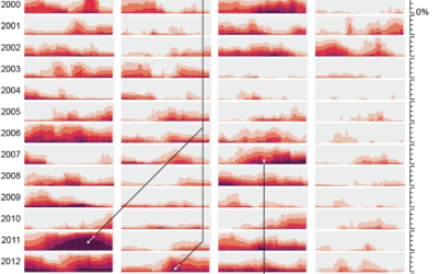
Sonified animation of London Covid-19 rates
[arve url=”https://vimeo.com/571217327″ loop=”no” muted=”no” /]
Valentina D’Efilippo, Arpad Ray, and Duncan Geere visualized… -
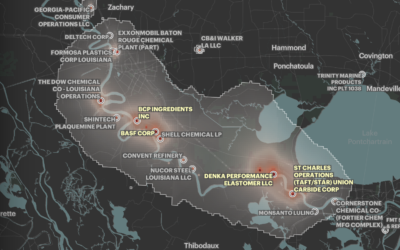
Where cancer risk is greater due to air pollution
Based on five years of data from EPA models, ProPublica mapped areas in…
-
Tracking the Lenna image
If you’ve taken classes that cover image processing, you’ve likely come across the…
-
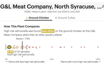
Check the frequency of salmonella in your chicken
The USDA recommends that you cook your chicken to at least 165°F to…
-
alt.VIS
The IEEE VIS 2021 conference is running virtually this week, and there’s a…
-
Members Only
Visualization Tools and Resources, October 2021 Roundup
Here’s the good stuff for October.
-
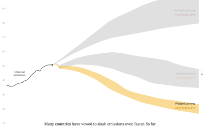
Bend the emissions curve
There has been progress since the Paris climate agreement in 2014, but there’s…
-
Members Only
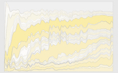
How to Make a Custom Stacked Area Chart in R
You could use a package, but then you couldn’t customize every single element, and where’s the fun in that?
-
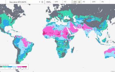
Mapping the probable heat around the world
Earth is getting warmer, and the previously abstract concept seems to grow more…
-
Drought extent by region
For Scientific American, Cédric Scherer and Georgios Karamanis charted drought extent by region…
-
Television Genres Over Time
Here’s how the distribution of genres has changed since 1945 up to present.
-

Are you statistically normal?
Mona Chalabi has a new podcast Am I Normal? and it’s very good:…
-
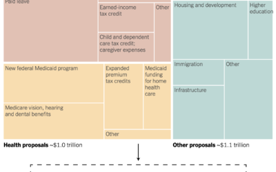
Spending bill in a treemap box
Margot Sanger-Katz and Alicia Parlapiano for NYT’s The Upshot broke down a Democrat…
-
Members Only
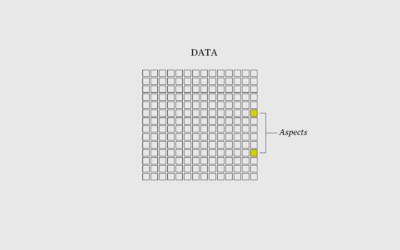
I Want to Visualize Aspects of the Data – The Process 162
When you visualize aspects of the data instead of just the data itself, what you show grows more obvious.
-
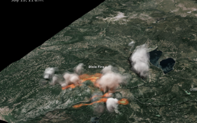
3-D rendering of Dixie fire smoke clouds
The New York Times used radar data to create a 3-D model of…
-
Search every USPS mail route
I’m not sure how long this has been around, but the USPS has…
-

A view from the Moon’s south pole
[arve url=”https://www.youtube.com/watch?v=aD1OQ9UBwuU” loop=”no” muted=”no” /]
NASA Goddard visualized the point of view from…
Recently for Members
Browse by Chart Type See All →


Browse By Topic
Get the Book
 Visualize This: The FlowingData Guide to Design, Visualization, and Statistics
 Visualize This: The FlowingData Guide to Design, Visualization, and Statistics
Available now.