Russell Jeung, chair of the Asian American Studies Department at San Francisco State…
2021
-
Rising number of anti-Asian attacks
-
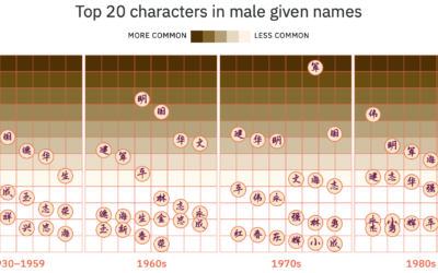
Evolution of Chinese names
For Kontinentalist, Isabella Chua took a dive into the evolution of Chinese names:…
-
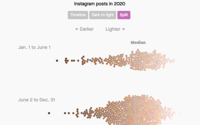
Analysis of skin tones in beauty ads on Instagram
For Quartz, Amanda Shendruk and Marc Bain analyzed skin tones that appeared in…
-
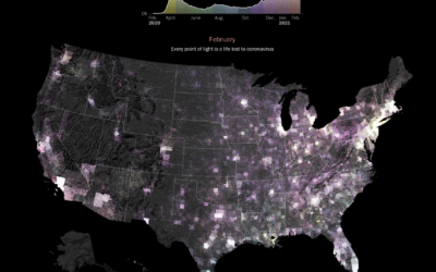
Pandemic timeline as animated dot density map
As a lead-in and backdrop to a timeline of the past year by…
-
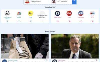
Facebook feed comparison between groups
As part of their Citizen Browser project to inspect Facebook, The Markup shows…
-
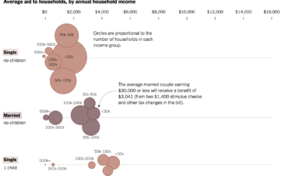
Average stimulus aid, by household size and income
Alicia Parlapiano and Josh Katz, reporting for NYT’s The Upshot, plotted the average…
-
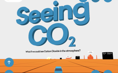
Seeing CO2 is a playable data visualization
Seeing CO2, by design studio Extraordinary Facility, is a playable data visualization that…
-
Members Only

Imagining the Path to a Bad Chart – The Process 130
Bad charts get made. It’s inevitable. Sometimes I wonder how it happens though.
-
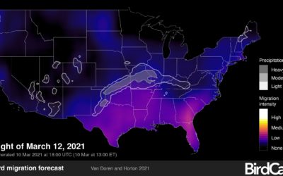
Bird migration forecast maps
BirdCast, from Colorado State University and the Cornell Lab of Ornithology, shows current…
-

DeepTomCruise breakdown
Chris Ume, with the help of Tom Cruise impersonator Miles Fisher, created highly…
-
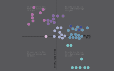
Minimum Wage and Cost of Living
We already looked at minimum wage over time, but when it comes to geography and income, you also have to consider the cost of living for a fair comparison.
-
Machine learning to find movie ideas
Speaking of A.I. and fiction, Adam Epstein for Quartz reported on how Wattpad,…
-
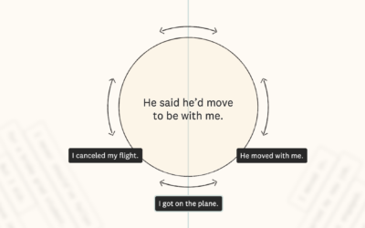
A.I. love story
Pamela Miskhin, in collaboration with The Pudding, wrote a love story. It’s not…
-
10 statistical lessons from the past pandemic year
The Royal Statistical Society published ten lessons governments should takeaway from this year,…
-
Forecasting Covid-19 cases in the early goings
There was a lot of uncertainty in the beginning of the pandemic, so…
-
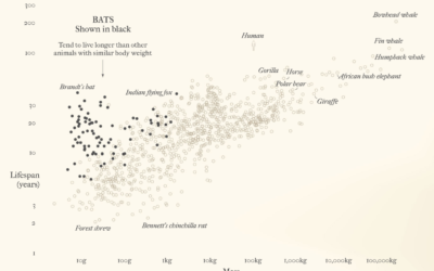
Bats and outbreaks
For Reuters, Julia Janicki and Simon Scarr, with illustrations by Catherine Tai, show…
-
Members Only

Visualization Tools and Resources, February 2021 Roundup
Every month I collect new visualization tools and learning resources to help you make better charts. Here’s the good stuff for February 2021.
-
RAWGraphs 2.0, an open-source tool to visualize data
RAWGraphs, a tool conceived by DensityDesign in 2013, got a 2.0 update in…
-
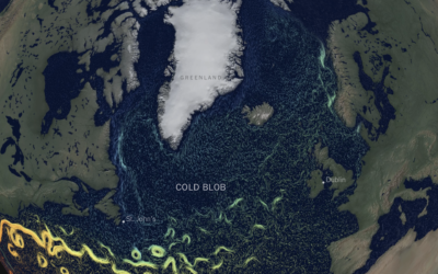
Cooling Gulf Stream
This is quite a dive by Moises Velasquez-Manoff and Jeremy White for The…
-
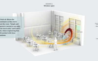
Schools should open their windows for ventilation
As schools begin to reopen, The New York Times illustrates why classrooms should…
Recently for Members
Browse by Chart Type See All →


Browse By Topic
Get the Book
 Visualize This: The FlowingData Guide to Design, Visualization, and Statistics
 Visualize This: The FlowingData Guide to Design, Visualization, and Statistics
Available now.