My main goal for FD this year was to make charts.
I hoped…
2019
-

2019.
-

One leaked file, the location of 12 million smartphones
A file leaked to The New York Times contained location traces of 12…
-

Scripts from The Office, the dataset
The decade is almost done. You’re sitting there and you’re thinking: “I wish…
-

Making invisible gas leaks visible
For The New York Times, Jonah M. Kessel and Hiroko Tabuchi went to…
-
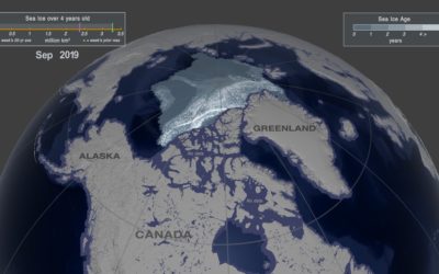
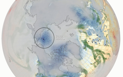
Arctic ice melting
One way to gauge the amount of ice in the Arctic is to…
-

Analysis of online sermons
Pew Research Center analyzed online sermons in U.S. searches, taking a closer look…
-
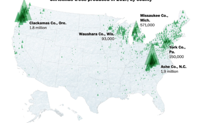
Where Christmas trees come from
For The Washington Post, Tim Meko and Lauren Tierney:
Before the 1930s, Christmas… -
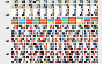
Color breakdown of Scientific American covers
For Scientific American, Nicholas Rougeux and Jen Christiansen show the shift in hues…
-

Best Data Visualization Projects of 2019
As I do every year, I picked my ten favorite visualization projects. Here they are in no particular order.
-
Members Only
Visualization Tools, Data, and Resources Roundup – December 2019 Roundup (The Process #69)
Every month I collect links to new tools, datasets, and visualization resources. Here’s the good stuff for December 2019 and the last roundup for the decade.
-

Best visual illusion of the year
Our brains are pretty good at finding patterns, but it has some blindspots…
-
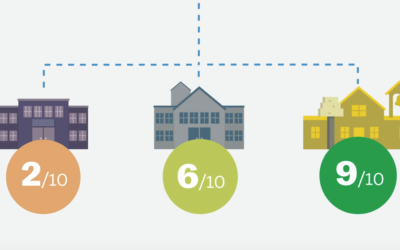
How online school ratings are flawed
Standardized ratings are a challenge, because they often try to encapsulate many variables…
-
Deaths from child abuse, a starting dataset
By way of the Child Abuse Prevention and Treatment Act, ProPublica and The…
-
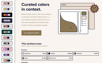
Color palettes browsable in context
Color scheme selections are nice and all, but they’re even better when viewed…
-
Members Only
How to Make a Grid Map with Histograms in R, with ggplot
Layout multiple charts in a single view. Then adjust the scales appropriately for maximum comparability and a unified graphic.
-
Members Only
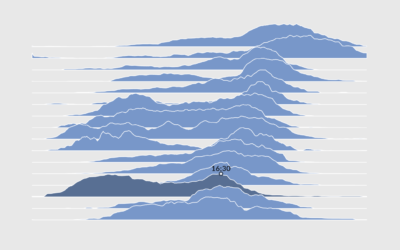
How to Make Interactive Frequency Trails with D3.js
Layering time series data or distributions with this method can change the feel and aesthetic versus a multi-line chart or small multiples. In some cases, frequency trails let you show more in less space.
-
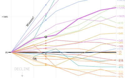
Occupation Growth and Decline
We looked at shifts in job distribution over the past several decades, but it was difficult to see by how much each occupation group changed individually. This chart makes the changes more obvious.
-
Datawrapper updates pricing structure, do more for free
Datawrapper, a focused web tool that makes online charts easier to put together…
-
Using old ship logs as a window into the weather in the 1800s
For Reuters, Feilding Cage describes a weather time machine project by NOAA that…
-
Members Only

Moratorium On Bar Chart Races; When Impractical Visualization is More Practical (The Process #68)
The dataisbeautiful subreddit announced a moratorium on the ever popular bar chart race. The frequency of submissions that used the method got out of hand and spam made it all the less savory. Still, the method holds value.
Recently for Members
Second Edition
 Visualize This: The FlowingData Guide to Design, Visualization, and Statistics (2nd Edition)
 Visualize This: The FlowingData Guide to Design, Visualization, and Statistics (2nd Edition)
New tools, refined process.
Browse by Chart Type See All →


