Comparing ggplot2 and R Base Graphics

In R, the open source statistical computing language, there are a lot of ways to do the same thing. Especially with visualization.
R comes with built-in functionality for charts and graphs, typically referred to as base graphics. Then there are R packages that extend functionality. Although there are many packages, ggplot2 by Hadley Wickham is by far the most popular.
These days, people tend to either go by way of base graphics or with ggplot2. It’s one or the other. Rarely both. I use base graphics. I don’t use ggplot2.
It’s not that I think one is better than the other. It’s just that base graphics continues to get me where I want to go, and the times I tried ggplot2, it didn’t get me anywhere faster than the alternative.
However, last month, Jeff Leek explained why he purposely avoids ggplot2. Then David Robinson rebutted with why ggplot2 is superior to R’s lowly base graphics.
It seemed like a good time to revisit ggplot2 to make my own comparison.
The problem is that I don’t use the package, making any comparison useless. So instead, I worked through Winston Chang’s abridged R Graphics Cookbook and translated the ggplot2 examples to base graphics in the process.
Here are the graphics and code that I got and what I learned.
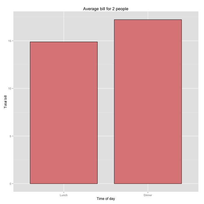
The Bar Chart
Start with the basics, a two-column bar chart that shows two data points. The data frame below represents (imaginary) average bills for lunch and dinner.
dat <- data.frame(
  time = factor(c("Lunch","Dinner"), levels=c("Lunch","Dinner")),
  total_bill = c(14.89, 17.23)
)
In the charts that follow, I put Chang’s ggplot2 examples on the left and my own base graphics translations on the right for side-by-side comparison.
ggplot2
ggplot(data=dat, aes(x=time, y=total_bill, fill=time)) +
  geom_bar(colour="black", fill="#DD8888", width=.8, stat="identity") +
  guides(fill=FALSE) +
  xlab("Time of day") + ylab("Total bill") +
  ggtitle("Average bill for 2 people")
Base Graphics
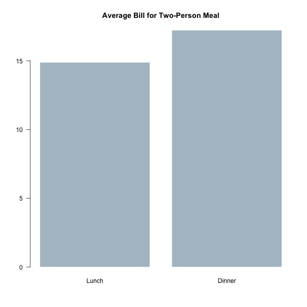
par(las=1)
barplot(dat$total_bill,
		names.arg=dat$time,
		col="#AFC0CB",
		border=FALSE,
		main="Average Bill for Two-Person Meal")
The ggplot2 bar graph has the now familiar gray background and white grid lines. The tick labels are smaller than the axis labels and a light gray. The base graphics bar chart is more barebones.
When we think about graphics from either side, we imagine these aesthetics, and it’s how you can spot one or the other. I’ll go more into looks later, but for now, let’s just imagine this is how it always is.
More importantly, look closer at the code for each. If you’re unfamiliar with ggplot2, it implements a “grammar of graphics” based on Leland Wilkinson’s book The Grammar of Graphics. The basic idea is that you can split a chart into graphical objects — data, scale, coordinate system, and annotation — and think about them separately. When you put it all together, you get a complete chart.
This is how you make any chart with ggplot2. There is a call for each component, and you piece them together with the + operator.
On the other hand, you use the barplot() function with base graphics and specify everything in the function arguments.
The idea is that you can piece together various parts using the grammar for other visualization types. Whereas the single function call to barplot() is specialized to one thing.
Bins
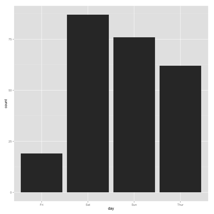
ggplot2 also has some built-in data management. Say you have a data frame of tips at a restaurant (from the reshape2 package):
  total_bill  tip    sex smoker day   time size
1      16.99 1.01 Female     No Sun Dinner    2
2      10.34 1.66   Male     No Sun Dinner    3
3      21.01 3.50   Male     No Sun Dinner    3
4      23.68 3.31   Male     No Sun Dinner    2
5      24.59 3.61 Female     No Sun Dinner    4
6      25.29 4.71   Male     No Sun Dinner    4
In ggplot2, you specify a binning by day through aes() and geom_bar().
# Bar graph of counts
ggplot(data=tips, aes(x=day)) +
  geom_bar(stat="bin")
This gives you a bar chart where the height shows the number of tips per day.
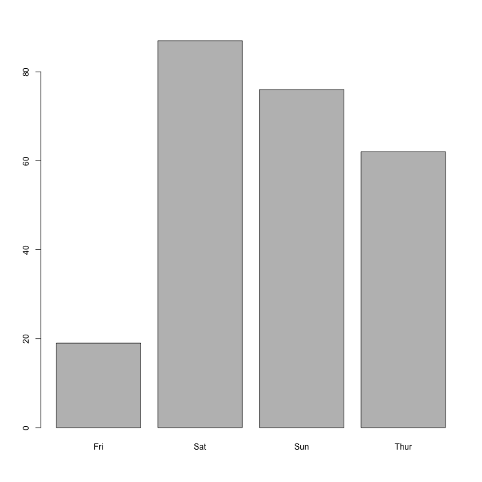
However, in base graphics, you work with the data outside of the visualization functions. In this case, you can use table() to aggregate by day, and you pass that result to barplot().
# Number of tips per day
tips_per_day <- table(tips$day)

# Bar graph of counts
barplot(tips_per_day)
You get a similar bar chart to the one above.
For this example, I’d order the bars by time though — Thursday through Sunday — instead of order of appearance in the data frame. In base graphics, you work outside the barplot() function. Order how you want and pass the result to the function.
# Order by day
tips_per_day <- tips_per_day[c("Thur", "Fri", "Sat", "Sun")]
With ggplot2, you prepare the data in a similar fashion, before the ggplot() call:
# Reorder
tips$day <- factor(tips$day, c("Thur", "Fri", "Sat", "Sun"))
I prefer to handle all of my data outside of any visualization calls, so I’m okay with this. But for this super basic stuff, we’re looking at the same amount of work so far.
Line Chart
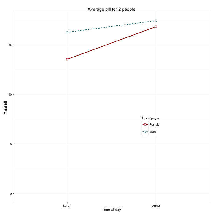
Now for a quick look at another basic chart type. Same data frame with the first bar graphs.
ggplot2
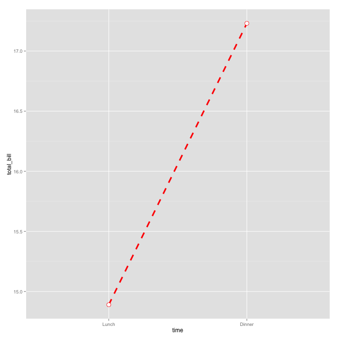
ggplot(data=dat, aes(x=time, y=total_bill, group=1)) +
  geom_line(colour="red", linetype="dashed", size=1.5) +
  geom_point(colour="red", size=4, shape=21, fill="white")
Base Graphics
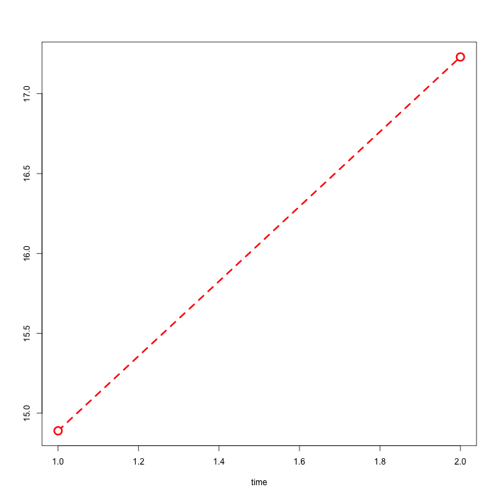
plot(c(1,2), dat$total_bill, type="l", xlab="time", ylab="",
	lty=2, lwd=3, col="red")
points(c(1,2), dat$total_bill, pch=21, col="red", cex=2,
	bg="white", lwd=3)
Again, notice the component approach for ggplot2 with calls to geom_point() and geom_line(). In contrast, I use a call to plot() to make a line chart and then points() to add the circles at the end of the line.
For convenience, I use 1 and 2 for the x-coordinates instead of the lunch and dinner categorical variables. I could make the base match the ggplot2 version, but I don’t care for this example. I mean in practice, other than with parallel coordinate plots, I’m not going to make a line chart with categories on the horizontal.
Multiple Variables
Now let’s say you have multiple variables or dimensions to show. The data frame below has sex, time of day (lunch or dinner), and total bill.
dat1 <- data.frame(
  sex = factor(c("Female","Female","Male","Male")),
  time = factor(c("Lunch","Dinner","Lunch","Dinner"), levels=c("Lunch","Dinner")),
  total_bill = c(13.53, 16.81, 16.24, 17.42)
)
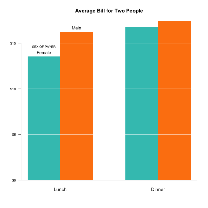
Here’s what the side-by-side bar chart looks like, where height represents total bill, each group represents time of day, and each color represents sex.
ggplot2
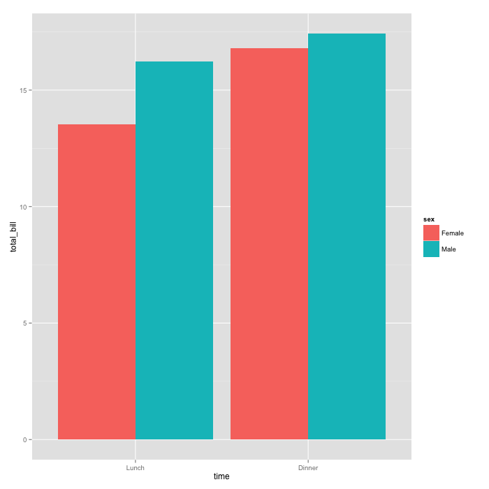
ggplot(data=dat1, aes(x=time, y=total_bill, fill=sex)) +
  geom_bar(stat="identity", position=position_dodge(),
      colour="black") +
  scale_fill_manual(values=c("#999999", "#E69F00"))
Base Graphics
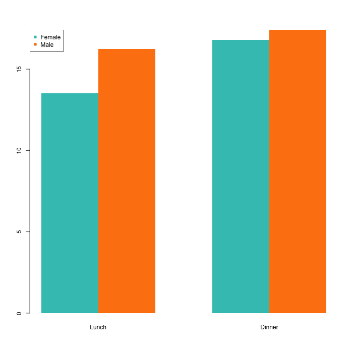
mf_col <- c("#3CC3BD", "#FD8210")
barplot(dat1mat, beside = TRUE, border=NA, col=mf_col)
legend("topleft", row.names(dat1mat), pch=15, col=mf_col)
I converted the data frame to a matrix for barplot():
dat1mat <- matrix( dat1$total_bill,
                   nrow = 2,
                   byrow=TRUE,
                   dimnames = list(c("Female", "Male"), c("Lunch", "Dinner"))
                   )
Cheating, maybe? To be fair though, the original data frame was intentionally constructed for ggplot2. If we were going from base to ggplot2, we’d have to do the same conversion, just the other way around.
I also made a call to legend() to add a legend to the base plot. With ggplot2, the legend comes standard. It’s not exactly a burden to me though, as I try to avoid legends altogether if I can, which is why I disagree with ggplot2 fans that legends with the package are so rad.
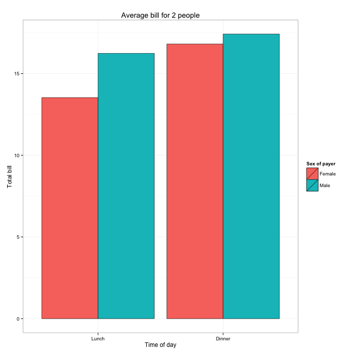
Polish
I’m guessing here, but I think the main reason that people like ggplot2 better than base is that they like the default colors and organization more than that of the barebones base graphics. Out of this list of reasons to use ggplot2, about a quarter of them are that the defaults look good.
Here’s the thing though: Defaults suck. Defaults are there because something has to be there, and they are generalized settings to fit as generically as possible with as many datasets and charts as possible. This is true for all software.
From a presentation perspective, I don’t want any chart I make to look like ggplot2 or base, which is why I almost always touch up final graphics in Illustrator. But that’s not for everyone, and sometimes you need to keep everything in R. So let’s go to the side-by-side.
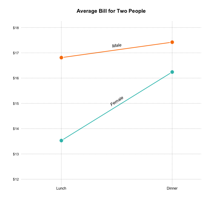
Instead of reproducing Chang’s chart, I went with my own versions.
ggplot2
ggplot(data=dat1, aes(x=time, y=total_bill, fill=sex)) +
  geom_bar(colour="black", stat="identity",
           position=position_dodge(),
           size=.3) +
  scale_fill_hue(name="Sex of payer") +
  xlab("Time of day") + ylab("Total bill") +
  ggtitle("Average bill for 2 people") +
  theme_bw()
Base Graphics
par(cex=1.2, cex.axis=1.1)
barplot(dat1mat, beside = TRUE, border=NA, col=mf_col,
    main="Average Bill for Two People", yaxt="n")
axis(2, at=axTicks(2), labels=sprintf("$%s", axTicks(2)),
    las=1, cex.axis=0.8)
grid(NA, NULL, lwd=1, lty=1, col="#ffffff")
abline(0, 0)
text(1.5, dat1mat["Female", "Lunch"], "Female", pos=3)
text(2.5, dat1mat["Male", "Lunch"], "Male", pos=3)
text(1.5, dat1mat["Female", "Lunch"]+0.7, "SEX OF PAYER",
    pos=3, cex=0.75)
I’m starting to think that if I go custom enough in base graphics, the code starts to look like I’m writing for ggplot2.
The main point is that you can make your graphs look like whatever you want, regardless of method you choose.
I did the same thing with the line chart.
ggplot2
ggplot(data=dat1, aes(x=time, y=total_bill, group=sex,
    shape=sex, colour=sex)) +
  geom_line(aes(linetype=sex), size=1) +
  geom_point(size=3, fill="white") +
  expand_limits(y=0) +
  scale_colour_hue(name="Sex of payer", l=30) +
  scale_shape_manual(name="Sex of payer", values=c(22,21)) +
  scale_linetype_discrete(name="Sex of payer") +
  xlab("Time of day") + ylab("Total bill") +
  ggtitle("Average bill for 2 people") +
  theme_bw() +
  theme(legend.position=c(.7, .4))
Base Graphics
par(cex=1.2, cex.axis=1.1)
matplot(dat1mat, type="b", lty=1, pch=19, col=fm_col,
    cex=1.5, lwd=3, las=1, bty="n", xaxt="n",
    xlim=c(0.7, 2.2), ylim=c(12,18), ylab="",
    main="Average Bill for Two People", yaxt="n")
axis(2, at=axTicks(2), labels=sprintf("$%s", axTicks(2)),
    las=1, cex.axis=0.8, col=NA, line = -0.5)
grid(NA, NULL, lty=3, lwd=1, col="#000000")
abline(v=c(1,2), lty=3, lwd=1, col="#000000")
mtext("Lunch", side=1, at=1)
mtext("Dinner", side=1, at=2)
text(1.5, 17.3, "Male", srt=8, font=3)
text(1.5, 15.1, "Female", srt=33, font=3)
Chang points out an interesting issue with the legend in his version. He had to specify it three times (lines with “Sex of payer” in it) to make it appear just once. If you don’t do that, multiple legends with the same encodings show up.
Like the bar chart before, I go sans legend and use direct labeling instead. By the way, labeling is much easier in illustration software, where you can move things around with your mouse.
Chang provides how-tos for more chart types using ggplot2, along with axes, legends, and titles. I worked through the examples pretty quickly. They’re similar to the above, so I won’t go through them one-by-one here. But I should mention this as one of the benefits of ggplot2. The coding pattern is formally defined, so once you know how the pieces fit together, you can make the other chart types.
In contrast, base graphics functions aren’t the same across all chart types, so you might struggle if you don’t know how to read the documentation.
Anyway, if you’re curious about a specific chart type like a scatterplot or a histogram, look at Chang’s site for more. For the base graphics versions, there’s a tutorial for that.
Drawing Lines
Drawing error lines on plots manually? Yeah, you can do that with both. With ggplot2, there’s geom_errorbar(), and with base graphics there’s lines() and segments().
ggplot2
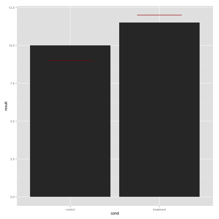
bp <- ggplot(dat, aes(x=cond, y=result)) +
  geom_bar(position=position_dodge(), stat="identity")
bp + geom_errorbar(width=0.5, aes(y=hline, ymax=hline, ymin=hline), colour="#AA0000")
Base Graphics
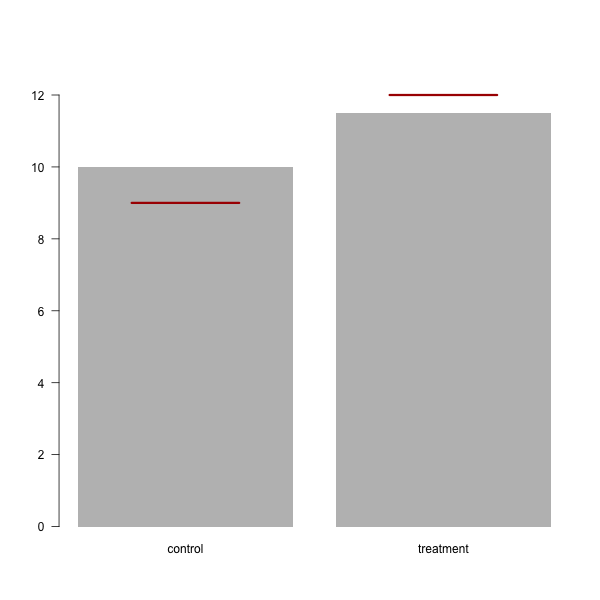
bar_width <- 2
bp_df <- barplot(dat$result, names.arg=dat$cond, ylim=c(0,13), las=1, width=bar_width, border=NA)
bp_df
x0 <- bp_df[,1] - 0.5*bar_width/2
x1 <- bp_df[,1] + 0.5*bar_width/2
y0 <- dat$hline
y1 <- dat$hline
segments(x0, y0, x1, y1, col="#AA0000", lwd=3)
The geom_errorbar() specifically fills this need, whereas the base graphics version is more manual, simply going with straight up geometry.
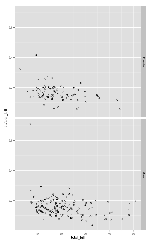
Facets
This is by far the most useful part of ggplot2, and if I use the package again it will be for facets. During exploratory data analysis, you often need to create graphs of various categories. For example, before I made the interactive version of a time series chart on marrying age, I looked at all the demographic breakdowns in R.
Facets with ggplot2 are pretty straightforward using facet_grid() and a common notation for R users. Going back to the tips data, here’s how to create a scatterplot for each sex.
sp <- ggplot(tips, aes(x=total_bill, y=tip/total_bill))
    + geom_point(shape=1)
sp + facet_grid(. ~ sex)
This gives you two scatterplots.
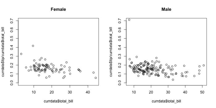
It’s not difficult to make this with base graphics, but it’s not as straightforward. Base requires that you use a for loop, subset on the sexes, and then call plot() for each iteration.
par(mfrow=c(1,2))
sexes <- unique(tips$sex)
for (i in 1:length(sexes)) {
  currdata <- tips[tips$sex == sexes[i],]
  plot(currdata$total_bill, currdata$tip/currdata$total_bill,
    main=sexes[i], ylim=c(0,0.7))
}
I mean, it gets you there:
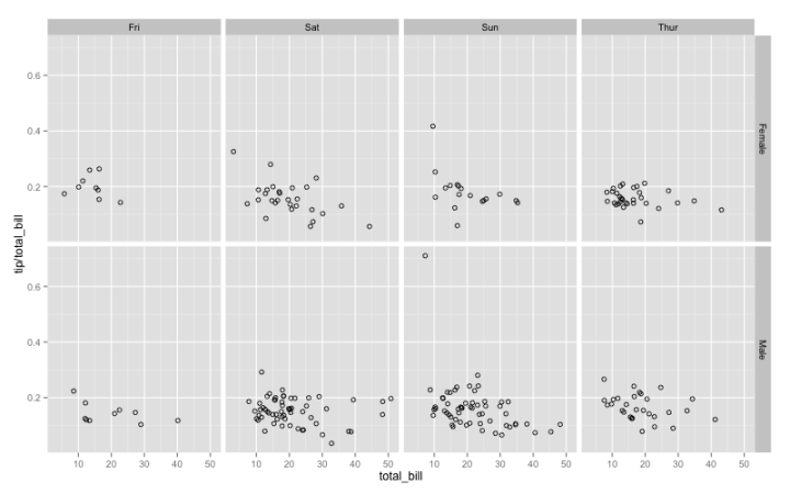
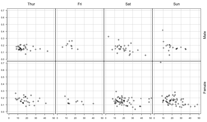
The ease of use is more evident when you facet on multiple categorical variables. The code is almost the same as the previous ggplot2 snippet.
sp <- ggplot(tips, aes(x=total_bill, y=tip/total_bill))
    + geom_point(shape=1)
sp + facet_grid(sex ~ day)
You get a breakdown for age and sex.
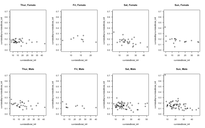
In contrast, here’s how to get the same breakdown in base graphics.
par(mfrow=c(2,4))
days <- c("Thur", "Fri", "Sat", "Sun")
sexes <- unique(tips$sex)
for (i in 1:length(sexes)) {
  for (j in 1:length(days)) {
    currdata <- tips[tips$day == days[j] & tips$sex == sexes[i],]
    plot(currdata$total_bill, currdata$tip/currdata$total_bill,
        main=paste(days[j], sexes[i], sep=", "), ylim=c(0,0.7), las=1)
  }
}
For beginners, the code might look a bit hairy. For me, it isn’t much, but I can easily see the advantage of the ggplot2 snippet. There’s a lower chance of typo or blip with ggplot2.
The base result is also not as easy to read as the ggplot2 version.
Now, I can easily modify graphical parameters to make the base version easier to read:
But if I’m in exploratory mode, I don’t want to spend time with appearance. I save that for presentation.
Wrapping Up
Now that I looked at ggplot2 more closely, do I want to switch away from base graphics? No.
I see the appeal, but I know my way around base graphics well enough where I don’t get stuck or wish it did something else. Plus I appreciate a good one-liner function where I can just specify a bunch of parameters. I know I can use qplot() with ggplot2, but again, that’s just another way to make something I can already make.
Should you use ggplot2 or base graphics? Tough call.
The argument always seems to whittle down to whether or not you can make a certain type of chart. The truth is that if it can be done with ggplot2, it can probably be done with base graphics, and vice versa.
If you’re new to visualization in R, here’s a better question: What type of data do you have and what kind of chart do you want to make?
Google for a solution in R, and in all likelihood there’s at least one floating around somewhere. Try to visualize your data based on what you find. Maybe it’s ggplot2. Maybe it’s base graphics. Maybe it’s something else entirely (like lattice). Once you work it through, try another. Then again.
My bet is you quickly converge to something.
If you converge to ggplot2, Chang’s unabridged R Graphics Cookbook from O’Reilly is a handy reference.
If you converge to base graphics, you can sign up for FlowingData membership for access to the tutorials collection and the four-week course.
There’s also no problem with using everything available to you. At the end of the day, it’s all R.
Become a member. Support an independent site. Get extra visualization goodness.
See What You Get