Notice anything new at the top of this page? FlowingData readers, say hello…
-
Say Hello to the Brand New FlowingData Forums
-

Shouldn’t You Be Using Firefox By Now?
I’ve been using Mozilla Firefox for years and have nothing but good things…
-
Martin Wattenberg On Visualizing Large Textual Data
Martin Wattenberg, one of the creators of Many Eyes, in reply to “Why…
-
Thank You, Everyone for Reading FlowingData
A few days ago, FlowingData’s subscriber count shot up to 3,100+ subscribers, moving…
-
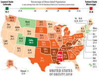
Weekend Minis for Your Lazy Weekend – 7/19/08
BedPost – I put this up earlier for the FlowingData personal visualization project,…
-
Can You Improve this Mediocre Statistical Graphic?
I’m on my way back home from the workshop Integrating Computing into the…
-
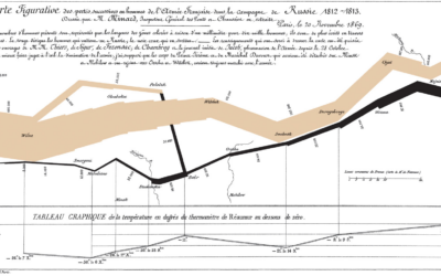
Is Napoleon’s March the Greatest Statistical Graphic Ever?
I am starting to hear about Charles Minard’s map of Napoleon’s march time…
-
Browse Your del.icio.us Bookmarks as Thumbnails
I bookmark stuff with del.icio.us almost every day, and it’s become indispensable, because…
-

Radiohead Music Video by Capturing and Rendering 3D Data
Radiohead’s most recent music video, House of Cards, was made entirely without cameras.…
-
Mapping Economic Activity for the World
The G-Econ (Geographically-based Economic data) group has worked on making economic data publicly…
-
My Ugly Experience with the JetBlue Kiosk
Photo by TR4NSLATOR
As I write this, I’m waiting for my connecting flight… -
If You’re a Criminal on the Run, Don’t Use GPS
With all the new technologies we’ve come to rely on, it’s easy to…
-
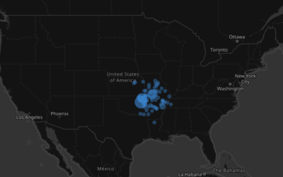
Watching the Growth of Walmart Across America, Interactive Edition
The animated map starts slow with the first location in Arkansas in 1962 and then spreads like a wildfire. When did your nearest Walmart open?
-

Reflecting On the Data Viz VI Conference
A little over a week ago, I was in Bremen for the Data…
-
Map With All the Common APIs at Once – Mapstraction
For those who want more out of the commonly-used mapping APIs from Google,…
-
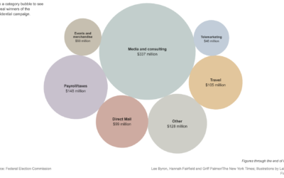
Playful Infographics Triumph Over Pure Analytics (Sometimes)
The New York Times shows how presidential candidates have spent more than $900…
-
The Girl Effect – Beautiful Use of Animated Typography
The Girl Effect – “the idea that adolescent girls are uniquely capable of…
-
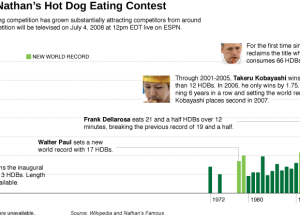
Nathan’s Annual Hot Dog Eating Contest – Kobayashi vs Chestnut
It’s July 4th weekend which means lots of burgers and hot dogs across…
-
Personal Data Visualization, More Details [PROJECT]
Earlier this month, I announced FlowingData’s summer project for personal data visualization. It’s…
-
Infographics Movie: Cost of the War In Iraq
In the time that it takes you to watch this movie, the US…
Recently for Members
Second Edition
 Visualize This: The FlowingData Guide to Design, Visualization, and Statistics (2nd Edition)
 Visualize This: The FlowingData Guide to Design, Visualization, and Statistics (2nd Edition)
New tools, refined process.
Browse by Chart Type See All →