It’s hard to believe that it’s been almost a year since I was…
-
Visualization Workshop in Madrid – Database City
-
Beautiful Generative Computer Art – Metamorphosis
Glenn Marshall has released his finished version of Metamorphosis, a beautiful piece of…
-
Write a Guest Post on FlowingData
I’m headed to Chicago next week for Wired Magazine’s NextFest, “a premier showcase…
-
maeve Installation Shows Relationships Between Projects
The Interface Design Team at the University of Potsdam revealed maeve last week.…
-
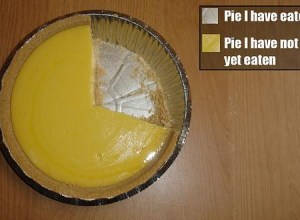
Pie I Have Eaten and Pie I Have Not Eaten
Gotta love Fridays. Have a good weekend everyone. Go have yourself a slice…
-
Caption Contest – Win The Numerati by Stephen Baker
As promised, it’s time for a FlowingData contest. To the winner goes The…
-
FlowingData Welcomes Tableau Software
I’m pleased to welcome Tableau Software as FlowingData’s newest sponsor. I know that…
-
Art of Mathematics – Visualization of Dynamical Systems
Dynamical systems are mathematical models used to describe the time-dependent position of a…
-
Tree Map to Show Losses by Major Companies
Taking after Map of the Market, the New York Times uses tree maps…
-
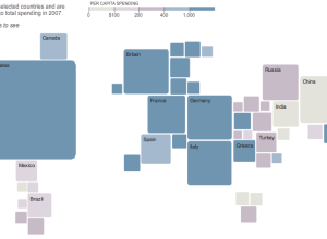
How Consumers Around the World Spend Their Money
This pseudo-map graphic from The New York Times shows how consumers in different…
-
How Eating Ice Cream and Feeling Gross Leads to Alcholism
This stream of consciousness video (below) from Current is complete with animated infographics…
-
Compare Media Coverage of Presidential Candiates with Everymoment Now
I keep stumbling on rants about how media coverage of presidential candidates is…
-
Welcome to FlowingData’s First Sponsor
Some of you might have noticed that FlowingData has a new sponsor in…
-
23 Personal Tools to Learn More About Yourself
In the not too distant past, the Web was all about sharing, broadcasting, and distribution. The tide is turning.
-
OneGeology Wants to Be Geological Equivalent of Google Maps
There’s lots of free geographical data about what’s going on at the surface…
-
See the World Through SimCity’s Eyes – One Up On OnionMap
Michael comments, “Onionmap is nothing when compared to this Chinese site…They’ve practically mapped…
-
Winner of the Personal Visualization Project is…
Like what you see here? Subscribe to the feed to stay updated on…
-
Interactive Graph Visualization System – Skyrails
Skyrails is an interactive graph visualization system that looks a lot like a…
-
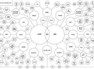
Flowchart Shows You What to Say During Sex
This flowchart shows you what to say during private time with your special…
-

How to Create a Real-Time Web Traffic Map for Your Site
I just released Visitr. Now you can create a real-time web traffic visualization for your own site or blog.
Recently for Members
Second Edition
 Visualize This: The FlowingData Guide to Design, Visualization, and Statistics (2nd Edition)
 Visualize This: The FlowingData Guide to Design, Visualization, and Statistics (2nd Edition)
New tools, refined process.
Browse by Chart Type See All →


