To demonstrate outbreak possibilities of, say, the measles, Aatish Bhatia and Francesca Paris,…
Infographics
Telling stories with data and graphics.
-

Viral outbreak simulations
-

When measles infects an unvaccinated child, illustrated
If you are not vaccinated against measles, you will most likely catch it…
-
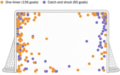
Alex Ovechkin’s spot on the ice and shot preference
Alex Ovechkin passed Wayne Gretzky’s all-time goals record with number 895. For The…
-
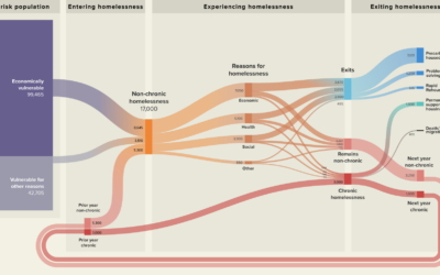
Visualized plans to reduce homelessness
With Streets to Stability, Crankstart illustrates a plan to reduce homelessness in San…
-

Science of the loud sneeze, illustrated
Some people sneeze very loudly. For the Washington Post, Teddy Amenabar, Álvaro Valiño,…
-

History of slipping on banana peels
Secret Base offers a much too complete history of slipping on banana peels,…
-
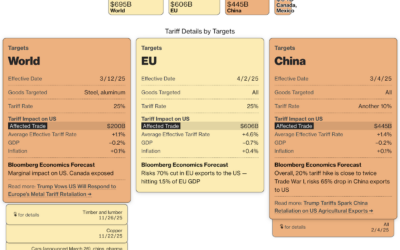
Tariff tracker and economic effects
I guess we’re going to learn a good bit about tariffs over the…
-
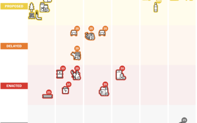
Four stages of tariff progressions
Tariff announcements seem to waver in tone and finality depending on the day.…
-
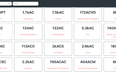
Improved Relative Time, a comparison to many more things in the timeline
You’re familiar with AD and BC, but you probably haven’t heard of AiP…
-

Classic arcade game powered by Wikipedia edits
What if the game Asteroids used Wikipedia edits to drive the volume and…
-
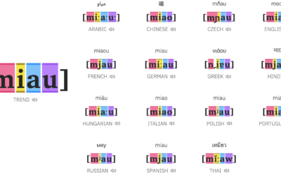
Animal sounds in different languages
The purpose of onomatopoeia is to imitate sounds with words, so you might…
-
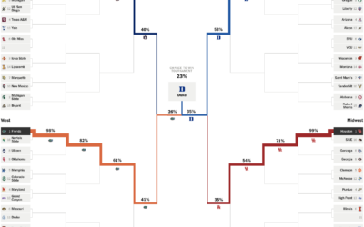
Projections for NCAA basketball tournament, winning chances for each team
Leading up to the NCAA Men’s basketball tournament, the Athletic has a bracket…
-
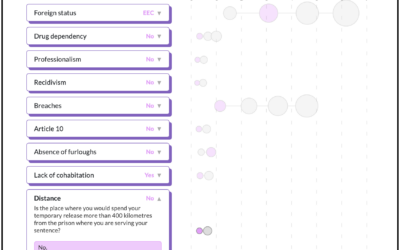
Three-decades-old risk assessment used to decide prison release
In efforts to reduce repeat offenses in Spain thirty years ago, researchers developed…
-
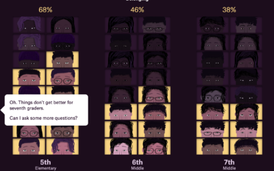
Less sense of belonging, in middle school
Alvin Chang, for the Pudding, highlights education research on the awkwardness of middle…
-
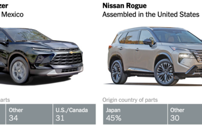
Ambiguity in what counts as American-made vehicles
Speaking of imported vehicle parts, June Kim and Neal Boudette, for The New…
-
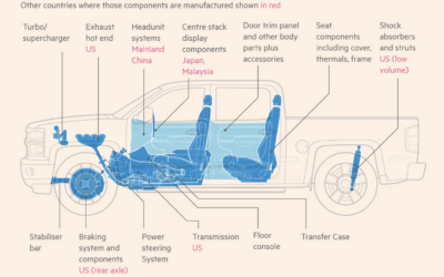
Imported parts on a Chevrolet Silverado
To demonstrate how tariffs can impact American products, Financial Times focuses on the…
-
House colors as an indicator for gentrification
It appears that gray and neutral tones on houses are a sign of…
-

Reality of organ transplant waiting lists
One might hope that people on a waiting list for an organ transplant…
Recently for Members
Second Edition
 Visualize This: The FlowingData Guide to Design, Visualization, and Statistics (2nd Edition)
 Visualize This: The FlowingData Guide to Design, Visualization, and Statistics (2nd Edition)
New tools, refined process.
Browse by Chart Type See All →


