RJ Andrews and Attila Bátorfy highlight information graphics from Signal, the Nazi propaganda…
Infographics
Telling stories with data and graphics.
-

Nazi propaganda charts
-

Data-driven story on the first vaccine
As we enter a time when people question the usefulness of vaccines, even…
-
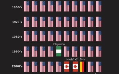
MVP honors dominated by international NBA players
Kirk Goldsberry plotted MVP winners in the NBA, by nationality. Shai Gilgeous-Alexander from…
-
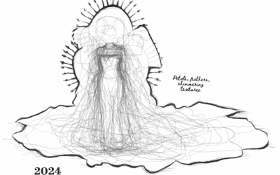
Met Gala dress silhouettes over the years
This is outside my wheelhouse, but it seems like Met Gala dresses grow…
-
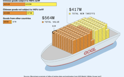
Value of Chinese goods vs. tariffs
Bloomberg, leaning in to a shipping container metaphor, shows the value of goods…
-

All the lawsuits against Sean Combs
The Sean “Diddy” Combs trial started. There have been 78 lawsuits filed against…
-
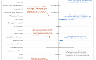
Measles vaccine effectiveness
Despite what some say, the measles vaccine saves lives and is not associated…
-
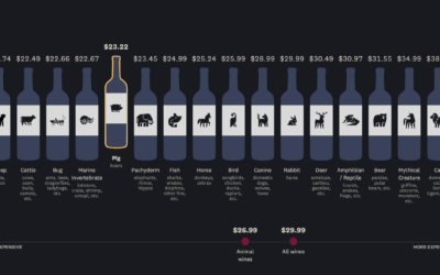
Wine bottles with animals on the label vs. price and quality
You have to pick up a bottle of wine but don’t know what…
-

Deconstructed iPhone to show where the parts are manufactured
iPhone parts are manufactured and assembled by different countries, which makes it tricky…
-

American floor plan from China
Many household items in the United States are almost entirely from China, making…
-
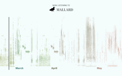
Bird songs of spring
The other morning, my eyes opened about an hour earlier than usual to…
-

Kurt Vonnegut, Shape of Stories illustrated with charts
New to me, a couple decades ago, author Kurt Vonnegut delivered a lecture…
-

Viral outbreak simulations
To demonstrate outbreak possibilities of, say, the measles, Aatish Bhatia and Francesca Paris,…
-

When measles infects an unvaccinated child, illustrated
If you are not vaccinated against measles, you will most likely catch it…
-
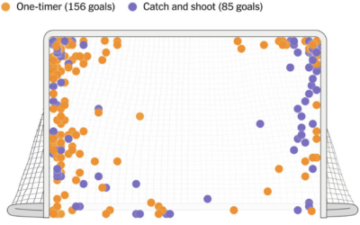
Alex Ovechkin’s spot on the ice and shot preference
Alex Ovechkin passed Wayne Gretzky’s all-time goals record with number 895. For The…
-
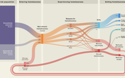
Visualized plans to reduce homelessness
With Streets to Stability, Crankstart illustrates a plan to reduce homelessness in San…
-

Science of the loud sneeze, illustrated
Some people sneeze very loudly. For the Washington Post, Teddy Amenabar, Álvaro Valiño,…
-

History of slipping on banana peels
Secret Base offers a much too complete history of slipping on banana peels,…
Recently for Members
Second Edition
 Visualize This: The FlowingData Guide to Design, Visualization, and Statistics (2nd Edition)
 Visualize This: The FlowingData Guide to Design, Visualization, and Statistics (2nd Edition)
New tools, refined process.
Browse by Chart Type See All →


