For The New York Times, Agnes Chang and Keith Bradsher ask if it’s…
Infographics
Telling stories with data and graphics.
-

To make electric vehicle batteries, China must be involved
-
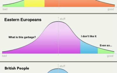
Objectiveness distributions
Putting this joke chart up for posterity, because it deserves it. The earliest…
-
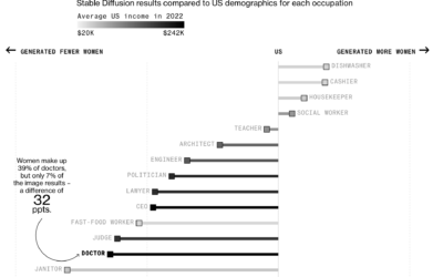
Generative AI exaggerates stereotypes
Perhaps to no one’s surprise, generative artificial intelligence models contain bias rooted in…
-
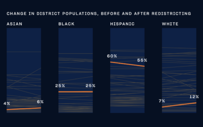
NYC city council district voting guide
With New York 2023 elections coming up, The City and NY1 put together…
-
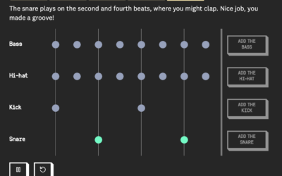
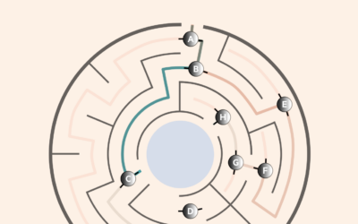
A moving drumbeat, explained visually
When you first learn to play music, a lot of the instruction is…
-

Rights at risk at the U.S. Supreme Court level
For ProPublica, Ian MacDougall and Sergio Hernandez evaluated records of sitting justices to…
-
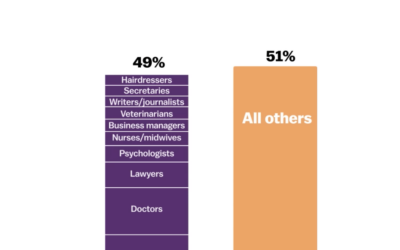
How teenagers’ job ambitions have changed
The Programme for International Student Assessment (PISA), run by the OECD since 2000,…
-
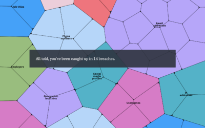
A portrait of your stolen identity in data breaches
You’ve probably heard about big data breaches over the years. They’re in the…
-
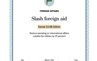
Swipe left or right to cut the national debt
Cutting the national debt is a complex process that involves a lot more…
-

Eurovision winners past and present
The 2023 Eurovision Song Contest finished up this past weekend with the winning…
-

A visual story about kimchi and family
Alvin Chang, for The Pudding, illustrated the search for his kimchi, which is…
-
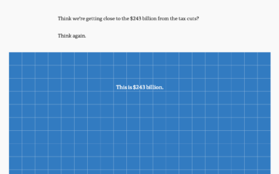
Scale of billions of dollars in Australia’s budget
To show the scale of tax cuts and Australia’s budget, ABC News takes…
-
Quantum computing visual explainer
Quantum computing promises a higher level of processing power over current computers, but…
-

Non-abstract Curry shot chart
Stephen Curry of the Golden State Warriors scored 50 points in game 7…
-

Switching to electric school buses
For Bloomberg, Zahra Hirji and Denise Lu on the electrification of the national…
-
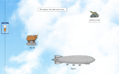
An illustrated tour of the skies in an elevator
Neal Agarwal is up to his wonderful ridiculousness again. Imagining an elevator that…
-
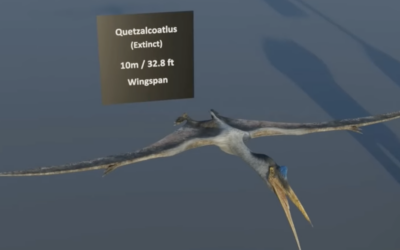
Scale of flying animals
A straightforward lineup of animals that fly provide a sense of scale, from…
-
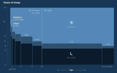
Age and getting enough sleep
Reuters dug in to the science of sleep and how paying attention to…
Recently for Members
Second Edition
 Visualize This: The FlowingData Guide to Design, Visualization, and Statistics (2nd Edition)
 Visualize This: The FlowingData Guide to Design, Visualization, and Statistics (2nd Edition)
New tools, refined process.
Browse by Chart Type See All →


