Ren Yuan visualized the GitHub commit history for the PyTorch library. The virtual…
Data Art
Finding the beauty in numbers.
-
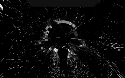
Visualizing GitHub commit history in a 3-D virtual space
-
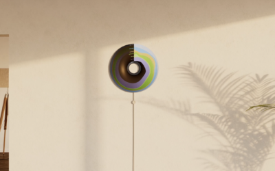
Currently, a light display that shows where your energy is from
Currently is a prototype ambient display that shows where your energy comes from.…
-

Wind flows displayed with spinning paddles
Joanie Lemercier used a grid of spinning paddles that turn with the wind.…
-
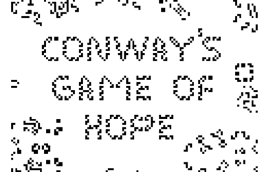
Conway’s Game of Hope
Alexander Miller wrote a “fable of emergence” that combines Conway’s Game of Life…
-

Conway’s Game of Life with a third dimension
Alec Singh added another dimension to Conway’s Game of Life for a pretty,…
-

A phone charger that only works when you recharge yourself
Recharge, an art installation by Dries Depoorter, uses a system that detects when…
-
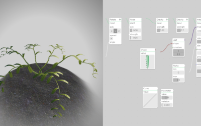
Generative plants
Generate your own plant with Max Richter’s interactive. Adjust leaf shape, density, and…
-
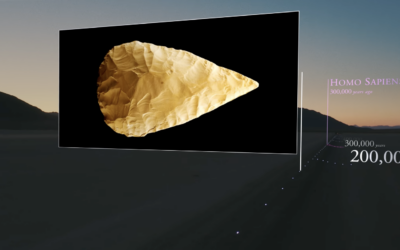
Scale model of the universe’s timeline
To better understand the scale of time and feed your existential dread, Wylie…
-
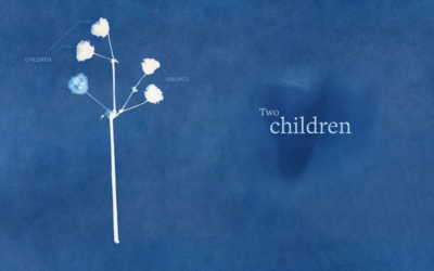
Cyanotype to represent grief
Marking the third anniversary of the first Covid deaths in the United States,…
-
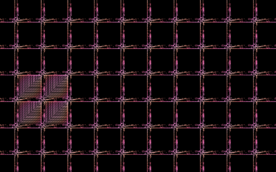
Conway’s Game of Life in infinite space
Conway’s Game of Life is a zero-person game where cells in a grid…
-
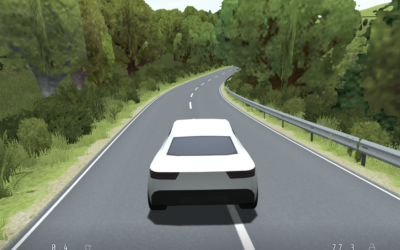
Procedurally generated driving game
Sometimes you need to slow down and go on a drive with no…
-
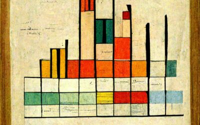
Data visualization(-ish) in the style of famous artists
DALL-E is an AI system from OpenAI that creates images from text. You…
-

Empty school buses as a representation of student lives lost
The NRA Children’s Museum from Change the Ref is a mile-long convoy of…
-

Generative sea creatures
Cindermedusae by Marcin Ignac is “a generative encyclopedia of imaginary sea creatures.” I’m…
-
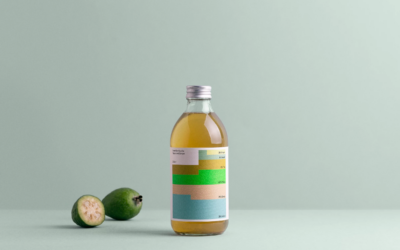
Chart used as drink label
For Swee Kombucha, Bedow used a stacked chart as a food label to…
-
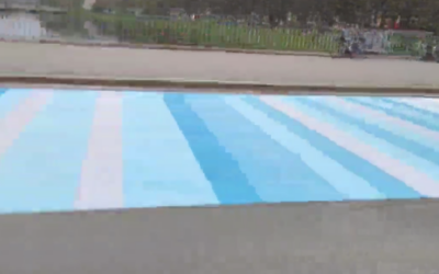
Global warming bike path
The @LpzfuersKlima team have completed painting a giant representation of the Warming Stripes…
-
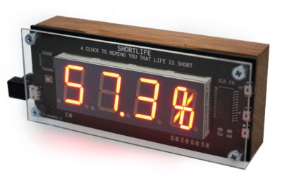
Clock shows percentage of life lived so far
Shortlife is a clock by artist Dries Depoorter that simply shows the percentage…
-

AI-powered artwork app
Wombo Dream is a fun app that lets you enter some words to…
Recently for Members
Second Edition
 Visualize This: The FlowingData Guide to Design, Visualization, and Statistics (2nd Edition)
 Visualize This: The FlowingData Guide to Design, Visualization, and Statistics (2nd Edition)
New tools, refined process.
Browse by Chart Type See All →


