Tutorials
Visualize your data like an expert with hundreds of practical how-tos for presentation, analysis, and understanding.
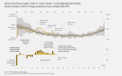
How to Make a Customized Excess Mortality Chart in Excel
Show current evolution against expected historical variability and add one or more series that could account for the difference.

How to Make a Spiral Chart in R
Using a spiral might not be the best way to encode data. But here's how to do it anyway. Just in case.
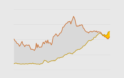
How to Make Difference Charts in Excel
Also known as a bivariate area chart, the plot type focuses on the comparison between two time series.
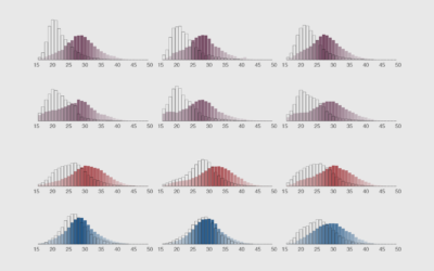
How to Make Animated Histograms in R, with ggplot and gganimate
Make them move to show a shift in distributions over time.
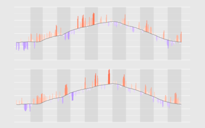
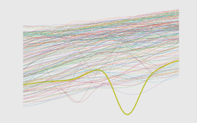
How to Visualize Anomalies in Time Series Data in R, with ggplot
Quickly see what's below and above average through the noise and seasonal trends.
How to Flatten the Curve, a Social Distancing Simulation and Tutorial
Using R, we look at how your decreased interaction with others can help slow the spread of infectious diseases.
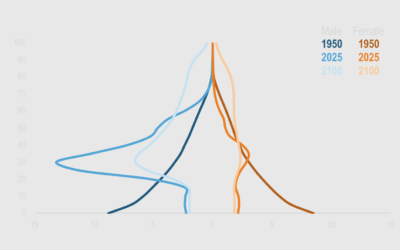
How to Make a Dynamic Multi-population Pyramid in Excel
Create better population pyramids that allow for improved comparisons between sexes and populations.
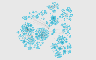
How to Visualize Hierarchical Graphs in R, with ggraph and tidygraph
Network graphs are a good way to find structure and relationships within hierarchical data. Here are several ways to do it.
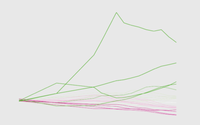
How to Make Line Charts in Python, with Pandas and Matplotlib
The chart type can be used to show patterns over time and relationships between variables. This is a comprehensive introduction to making them using two common libraries.
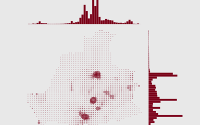
How to Make a Grid Map with Histograms in R, with ggplot
Layout multiple charts in a single view. Then adjust the scales appropriately for maximum comparability and a unified graphic.
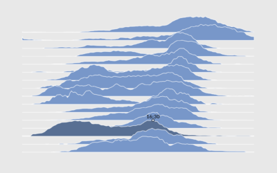
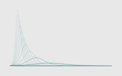
How to Make Interactive Frequency Trails with D3.js
Layering time series data or distributions with this method can change the feel and aesthetic versus a multi-line chart or small multiples. In some cases, frequency trails let you show more in less space.
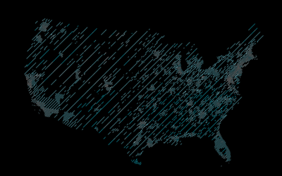
How to Draw Maps with Hatching Lines in R
Fill areas with varying line density to give more or less visual attention. With geographic maps, the technique is especially useful to adjust for population density.
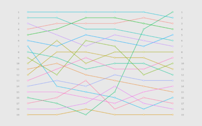
How to Make a Bump Chart in R, with ggplot
Visualize rankings over time instead of absolute values to focus on order instead of the magnitude of change.
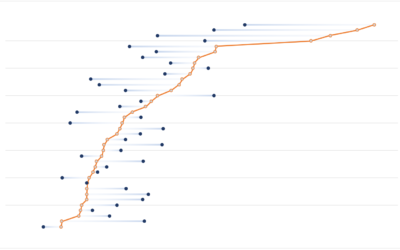
How to Make a Multi-Series Dot Plot in Excel
Easily compare multiple categories and spot differences between two or more series.
How to Use IPUMS Extraction Tools to Download Survey Data
Almost all of my visualization projects that use data from the Census Bureau comes via IPUMS. In this guide, I provide five steps to getting the data you need using their tools.
How to Make Animated Visualization GIFs with ImageMagick
Using the library command-line gets you more flexibility to highlight the important parts of the data.
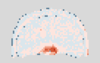
How to Make a Polar Density Plot in R
With cyclical data, a circular format might be useful. Combine that with a smooth density to reduce noise, and you got yourself a plot.
How to Make Baseline Charts in R
By shifting the baseline to a reference point, you can focus a line chart on relative change, which can improve the visibility of smaller categories.