Tutorials
Visualize your data like an expert with hundreds of practical how-tos for presentation, analysis, and understanding.
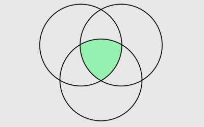
How to Make Venn Diagrams in R
The usually abstract, qualitative and sometimes quantitative chart type shows relationships. You can make them in R, if you must.
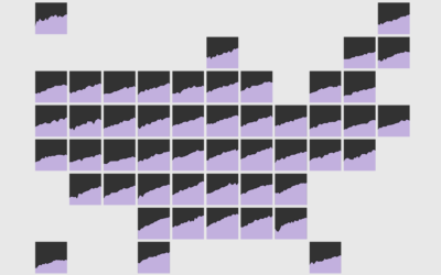
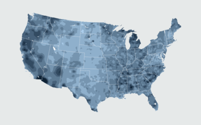
How to Make a State Map Grid with Small Multiples in R
Combining small multiples with the grid layout can make for an intuitive geographic reference.
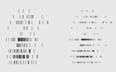
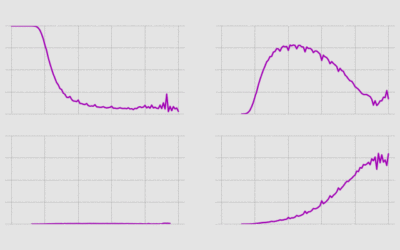
Compact Ways to Visualize Distributions in R
For when you want to show or compare several distributions but don't have a lot of space.
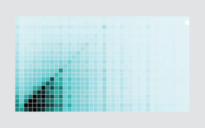
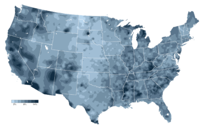
How I Made That: Interactive Heatmap
Add interaction so that you can show different segments of the data and allow comparisons.
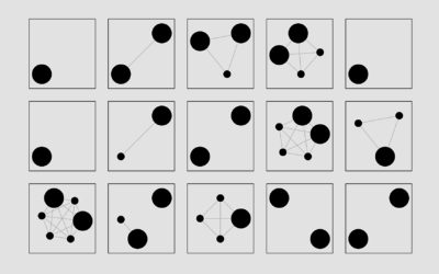
Getting Started with Network Graphs in R
Add the vertices. Connect them with edges. Repeat as necessary.
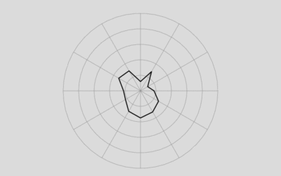
How to Make (and Animate) a Circular Time Series Plot in R
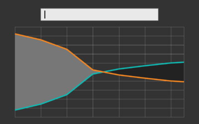
Also known as a polar plot, it is usually not the better option over a standard line chart, but in select cases the method can be useful to show cyclical patterns.
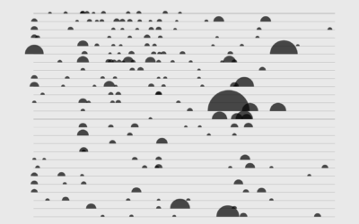
How to Make a Semicircle Plot in R
It's the half cousin of the bubble plot with less overlap and more straight edges.
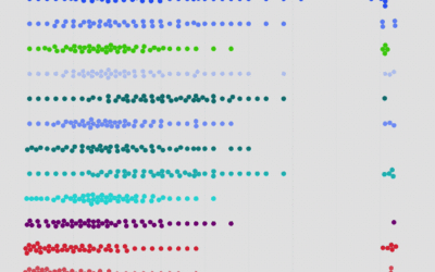
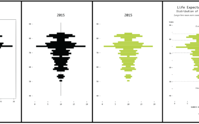
How I Made That: Interactive Beeswarm Chart to Compare Distributions
The histogram is my favorite chart type, but it's unintuitive for many. So I've been using the less accurate but less abstract beeswarm.
How I Made That: Searchable Time Series Chart
When there are too many options or categories, it can be helpful to make the data searchable.
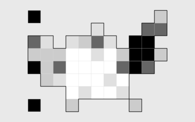
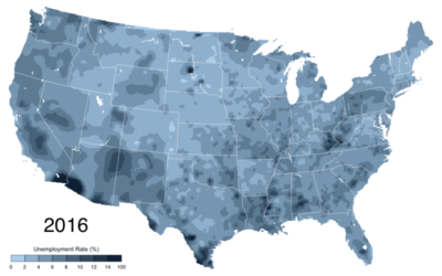
How to Make a State Grid Map in R
Something of a cross between a reference table and a map, the state grid provides equal space to each state and a semblance of the country to quickly pick out individual states.
How to Make Animated Line Charts in R
Sometimes it's useful to animate the multiple lines instead of showing them all at once.
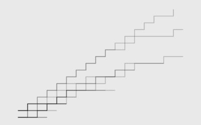
How to Make a Multi-line Step Chart in R
For the times your data represents immediate changes in value.
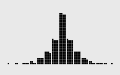
Symbols-based Unit Charts to Show Counts in R
Add visual weight by using individual items to show counts.
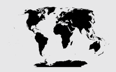
Introducing a Course for Mapping in R
Mapping geographic data in R can be tricky, because there are so many…
How to Edit R Charts in Adobe Illustrator
A detailed guide for R users who want to polish their charts in the popular graphic design app for readability and aesthetics.
How to Make an Animated Map in R, Part 4
In the the last part of the four-part series, you make a longer animation with more data and annotate.
Transitioning Map, Part 3: Animate Change Over Time
How to make a bunch of maps and string them together to show change.
Transitioning Map, Part 2: Refining the Format and Layout
How to make a more readable and more visually accurate map, before you dive into the big transitions.