Tutorials
Visualize your data like an expert with hundreds of practical how-tos for presentation, analysis, and understanding.

Getting Started with D3.js
Learn how to build a custom visualization using D3.js and get acquainted with the popular JavaScript library.
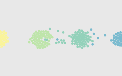
How to Make a Moving Bubble Chart, Based on a Dataset
Ooo, bubbles... It's not the most visually efficient method, but it's one of the more visually satisfying ones.
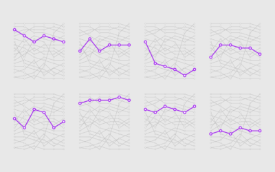
How to Make a Bump Chart in R
Visualize rankings over time instead of absolute values to focus on order instead of the magnitude of change.
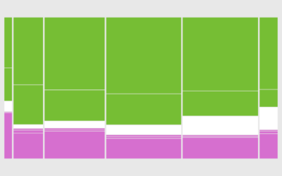
How to Make a Mosaic Plot in R
Also known as a Marimekko diagram, the mosaic plot lets you compare multiple qualitative variables at once. They can be useful, sometimes.
How to Make Animated (GIF) Heatmaps in R
Using color as the visual encoding, show changes over time in two dimensions.
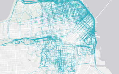
How to Make an Interactive Map of Geographic Paths
With latitude and longitude coordinates, there are a number of ways to map geographic data using D3.js and Leaflet.
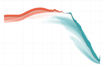
How I Made That: Animated Difference Charts in R
A combination of a bivariate area chart, animation, and a population pyramid, with a sprinkling of detail and annotation.
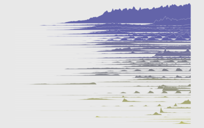
How to Make Frequency Trails in R
Also known as ridgeline plots, the method overlaps time series for a 3-D-ish view of the data. While perhaps not the most visually efficient, the allure is undeniable.
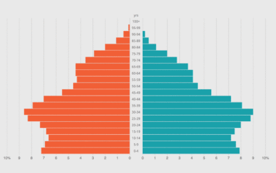
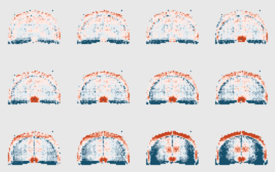
How to Make an Animated Pyramid Chart with D3.js
Compare distributions side-by-side with a pyramid chart. Observe the change over the years by animating it.
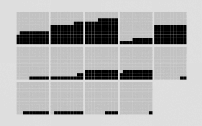
How to Make a Tiled Bar Chart with D3.js
Show individual data points by splitting bars into smaller cells.
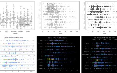
How to Make Better-Looking, More Readable Charts in R
Defaults are generalized settings to work with many datasets. This is fine for analysis, but data graphics for presentation benefit from context-specific design.
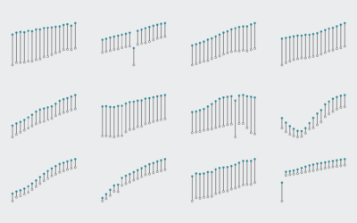
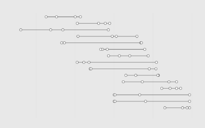
How to Visualize Ranges of Data in R
When you want to focus on the magnitude of differences between low and high values, use visual cues that highlight distance.
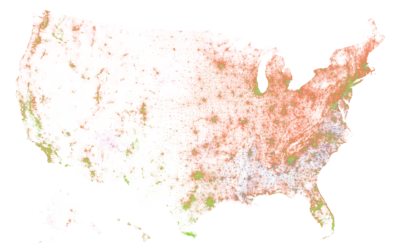
How I Made That: National Dot Density Map
Mapping one dot per person, it's all about putting the pieces together.
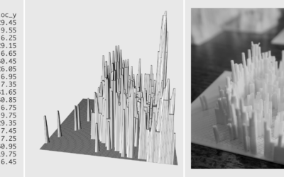
3-D Printing: How to Prepare the Data in R
Moving your data from the digital screen to something more physical isn't as tricky as it seems. Here's how I did it.
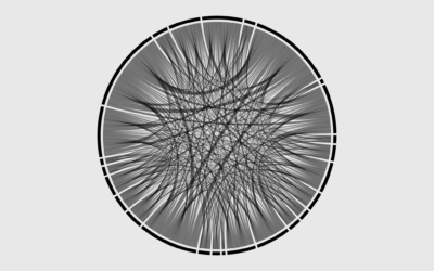
How to Make Chord Diagrams in R
Show connections in the circular layout for a more compact presentation.
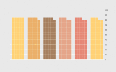
How to Make Unit Charts with Icon Images in R
Make the unit chart less abstract with icons that represent the data, or use this in place of a bar chart.
How I Made That: Animated Square Pie Chart
Also known as waffle charts. Using animated transitions between values, you can allow for comparisons between categories.