Financial Times highlights how researchers are using AI to try to learn what…
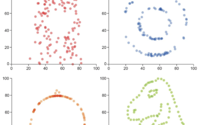
Statistical Visualization
Finding patterns, distributions, and anomalies.
-
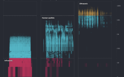
Learning animal languages with AI
-
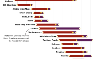
When movies become musicals and then movies again
For The Washington Post, Hanna Zakharenko charted all the movies that were adapted…
-
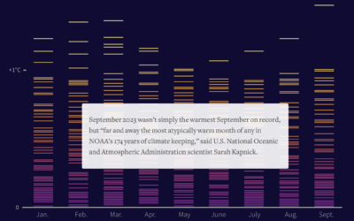
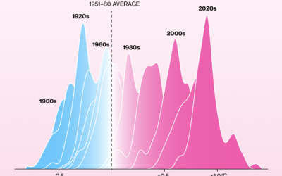
A hotter year, again
This year, 2023, was the hottest year on record. For Reuters, Gloria Dickie,…
-
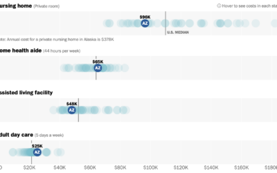
Cost of assisted living where you are
Assisted living can be expensive. For The Washington Post, Bonnie Berkowitz, Lauren Tierney,…
-
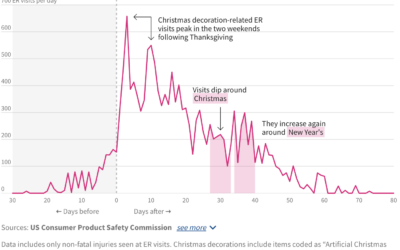
ER visits for Christmas decoration injuries
A lot of Christmas lights went up this past week. I hope you…
-
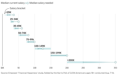
How much more income people need to be happy
For the Wall Street Journal, Joe Pinsker reports on income and happiness, or…
-
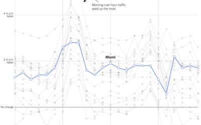
Change in commute times in major cities
Using GPS data processed by Replica, Lydia DePillis, Emma Goldberg, and Ella Koeze,…
-
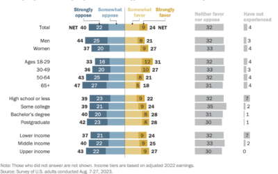
Attitudes towards tipping in the U.S.
Tipping seems to be in a confusing spot right now. On the one…
-
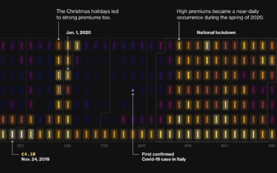
Premiums on electricity during Covid lockdowns in Italy
During Covid lockdowns, power companies in Italy charged premiums to cover increased prices…
-
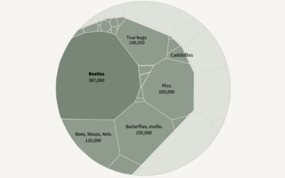
Falling insect species
Insects are dying at a high rate every year, but it is difficult…
-
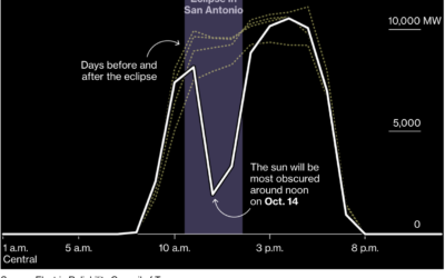
Dip in solar generation during the solar eclipse
Solar power is clean and all, but what happens when the sun is…
-
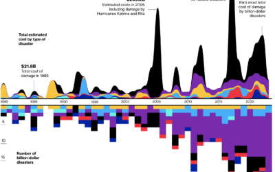
Billion dollar natural disasters
For Bloomberg, Rachael Dottle and Leslie Kaufman go with the combo stacked area…
-
Visualization to better see true values in data
For Scientific American, Jack Murtagh describes the importance of visualization in understanding the…
-
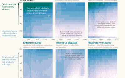
Shifting causes of death over the decades
Saloni Dattani, for Our World in Data, used a set of heatmaps to…
-
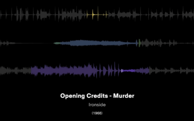
Visual breakdowns of iconic hip-hop samples
Hip-hop music producers often sample from previous works. They remake, restructure, and repurpose…
-
Shifting towards more hot days, fewer cold days
It keeps getting hotter around the world. Not every single day. But over…
-
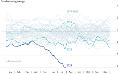
Losing ice in the Antarctic
In this chart from The Economist that shows ice extent from 1972 up…
-
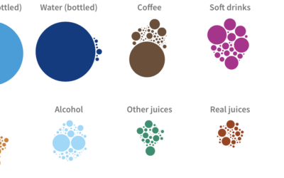
What Americans drink and their changing habits
When I was a kid, I drank a lot of milk, and bottled…
Recently for Members
Second Edition
 Visualize This: The FlowingData Guide to Design, Visualization, and Statistics (2nd Edition)
 Visualize This: The FlowingData Guide to Design, Visualization, and Statistics (2nd Edition)
New tools, refined process.
Browse by Chart Type See All →


