We see probabilities mentioned in the news, in weather forecasts, during sporting events,…
Design
Important in presenting data clearly and beautifully.
-
Writing about probability in a way that people will understand
-
Visualization accessibility
Øystein Moseng for Highcharts provides a brief guide on making your visualizations for…
-
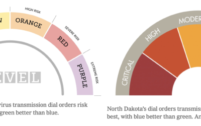
Varying colors of state guidance maps
Many states use color to represent levels of Covid-19 and/or county restrictions. The…
-
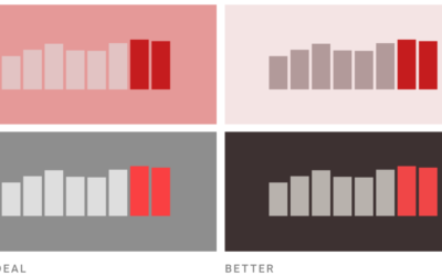
Which color scale to use for your charts
On a superficial level, color scale selection seems like a straightforward task. Pick…
-
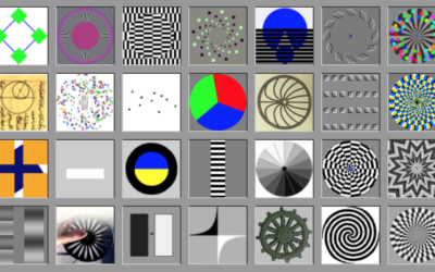
Large collection of optical illusions and visual phenomena
Sometimes our eyes play tricks on us. Even when we know what is…
-
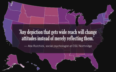
Election map design challenges
For NYT Opinion, Betsy Mason outlines the design challenges behind election maps. Do…
-
Colour Controversy is a game of perception and labeling
Colour Controversy is a simple game that shows you a shade and asks…
-

What states are doing to make mail-in ballots clearer
Mail-in ballots can be rejected if they’re not filled out or mailed correctly.…
-
Telling stories in visual, data-driven essays
For The Pudding, Ilia Blinderman rounds out his three-part series on creating visual,…
-
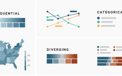
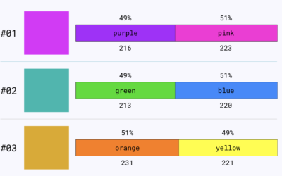
Picking the right colors for your charts
Picking colors for your charts can be tricky, especially when you’re starting a…
-
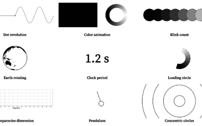
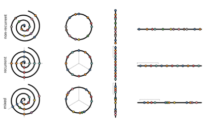
Visualizing periodicity with animations
Pierre Ripoll provides several ways to visualize periodicity using animation. Moving dots, rotating…
-
Everlasting pie chart
Manuel Lima goes into the history of the pie chart, or rather, circle…
-
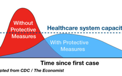
Why the “flatten the curve” chart worked
I know it seems like ages ago when we were talking about flattening…
-

Guides for Visualizing Reality
We like to complain about how data is messy, not in the right format, and how parts don’t make sense. Reality is complicated though.
-

Drawing the coronavirus
What does the coronavirus look like? Rebekah Frumkin for The Paris Review highlights…
-
Explore Explain is a new visualization podcast about how the charts get made
From Andy Kirk, there’s a new visualization podcast in town:
Explore Explain is… -
Evaluating timeline layouts
To show events over time, you can use a timeline, which is often…
-
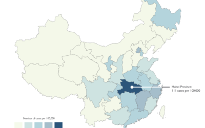
Responsible mapping
We’re seeing a lot of maps now about coronavirus. There are a lot…
-
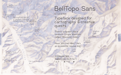
BellTopo Sans is is a free typeface based on maps from 1800s
While working on maps inspired by USGS maps from the 1800s, Sarah Bell…
-
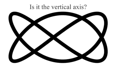
Best visual illusion of the year
Our brains are pretty good at finding patterns, but it has some blindspots…
Recently for Members
Second Edition
 Visualize This: The FlowingData Guide to Design, Visualization, and Statistics (2nd Edition)
 Visualize This: The FlowingData Guide to Design, Visualization, and Statistics (2nd Edition)
New tools, refined process.
Browse by Chart Type See All →


