There are many mistakes you can make when you first get into visualization.…
Design
Important in presenting data clearly and beautifully.
-
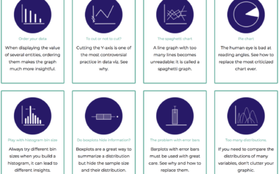
Collection of data visualization pitfalls
-
Fast and slow visualization
Visualization is often described in the context of speed and efficiency. Get the…
-

Visualization for an audience
Jonathan Corum, the Science graphics editor at The New York Times, talks about…
-

Abstract: The Art of Design, with Christoph Niemann
Abstract: The Art of Design kept popping up on my Netflix recommendations list…
-

Understanding animated transitions in data visualization
Alec Barrett for TWO-N describes the benefits and some of the intricacies of…
-
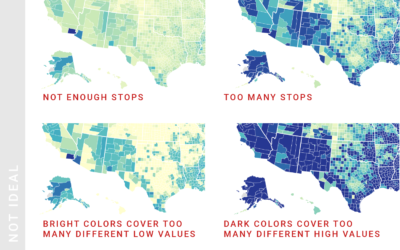
Choropleth map design considerations
Lisa Charlotte Rost for Datawrapper provides guidance for designing choropleth maps that most…
-

People font
You know those graphics that use icons of people to represent units or…
-
Link
Over Heard: A design exploration of the On Being archive →
The process of building a client project with varied expectations along the way.
-
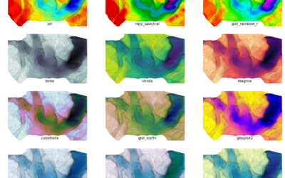
Alternatives to the rainbow color scale
Oh. It’s that time of year already. Time to hate on the rainbow…
-
Link
2017 Chart Diary →
Adam Pearce, a New York Times graphics editor, provides the notes and thinking behind the charts he made during the year.
-
Link
What Questions to Ask When Creating Charts →
Make charts with a purpose.
-
Importance of form and survey design to gain an accurate picture
Lena Groeger, writing for Source, shifts attention upstream from analysis to the design…
-
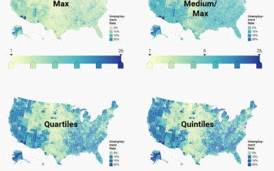
Choosing color palettes for choropleth maps
Choropleth maps, the ones where regions are filled with colors based on data,…
-
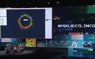
Project Lincoln from Adobe aims to reverse data visualization workflow
With data visualization, you start with the data and let it guide geometry,…
-
Infographic design sins in meme form
Visual editor Xaquín G.V. recently used the distracted boyfriend meme to represent our…
-
Link
How Many Users Resize Their Browser? →
I’ve been slow to get into making things that are responsive. But maybe I should hurry up.
-

Criticism vs. Creation
Filmmaker Kevin Smith talks about making things versus critiquing them. He’s talking about…
-
Data exploration banned
Statistician John Tukey, who coined Exploratory Data Analysis, talked a lot about using…
-
Use dual axes with care, if at all
Dual axes, where there are two value scales in a single chart, are…
-

Data bias at every step
Lena Groeger for ProPublica describes when the designer shows up in the design,…
Recently for Members
Second Edition
 Visualize This: The FlowingData Guide to Design, Visualization, and Statistics (2nd Edition)
 Visualize This: The FlowingData Guide to Design, Visualization, and Statistics (2nd Edition)
New tools, refined process.
Browse by Chart Type See All →


