Phew. Close call.
New York Times graphics editor Gregor Aisch noted during a…
Design
Important in presenting data clearly and beautifully.
-
Interactive visualization is still alive
-
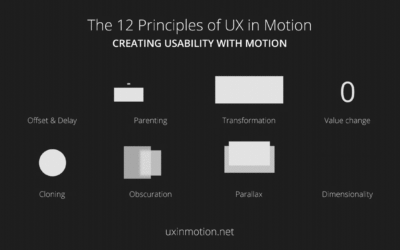
Motion design patterns
Issara Willenskomer talks in detail about the use of animation in UX design…
-
Interactive or not to interactive visualization?
In a recent talk, New York Times graphics editor Gregor Aisch noted that…
-
Visualization choice depends on the data and the questions
When you don’t know where to start with a dataset, try to come…
-
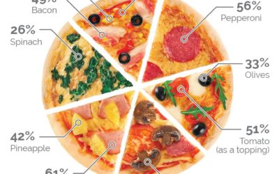
Pie charts are okay
There were some ripples in the space time continuum recently about a pizza…
-

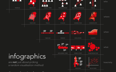
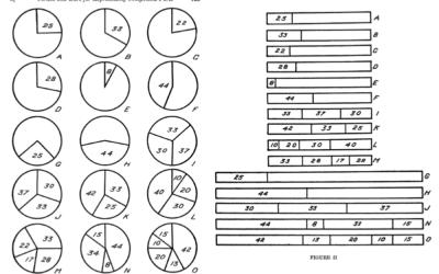
Infographic tools before the computer
There was a time when charts and infographics were drawn by hand, because…
-
Data with the feels
Data can be fact and analytical. It can help you make objective decisions.…
-
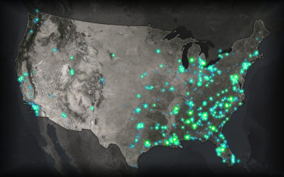
Glow map
John Nelson has a knack for making maps that glow, where the base…
-

Showing missing data in line charts
Missing data is everywhere. Or, I guess technically it’s nowhere. You know what…
-
Decision-making with big numbers we can’t really see
In a 2005 paper “If I look at the mass I will never…
-
Link
A Career Built on Side Projects →
My whole career is a side project.
-
Human perception for visualization
There is visualization in practice and there is visualization in theory and research.…
-
Link
Wear Patterns →
Naturally occurring visualization in the physical world.
-
Using information graphics to calibrate bias
Our daily lives are full of bias. We make assumptions about how the…
-
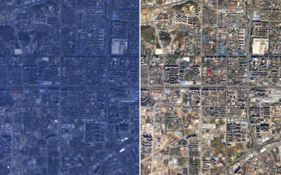
Practical guide for color correction of satellite images
Robert Simmon provides a hands-on guide to get true color from satellite imagery.…
-
Link
Ye Olde Pie Chart Debate →
The arguments over pie charts dates back to 1914.
-
Link
Perceptual Scaling of Map Symbols →
Scale circles by area or by how they are actually perceived?
-
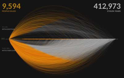
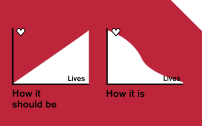
Role of empathy in visualization
On the PolicyViz podcast, Kim Rees of Periscopic and Mushon Zer-Aviv of Shual…
-
Link
Grid map showdown →
A quantitative look at which US grid layout is best.
-
Link
Little boxes →
It must be that time of year again when practitioners try to define visualization. It’s a medium. It’s continuous.
Recently for Members
Second Edition
 Visualize This: The FlowingData Guide to Design, Visualization, and Statistics (2nd Edition)
 Visualize This: The FlowingData Guide to Design, Visualization, and Statistics (2nd Edition)
New tools, refined process.
Browse by Chart Type See All →


