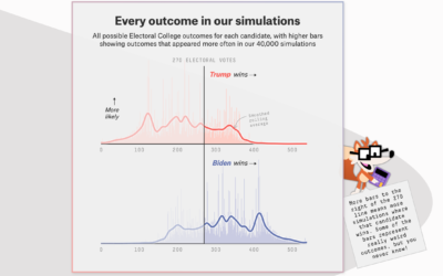
For NYT’s The Upshot, Aatish Bhatia, Josh Katz and Margot Sanger-Katz show the…
uncertainty
-
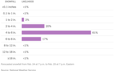
Distribution of snowfall estimates to show uncertainty
-
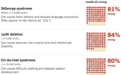
False positives with prenatal tests for rare conditions
Sarah Kliff and Aatish Bhatia for NYT’s The Upshot look at the uncertainty…
-
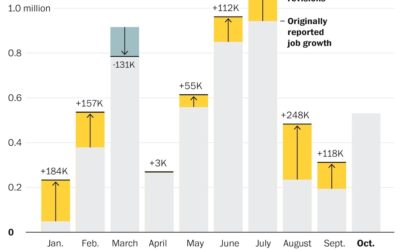
Job growth was underestimated
Andrew Van Dam for The Washington Post used a bar chart with corrections…
-
Writing about probability in a way that people will understand
We see probabilities mentioned in the news, in weather forecasts, during sporting events,…
-
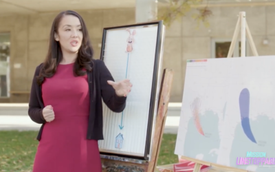
How perception can save lives
Visualization and perception researcher Lace Padilla was on the kid-centric show Mission Unstoppale…
-

Climate change and uncertainty
In his new data-driven documentary, Neil Halloran digs into the uncertainty attached to…
-
Members Only
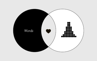
Uncertain Words and Uncertain Visualization, Better Together
People’s interpretation of a chart can change if you use differents words to describe it, even if the data stays the same.
-
Election needles are back
The NYT election needles of uncertainty are back, and they’re about to go…
-
Presidential Plinko
To visualize uncertainty in election forecasts, Matthew Kay from Northwestern University used a…
-
Members Only

The Process 108 – Expected Value
Look only at uncertainty and it can feel overwhelming. Look at just averages and it’s not enough information. So, smoosh them together.
-
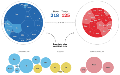
Choose your own election outcome
The election is full of what-ifs, and the result changes depending on which…
-
FiveThirtyEight launches 2020 election forecast
The election is coming. FiveThirtyEight just launched their forecast with a look at…
-
Understanding Covid-19 statistics
For ProPublica, Caroline Chen, with graphics by Ash Ngu, provides a guide on…
-
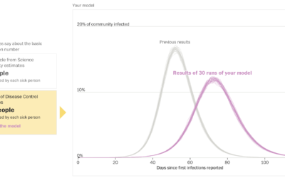
How experts use disease modeling to help inform policymakers
Harry Stevens and John Muyskens for The Washington Post put you in the…
-
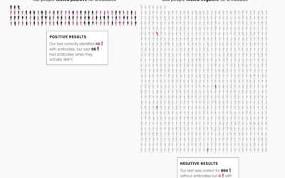
Coronavirus testing accuracy
Medical tests do not always provide certain results. Quartz illustrated this with the…
-
Not making Covid-19 charts
Will Chase, who specialized in visualization for epidemiological studies in grad school, outlined…
-
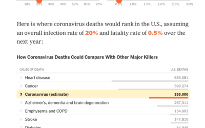
Possible coronavirus deaths compared against other causes
Based on estimates from public health researcher James Lawler, The Upshot shows the…
-
All data is wrong
Vicki Boykis riffing off the George Box quote, “All models are wrong, some…
-
Members Only

Uncertain – The Process 079
These past few weeks, and especially this one, has been full of uncertainty. Probabilities, odds, and rates. In this issue of The Process we talk about ways to visualize this uncertainty.
-
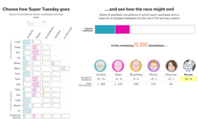
Super Tuesday simulator
With Super Tuesday on the way, there’s still a lot of uncertainty for…
Recently for Members
Second Edition
 Visualize This: The FlowingData Guide to Design, Visualization, and Statistics (2nd Edition)
 Visualize This: The FlowingData Guide to Design, Visualization, and Statistics (2nd Edition)
New tools, refined process.
Browse by Chart Type See All →


