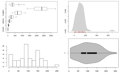
Single data points from a large dataset can make it more relatable, but those individual numbers don’t mean much without something to compare to. That’s where distributions come in.
R
-
How to Visualize and Compare Distributions in R
-
Members Only
How to Make a Sankey Diagram to Show Flow
These tend to be made ad hoc and are usually pieced together manually, which takes a lot of time. Here’s a way to lay the framework in R, so you don’t have to do all the work yourself.
-
A century of ocean shipping animated
Using hand-recorded shipping data from the Climatological Database for the World’s Oceans, history…
-
Link
Functional Programming in R →
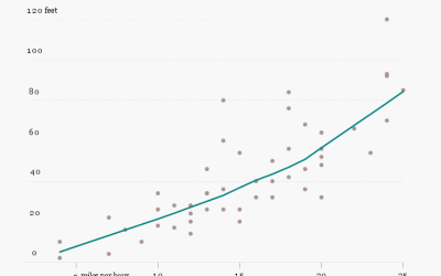
Improve code performance, knowing what R is actually doing [via]
-
Members Only
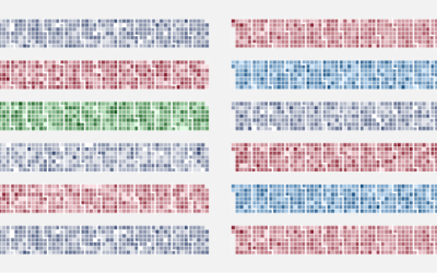
Calendar Heatmaps to Visualize Time Series Data
The familiar but underused layout is a good way to look at patterns over time.
-
Members Only
How to Hand Edit R Plots in Inkscape
You can control graph elements with code as you output things from R, but sometimes it is easier to do it manually. Inkscape, an Open Source alternative to Adobe Illustrator, might be what you are looking for.
-
Link
Maps with R →
-
Link
Must-Have R Packages for Social Scientists →
Oldie but a goodie
-
Members Only
How to Make a Contour Map
Filled contour plots are useful for looking at density across two dimensions and are often used to visualize geographic data. It’s straightforward to make them in R — once you get your data in the right format, that is.
-
Members Only
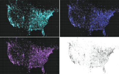
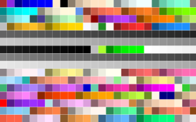
Using Color Scales and Palettes in R
Color can drastically change how a chart reads and what you see in your data, so don’t leave it up to chance with defaults.
-
Book: The Art of R Programming
R, the favorite computing language of a growing number of statisticians, is friendly…
-
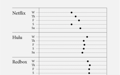
Brand sentiment showdown
There are many brands on Twitter that exist to uphold an image of…
-
Why learning code for data is worthwhile
There are lots of tools that have come out in the past couple…
-
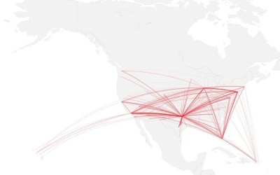
How to map connections with great circles
There are various ways to visualize connections, but one of the most intuitive and straightforward ways is to actually connect entities or objects with lines. And when it comes to geographic connections, great circles are a nice way to do this.
-
Infochimps R package for easy access to API
The data marketplace Infochimps recently expanded their API to include datasets such as…
-
RStudio: a new IDE for R that makes coding easier
I tweeted this out earlier, but people are really excited about RStudio, an…
-
Facebook worldwide friendships mapped
As we all know, people all over the world use Facebook to stay…
-
How to Make Bubble Charts
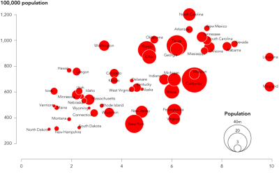
Ever since Hans Rosling presented a motion chart to tell his story of the wealth and health of nations, there has been an affinity for proportional bubbles on an x-y axis. This tutorial is for the static version of the motion chart: the bubble chart.
-
R is the need-to-know stat software
This Forbes post on the greatness that is R is being passed around…
-
How to visualize data with cartoonish faces ala Chernoff
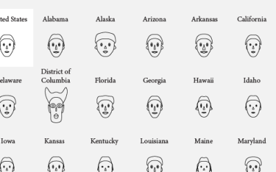
The goal of Chernoff faces is to show a bunch of variables at once via facial features like lips, eyes, and nose size. Most of the time there are better solutions, but the faces can be interesting to work with.



 Visualize This: The FlowingData Guide to Design, Visualization, and Statistics (2nd Edition)


