You can customize graphics in R with par(), but the docs are mostly text and just organized alphabetically. Here is a more visual reference, categorized by what you can change. Plus, a one-page printout.
R
-
Members Only
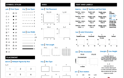
R Cheat Sheet and Guide for Graphical Parameters
-
R site updated
The R site has a new face. It looked dated for years —…
-
Members Only
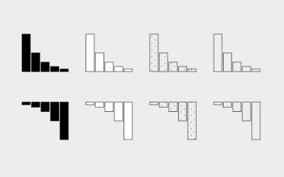
How to Make and Use Bar Charts in R
The chart type seems simple enough, but there sure are a lot of bad ones out there. Get yourself out of default mode.
-
rvest: R package to scrape web data
Inspired by the Python libraries RoboBrowser and BeautifulSoup, the rvest package by Hadley…
-
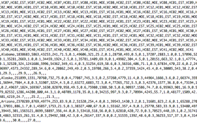
Loading Data and Basic Formatting in R
It might not be sexy, but you have to load your data and get it in the right format before you can visualize it. Here are the basics, which might be all you need.
-
Members Only
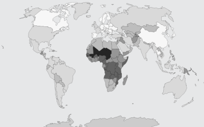
Choropleth Maps and Shapefiles in R
Fill those empty polygons with color, based on shapefile or external data.
-
Members Only
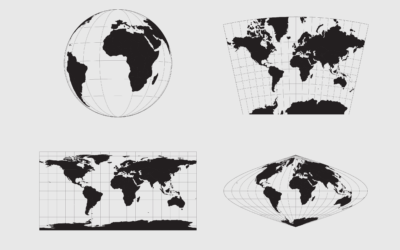
Working with Map Projections and Shapefiles in R
No need to settle for the mapping defaults in R. Apply map projections to show geographic data in a way most suitable for your work.
-

Rising R usage in the sciences
R continues its growth, and usage in the sciences is no exception. Nature…
-
Members Only
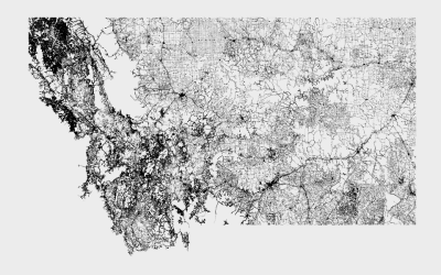
Mapping With Shapefiles in R – Getting Started
Geographic data is often available as a shapefile, and there’s plenty of heavy software to get that data in a map. R is an open source option, and as a bonus, much of the work can be done in a few lines of code.
-
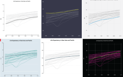
Moving Past Default R Charts
Customizing your charts doesn’t have to be a time-intensive process. With just a teeny bit more effort, you can get something that fits your needs.
-
Members Only
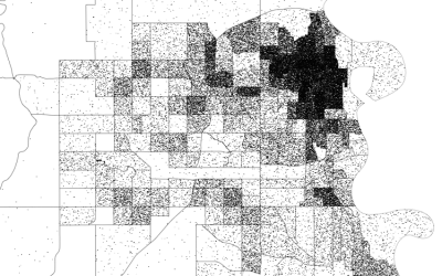
How to Make Dot Density Maps in R
Choropleth maps are useful to show values for areas on a map, but they can be limited. In contrast, dot density maps are sometimes better for showing distributions within regions.
-
Large-ish data packages in R
If you’ve played around with R enough, there comes a time when you…
-

R meme generator
Nobody asked for it, so you got it. The meme package for R…
-
Members Only
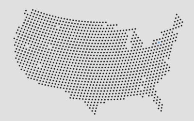
How to Make Gridded, Equal-Distance Dot Maps
For when your geographic data is evenly spread rather than aggregated by government boundaries.
-
Optimizing your R code
Hadley Wickham offers a detailed, practical guide to finding and removing the major…
-
Create a barebones R package from scratch
While we’re on an R kick, Hilary Parker described how to create an…
-
R for cats and cat lovers
Following the lead of JavaScript for Cats by Maxwell Ogden, Scott Chamberlain and…
-
Members Only
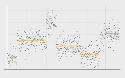
Detecting and Plotting Sequence Changes
Change detection for a time series can be tricky, but guess what, there’s an R package for that. Then show the results in a custom plot.
-
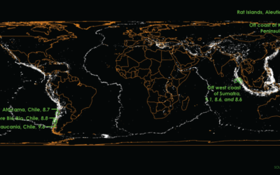
Mapping a century of earthquakes →
Earthquakes are in the news a lot lately. A quick search shows a…
-
Members Only
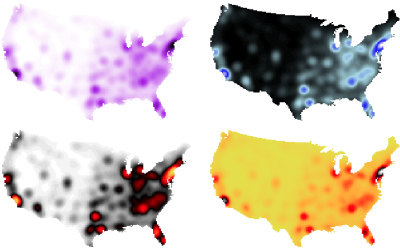
How to Make Smoothed Density Maps in R
Too many points to plot often means obscured patterns in the clutter. Density maps offer a smooth alternative.
Recently for Members
Second Edition
 Visualize This: The FlowingData Guide to Design, Visualization, and Statistics (2nd Edition)
 Visualize This: The FlowingData Guide to Design, Visualization, and Statistics (2nd Edition)
New tools, refined process.
Browse by Chart Type See All →


