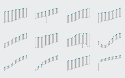
Moving Past Default R Charts
Customizing your charts doesn’t have to be a time-intensive process. With just a teeny bit more effort, you can get something that fits your needs.
For static data graphics my workflow typically involves R and Illustrator at varying degrees. I covered the process in Visualize This and provided an introduction on how to do the same with Inkscape, Illustrator’s open source counterpart. However, you don’t always have to use illustration software to produce more readable graphics.
You can stay in R, tweak a few variables, and it might be all you need. If not, you can at least get closer to what you want, which makes for less post-editing. In this tutorial you learn what parameters to change to mimic a handful of popular chart styles.
R is flexible, so you can draw whatever you want, but the point of this exercise is that a couple more lines of code can change your visuals quickly and easily.To make things interesting, I limited myself to base R graphics and did not start charts from scratch. The parameters had to be clearly specified in the documentation. No R packages allowed. No warnings allowed.
Setup
If you haven’t already, download R and install. Click on CRAN on the left of the R homepage, select a location near you, and download the installation that is meant for your computer. It’s a relatively easy installation after that. You won’t need any packages for this tutorial, but if you’re keen on exploring, you can look at available packages via the Package Installer in R’s main menu.
I recommend you follow along with the downloaded code instead of typing in the snippets in this post. It’s just less likely you get stuck on a typo mistake.Also download the code and data for this tutorial. Change the working directory in R via the main menu to wherever you save your files.
Load data
You will be charting life expectancy data. It’s time series data from 1960 to 2009 for over 200 countries.
#
# Load the data
#

startYear <- 1960; endYear <- 2009
life <- read.csv("data/life-expectancy-cleaned.csv", stringsAsFactors=FALSE)
countryRegions <- read.csv("data/country-regions.csv", stringsAsFactors=FALSE)
lifeComp <- na.omit(life)
lifeReg <- merge(lifeComp, countryRegions, by.x="Country.Code", by.y="CountryCode")
For the sake of simplicity, let’s just take a subset of the data: the countries in East Asia and Pacific.
# Subset East Asia and Pacific, for sake of simplicity eap <- subset(lifeReg, RegionName == "East Asia & Pacific (all income levels)") minVal <- min(eap[,-c(1,2,53,54)]) maxVal <- max(eap[,-c(1,2,53,54)]) eapYears <- eap[,-c(1,2,53,54)]
Helper function
I wrote a small helper function to draw a line for each country. It takes the data, and you specify the colors and widths.
#
# Helper function to draw a line for each country
#
lifeLines <- function(series, col="black", hcol="black", lwd=1, hlwd=2, showPoints=FALSE) {
	for (i in 1:length(series[,1])) {
		lines(startYear:endYear, series[i,], col=col, lwd=lwd)
	}
	randomIndex <- sample(1:length(series[,1]), 1)
	lines(startYear:endYear, series[randomIndex,], col=hcol, lwd=hlwd)

	if (showPoints) {
		points(startYear:endYear, series[randomIndex,], col=hcol, pch=4)
	}
}
Defaults
Okay, time for some actual plotting. Start with R’s plot() function to set axis limits, and then use the helper function lifeLines() to draw a line for each country in the data frame eapYears.
#
# Default plot
#
plot(0, 0, xlim=c(startYear, endYear), ylim=c(minVal, maxVal), type="n")
lifeLines(eapYears)
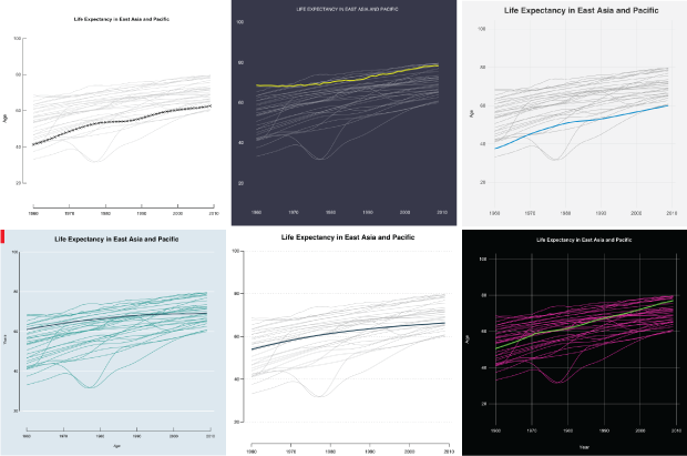
If you use R already, you should recognize the aesthetic of the chart below. All the lines are of the same width, the vertical axis labels are turned sideways, and a bounding box encapsulates the plotting region.
Default R plot.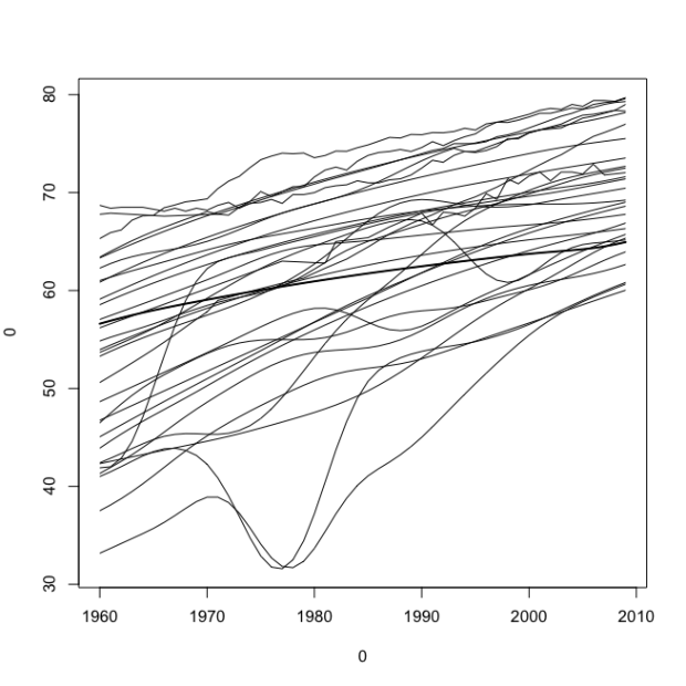
The plot() function has some arguments you can fill, such as axis limits, axis labels, and the main title. Fill those in, as shown below.
#
# Deafult Plot Options
#

plot(0, xlim=c(startYear, endYear), ylim=c(minVal, maxVal), type="n", main="Life Expectancy in East Asia and Pacific", sub="Subtitle", xlab="Years", ylab="Age", asp=1/2)
lifeLines(eapYears)
This gives you the same data, but shown in a slightly modified context.
Still default but with a few more filled in values in the plot() function.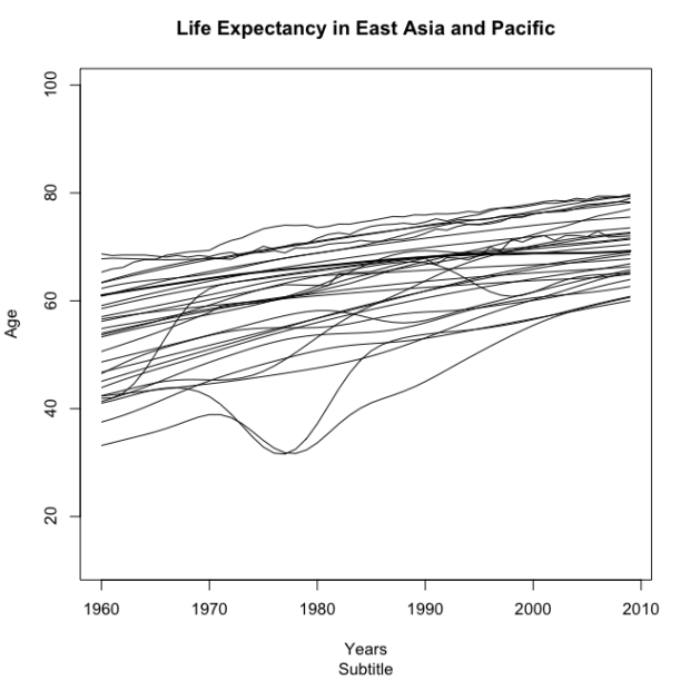
The sub argument allows you to specify a subtitle for the chart, but for some reason it’s on the bottom. I’m not sure who thought of that bright idea, but it sort of makes the subtitle worthless. I never use it.
Anyways, when you look at the two charts above, you think R. They look very R-ish, which I think is why so many people associate R with a certain type of chart. Let’s try to change that perception right now.
Work with parameters
Some parameters that are not listed in the documentation can also be changed via par(), but let’s use function strictly as intended.The par() function in R lets you change a lot of parameters for your current plotting device. It doesn’t let you change everything, but there are a good number of options to play with. Some of the parameters you specify in par() you can also specify directly in plot(). My rule for this tutorial is that you can change stuff listed in the plot() and the par() documentation, but no switching or adding.
I won’t describe what very parameter does, so if you’re curious about one, enter ?par in the R console to read a description.Start with las and bty, which change the orientation of axis labels and border type for the plotting region, respectively. Change the former to 1 so that labels are always horizontal and the latter to “n” to remove the border completely.
#
# Simplified
#

par(las=1, bty="n")
plot(0, xlim=c(startYear, endYear), ylim=c(minVal, maxVal), type="n", main="Life Expectancy in East Asia and Pacific", xlab="", ylab="Age", asp=1/2)
lifeLines(eapYears, col="#cccccc")
So there’s three lines of code above. The first sets some parameters (las and bty), the second creates a plotting region, and the third uses our helper function lifeLines() to draw a light gray line for each country in the data.
This gives you a plot of the same data as before, with a simplified look.
Simplified plot with no outer border and tick labels turned around.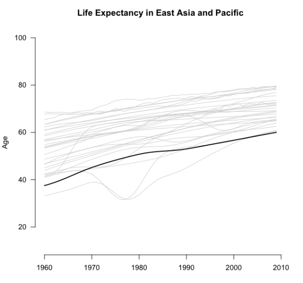
What else can you change? Well, you can change font size, the margins (and outer margins) of a plot (or collection of plots), clipping region, the margin line for axes and their labels, and the end type of your lines (rounded or straight).
With this in my mind, the code below makes a plot that looks newspaper-y. The axis label for age is smaller and bold, the tick labels are smaller, and the color of the highlighted line is a dark, neutral blue-green shade.
#
# Newspaper
#

par(mar=c(4, 4, 3, 1), oma=c(0,0,0,0), xpd=FALSE, xaxs="r", yaxs="i", mgp=c(2.1,.6,0), las=1, lend=1)
plot(0, xlim=c(startYear, endYear), ylim=c(minVal, maxVal), type="n", bty="n", las=1, cex.axis=0.8, cex.lab=0.8, main="Life Expectancy in East Asia and Pacific", xlab="", ylab=expression(bold("Age")), family="Helvetica", asp=1/2)
grid(NA, NULL, col="black", lty="dotted", lwd=0.3)
lifeLines(eapYears, col="dark grey", lwd=0.7, hlwd=3, hcol="#244A5D")
In this snippet, grid() is called before lifeLines() to draw horizontal lines that match up with the y-axis. The lines are thin with a width of 0.3 and dotted.
Kind of looks like a chart in a newspaper, right? I mean, most graphics in newspaper forgo the dark axis lines and just go with thin tick marks, but par() doesn’t let you control that directly, so we won’t do anything with that.
A newspaper-ish plot with grid lines.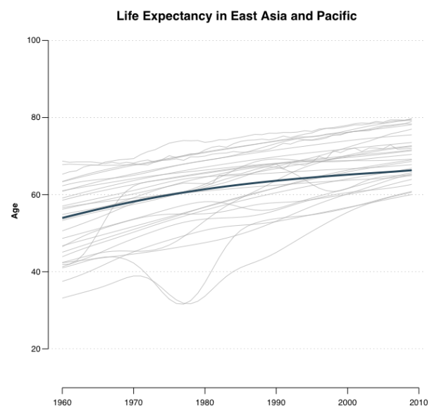
You can also change background color and the font size and weight of your main title. So with that, and the parameters we know we can change from the snippet above, try a Feltron-style plot. Nicholas Felton, known for his annual personal reports, likes to use small fonts and contrasting background and foreground colors. Below uses the colors from his 2013 report.
#
# Feltron
#

par(bg="#36394A", mar=c(5, 4, 3, 2), oma=c(0,0,0,0), xpd=FALSE, xaxs="r", yaxs="i", mgp=c(2.8,0.3,0.5), col.lab="white", col.axis="white", col.main="white", font.main=1, cex.main=0.8, cex.axis=0.8, cex.lab=0.8, family="Helvetica", lend=1, tck=0)
plot(0, xlim=c(startYear, endYear), ylim=c(minVal, maxVal), type="n", bty="n", las=1, asp=1/2, main="LIFE EXPECTANCY IN EAST ASIA AND PACIFIC", xlab="", ylab="")
lifeLines(eapYears, col="white", lwd=0.35, hcol="#E3DF0C", hlwd=3)
Hey, this doesn’t look like an R-ish chart.
A Feltron-style plot with a dark background, thin lines, and smaller fonts.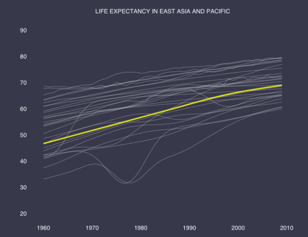
“But wait, where did the axis lines and ticks go? I thought you said par() doesn’t let you mess with that stuff.” Okay, you’re right. I cheated and used axis() to put up the tick labels separately. The snippet below is what actually produced the chart above.
# Axis change
par(bg="#36394A", mar=c(5, 4, 3, 2), oma=c(0,0,0,0), xpd=FALSE, xaxs="r", yaxs="i", mgp=c(2.8,0.3,0.5), col.lab="white", col.axis="white", col.main="white", font.main=1, cex.main=0.8, cex.axis=0.8, cex.lab=0.8, family="Helvetica", lend=1, tck=0, las=1)
plot(0, xlim=c(startYear, endYear), ylim=c(minVal, maxVal), type="n", bty="n", las=1, asp=1/2, main="LIFE EXPECTANCY IN EAST ASIA AND PACIFIC", xlab="", ylab="", xaxt="n", yaxt="n")
axis(1, tick=FALSE, col.axis="white")
axis(2, tick=FALSE, col.axis="white")
lifeLines(eapYears, col="white", lwd=0.35, hcol="#E3DF0C", hlwd=3)
While you’re in axis-drawing mode, how about a FiveThirtyEight-style chart? They typically use a light gray background with a grid that goes horizontal and vertical, and often forego any axis lines. The main title is bold, the axis labels are not, and the tick labels are dark gray, set at a medium font. They also like to use bold-ish but not super bright colors to highlight points, hence the bright blue life line.
#
# FiveThirtyEight
#

par(mar=c(3, 4, 3, 2), oma=c(0,0,0,0), bg="#F0F0F0", xpd=FALSE, xaxs="r", yaxs="i", mgp=c(2.1,.3,0), las=1, col.axis="#434343", col.main="#343434", tck=0, lend=1)
plot(0, xlim=c(startYear, endYear), ylim=c(minVal, maxVal), type="n", bty="n", las=1, main="Life Expectancy in East Asia and Pacific", xlab="", ylab="Age", family="Helvetica", cex.main=1.5, cex.axis=0.8, cex.lab=0.8, asp=1/2, xaxt="n", yaxt="n")
grid(NULL, NULL, col="#DEDEDE", lty="solid", lwd=0.9)
axis(1, tick=FALSE, cex.axis=0.9)
axis(2, tick=FALSE, cex.axis=0.9)
lifeLines(eapYears, col="dark grey", lwd=1, hlwd=3, hcol="#008ED4")
Looks pretty FiveThirtyEight-ish to me.
FiveThirtyEight-style plots with light gray background, thin grid lines, and no axis lines.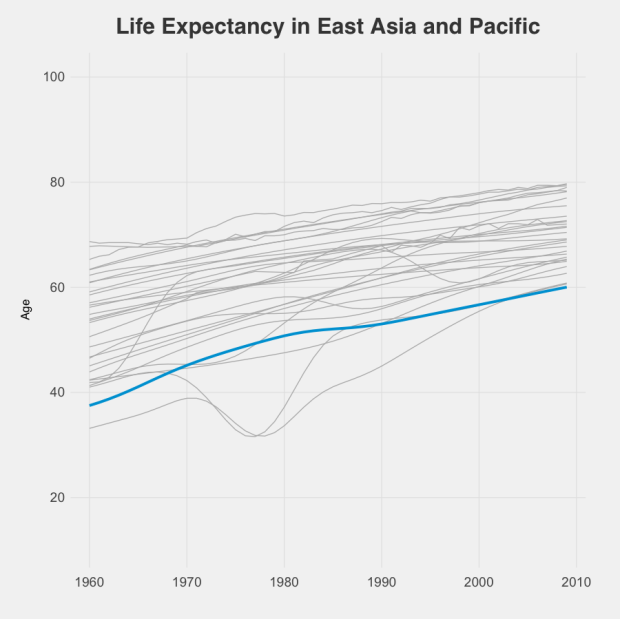
One thing you haven’t changed yet: the position of the axis labels. In a lot of publications, axis labels are left justified, but R center aligns them. There’s a way to change that with par() in R (see adj), but it doesn’t work very well. You can also change text position relatively easily if you start from scratch, but again, I want to limit that. I already went too far by using axis(). For shame.
Back to the rules.
Try on Economist-style for size. There is always the red rectangle in the top left corner, the light blue background, italicized axis labels, small tick labels, and ticks that point in towards the plot rather than out towards the labels, and white grid lines.
Start with the red rectangle. Draw an empty plot with all margins set to zero, and then draw a rectangle with rect(). No border.
#
# The Economist
#

# Red corner rectangle
par(xpd=NA, oma=c(0,0,0,0), mar=c(0,0,0,0), bg="#DCE6EC", xpd=FALSE, xaxs="i", yaxs="i", lend=1)
plot(0, 0, type = "n", bty = "n", xaxt="n", yaxt="n", xlim=c(0,100), ylim=c(0,100))
rect(0,100,2,94, col="red", border=NA)
I have a feeling there’s a better way to do this, as this feels kind of hack-ish, but it works and you get no warnings, so there.Then add another plot on top of that by setting new to TRUE in another call to par(), and then create another plot. Again, use grid() to draw the white horizontal lines across. The arguments cex.axis and cex.lab specify font size for axis labels and tick labels, respectively. By setting tck to 0.2, you create tick marks that point into the plotting region. A negative value makes them go outward.
# Actual chart
par(mar=c(4, 3, 3, 2), oma=c(0,0,0,0), xpd=FALSE, xaxs="r", yaxs="i", mgp=c(1.8,.2,0), cex.axis=0.7, cex.lab=0.7, col.lab="black", col.axis="black", col.main="black", tck=0.02, yaxp=c(minVal, maxVal, 2), new=TRUE)
plot(0, xlim=c(startYear, endYear), ylim=c(minVal, maxVal), type="n", bty="n", las=1, main="Life Expectancy in East Asia and Pacific", xlab=expression(italic("Years")), ylab=expression(italic("Age")), family="Helvetica", asp=1/2)
grid(NA, NULL, col="white", lty="solid", lwd=1.5)
lifeLines(eapYears, lwd=1.25, hlwd=2.5, col="#33A5A2", hcol="#244A5D")
This gives you your Economist-style plot.
Looks like the Economist, especially with the red rectangle in the top left corner.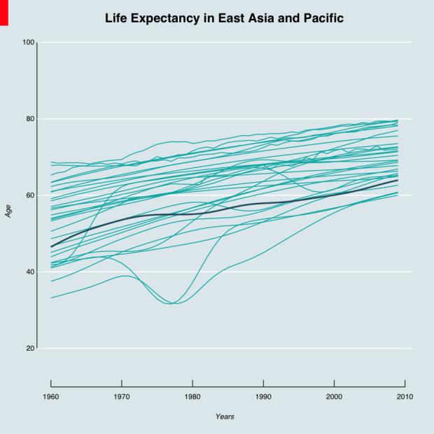
Getting the hang of it? We’re plotting the data in the same way structurally, but changing the aesthetic with just one more line of code.
Just for kicks, let’s try a Tukey-like plot from his book Exploratory Data Analysis. At the time, people drew most of their charts by hand. Tukey used symbols, wrote small labels, and drew his tick marks inward.
#
# Tukey
#

par(las=1, tck=0.02, mgp=c(2.8,0.3,0.5), cex.lab=0.85, cex.axis=0.8, cex.main=0.9)
plot(0, xlim=c(startYear, endYear), ylim=c(minVal, maxVal), type="n", bty="n", main="Life Expectancy in East Asia and Pacific", xlab="", ylab="Age", asp=1/2)
lifeLines(eapYears, col="#cccccc", hlwd=1.2, showPoints=TRUE)
Looks similar to the simplified chart you made early in this tutorial.
Trying to mimic Tukey with smaller labels, symbols, and inward-facing tick marks.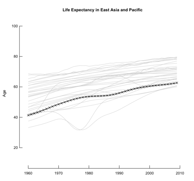
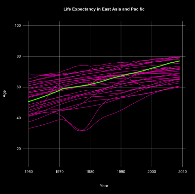
Finally, just because we can, how about a dark background with neon bright lines. Looks kind of old school console.
#
# Bright on Dark
#

par(bg="black", las=1, tck=0, mgp=c(2.8,0.3,0), cex.lab=0.85, cex.axis=0.8, cex.main=0.9, col.axis="white", col.main="white", col.lab="white")
plot(0, xlim=c(startYear, endYear), ylim=c(minVal, maxVal), type="n", main="Life Expectancy in East Asia and Pacific", xlab="Year", ylab="Age", asp=1/2)
grid(NULL, NULL, lty="solid", col="white", lwd=0.5)
lifeLines(eapYears, col="#f30baa", lwd=1.2, hcol="green", hlwd=3)
Ooo, colors.
Wrapping up
Here’s what we learned:
- Sticking to default settings on our charts is easy, but so is customizing them.
- The
par()function in R is your friend. Unless you use it a lot you probably won’t remember all the parameter names (I still don’t), but you can always consult the documentation with?par. - R charts don’t have to look like “R charts.”
Some people even paint in Excel.Customization doesn’t just apply to R. Maybe you use Excel or some other tool that has a reputation for ugly. More often than not, it’s not that hard to change the look and readability. So you’re not stuck with default.
However, remember that this is just a start. Because R lets you draw lines, shapes, and text how you want, you can customize a lot more. The point isn’t that you can mimic other styles. It’s that there’s enough flexibility to create your own.
Personally, I stick with my R and Illustrator workflow, but the closer I can get to a finished graphic on the first go, the less time I have to spend hand-editing.
Made possible by FlowingData members.
Become a member to support an independent site and learn to make great charts.
About the Author
Nathan Yau is a statistician who works primarily with visualization. He earned his PhD in statistics from UCLA, is the author of two best-selling books — Data Points and Visualize This — and runs FlowingData. Introvert. Likes food. Likes beer.
8 Comments
Add Comment
You must be logged in and a member to post a comment.
Hi there,
In the helper function lifeLines, can you explain why you’re picking a random record and plotting it?
randomIndex <- sample(1:length(series[,1]), 1)
lines(startYear:endYear, series[randomIndex,], col=hcol, lwd=hlwd)
thanks!
Lien
Nevermind, I figured it out…
Hi Nathan, there are some mistakes in the codes. Couldn’t follow the tutorial. Thanks!
Can you be more specific? What errors are you running into?
Hi, I couldn’t download the code and datafile – the ‘Download Source’ code on this page doesn’t seem to do anything… I can copy the R code but I need the data file. I think. Thanks!
Hi Mary! Does this work:
https://projects.flowingdata.com/tut/201410-style-tutorial.zip
It’s the same link from the “Download Source” but seems to be working on my end. Let me know if it still doesn’t work for you and let me know which browser you’re using.
Hi Nathan. I cant download the download source – dont have access to data life-expectancy. can you help?
Hi rupali, this link should work, but let me know if it still doesn’t:
https://projects.flowingdata.com/tut/201410-style-tutorial.zip