Natalie Wolchover for Quanta Magazine asked several physicists what a particle is. She came away with several points of view. For example, the particle as a “irreducible representation of a group”:
It’s the standard deep answer of people in the know: Particles are “representations” of “symmetry groups,” which are sets of transformations that can be done to objects.
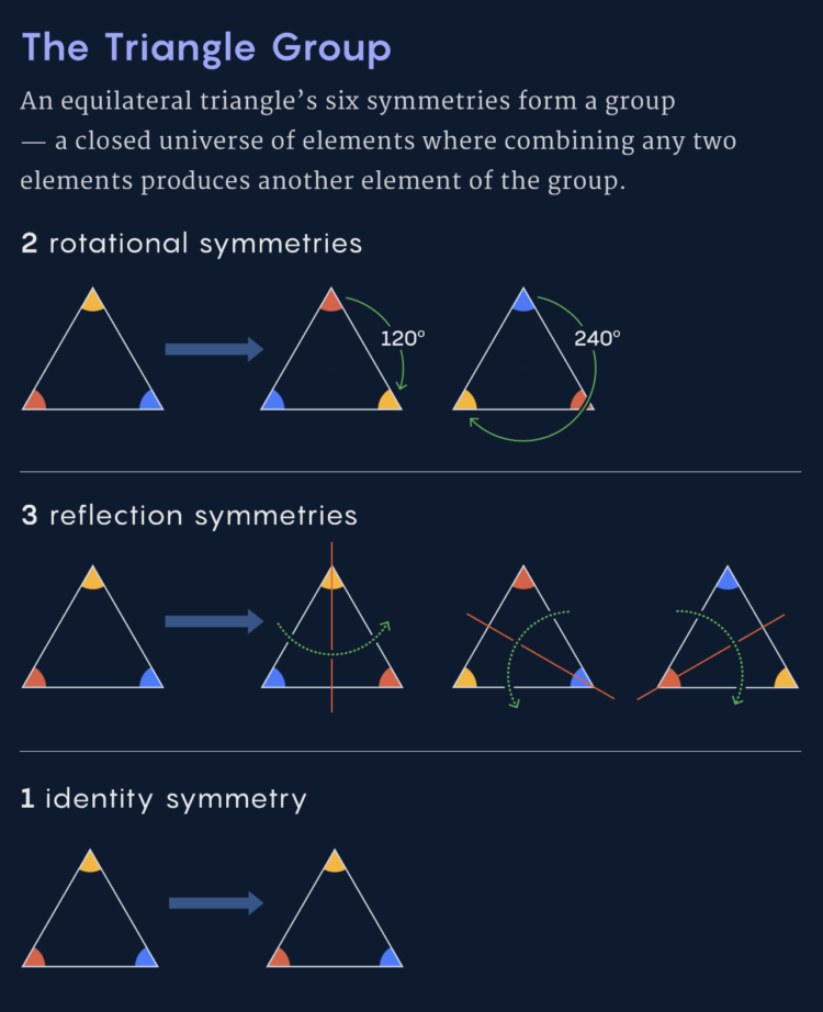
Take, for example, an equilateral triangle. Rotating it by 120 or 240 degrees, or reflecting it across the line from each corner to the midpoint of the opposite side, or doing nothing, all leave the triangle looking the same as before. These six symmetries form a group. The group can be expressed as a set of mathematical matrices — arrays of numbers that, when multiplied by coordinates of an equilateral triangle, return the same coordinates. Such a set of matrices is a “representation” of the symmetry group.
Oh boy. A lot of this was over my head, as I nearly failed physics in college, but the various explanations with basic diagrams taught me a few new things.


 Visualize This: The FlowingData Guide to Design, Visualization, and Statistics (2nd Edition)


