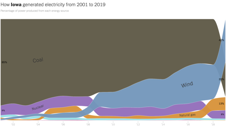
The way we make electricity in America is changing. For The New York Times, Nadja Popovich and Brad Plumer used ribbon charts, which I think are a NYT staple now, to show the shift between 2001 to 2019.
The width of each ribbon represents percentage of power produced by a source, and the vertical order shows highest percentage to lowest over time. Each state gets a chart and an explanation.
Wind power in Iowa, shown above, is up at 42 percent. Impressive.

 Visualize This: The FlowingData Guide to Design, Visualization, and Statistics (2nd Edition)