These sonographs of bird song, in contrast to the sounds from traditional instruments, show complex patterns on a base frequency.
-
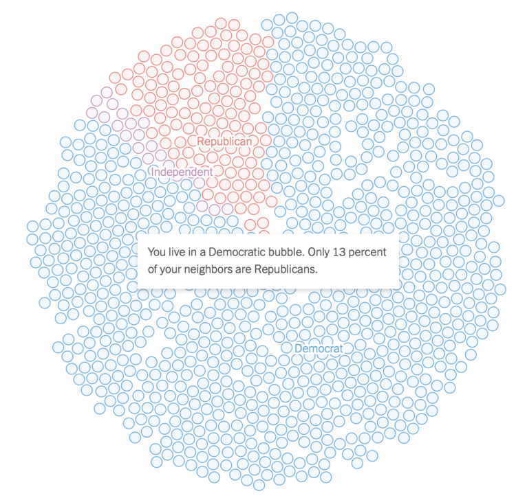
Gus Wezerek, Ryan D. Enos, and Jacob Brown for NYT Opinion use neighborhood-level data to show how those around you voted in the 2020 election. They ask: do you live in a political bubble? Enter an address to see.
This is riffing off of NYT’s similarly-themed map from 2018, which asked the same question but answered more geographically. This newer version, as is the current way of doing things these days, is more bubbly and mobile-focused with the scroll format.
-
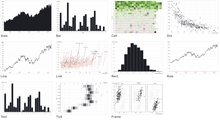
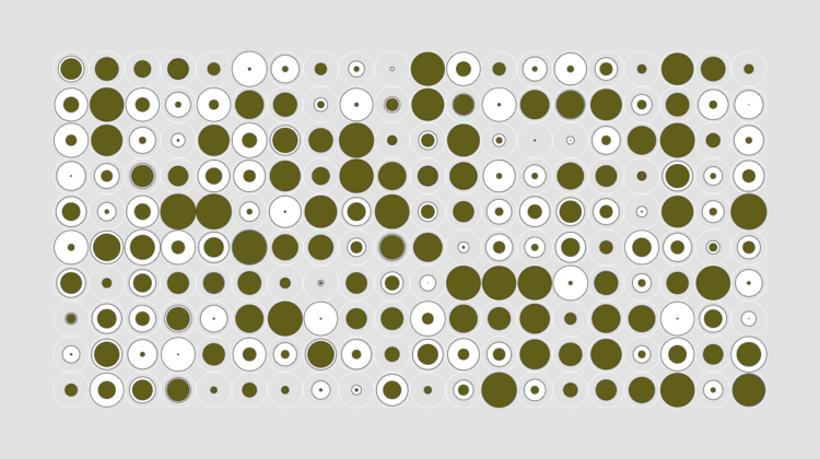
If you’re into the notebook workflow, Observable Plot is a JavaScript library built for you:
We created Plot to better support exploratory data analysis in reactive, JavaScript notebooks like Observable. We continue to support D3 for bespoke explanatory visualization and recommend Vega-Lite for imperative, polyglot environments such as Jupyter. Plot lets you see your ideas quickly, supports interaction with minimal fuss, is flexible with respect to data, and can be readily extended by the community. We believe people will be more successful finding and sharing insight if there’s less wrestling with the intricacies of programming and more “using vision to think.”
In case you’re curious how Plot compares to D3, which was used to build Plot, you can find that information here.
-
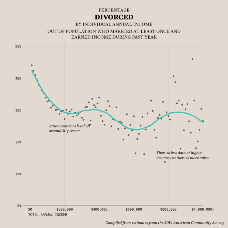
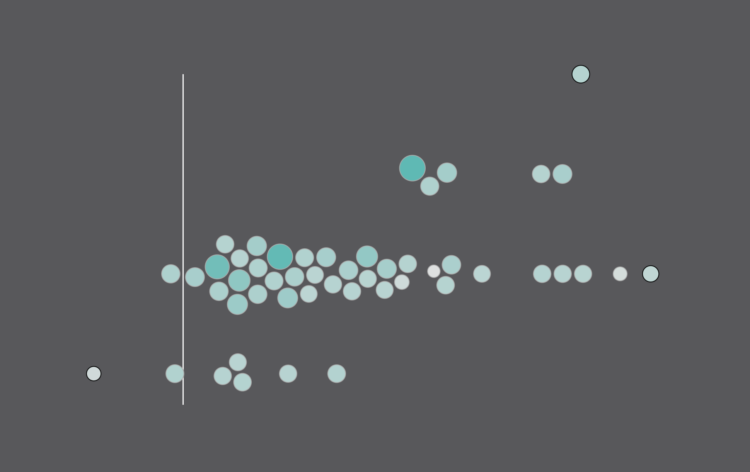
Divorce rates are tied to job security, age, and occupation, so it should make sense that we see a pattern when we plot divorce rates against income.
-
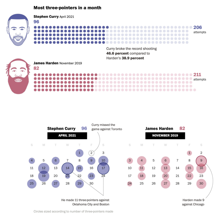
Steph Curry has been on a tear as of late. In April he made more threes than any NBA player ever has in a month. Ben Golliver and Artur Galocha for The Washington Post provide perspective on just how record-setting Curry’s current play is.
I’d be lying if I said it wasn’t satisfying to see half of the comparisons show how Curry has played better than James Harden.
-
In his new data-driven documentary, Neil Halloran digs into the uncertainty attached to estimates for climate change. Halloran’s argument is that we have to understand the limitations of forecasting the future before we can change it.
-
Members Only
-
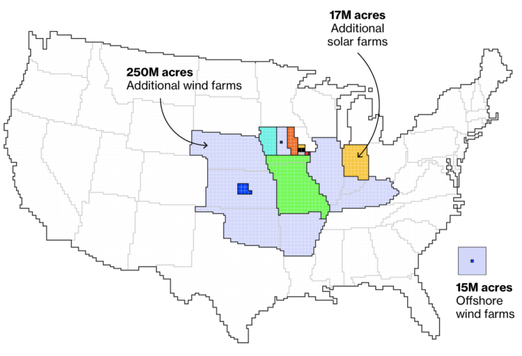
Princeton University’s Net-Zero America project analyzes and models the infrastructure required to get to net-zero carbon emissions nationally. Dave Merrill for Bloomberg highlighted the group’s estimates for land usage to build things like wind and solar farms, which, as you might imagine, will require millions of acres.
-
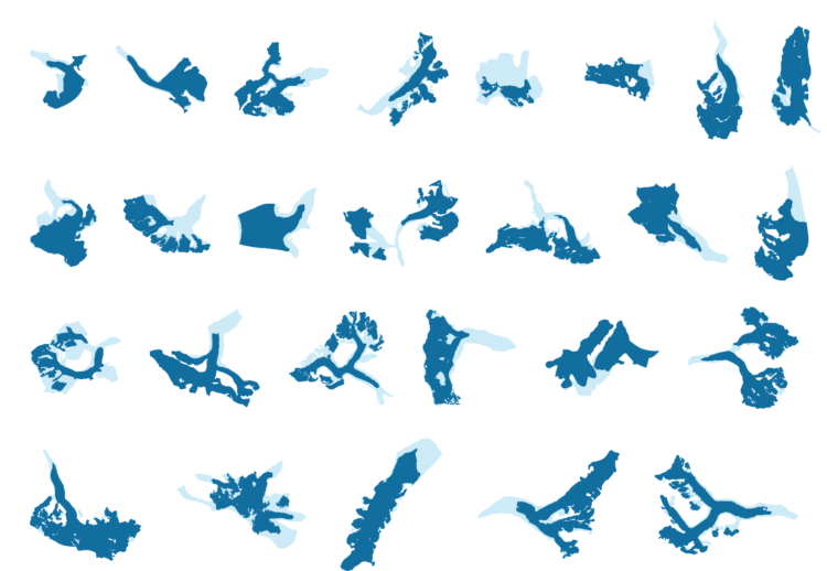
Niko Kommenda for The Guardian used small multiples to show 90 of the largest glaciers in the world and how they have melted over many decades. The animation transitions between two time periods for each glacier, showing what was there earlier and what is left.
-
The Census Bureau released state population counts for 2020. Here’s how each state gained and lost population and seats.
-
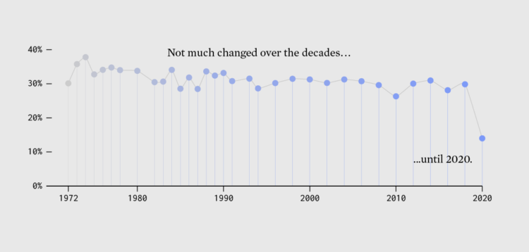
Since 1972, the General Social Survey has asked people about their happiness. It never changed much — until 2020 happened.
-
The Census Bureau announced their state population totals, so we can see who gained and lost seats:
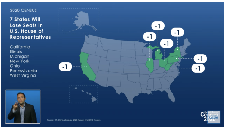
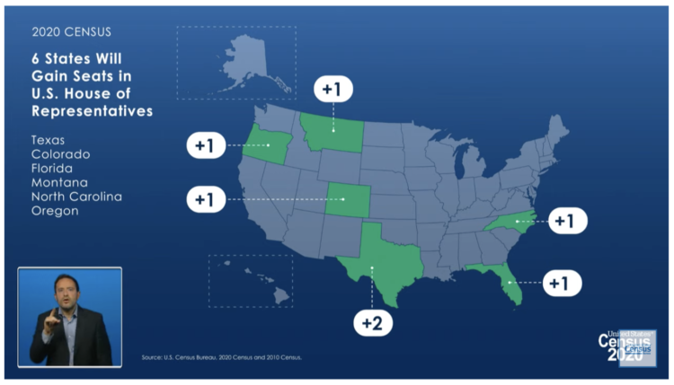
The tables aren’t accessible yet, but during the live conference, the bureau noted that the difference between New York losing a seat (which they did) and staying the same was only a difference of 89 people. It’ll be interesting to see these small deltas for all the states.
-
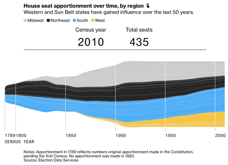
The 2020 Census count at the state level is set for release this afternoon, April 26 at 12pm PST. While we wait, Gregory Korte and Allison McCartney, reporting for Bloomberg, show which states are expected to lose and gain representation.
I appreciate the streamgraph that shows how the distribution of seats changed over the decades, along with the bar chart mouseover so you can see the shift for each state individually.
-
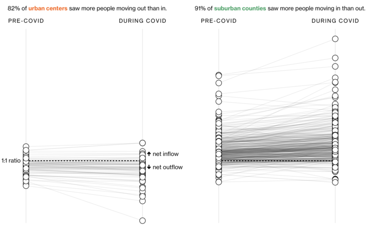
In another look at migration through the lens of USPS change of address data, Bloomberg CityLab shows where people moved during the pandemic, focusing on movement in and out of metro areas. With the exception of San Francisco and New York, most areas didn’t see much movement distance-wise:
Even in the biggest metro areas, most people didn’t go very far. In the country’s 50 most populous cities, 84% of the moves were to somewhere within the perimeter of the central metro area, down just slightly from pre-pandemic levels. Many of the most local moves were likely related to the economic downturn: A February Pew Research Center survey of those who moved during the pandemic found that the most common reason people cited was financial distress including job loss.
See also similar conclusions by The New York Times and Financial Times.
While there wasn’t the mass exodus that some imagined, the pandemic did seem to speed up some trends. So as we wait for the 2020 Census count, which comes out out this afternoon, it’ll be interesting to see if the rate of change continues in the coming years.
-
Oftentimes visuals generated through code can seem cold and mechanical when you’re after something more warm that breathes life. Introducing organized noise into the mix is one path. Varun Vachhar describes how you might use noise in the context creative coding.
-
Riffing on the Ever Given Ever Ywhere, which lets you place the Ever Given container ship anywhere on a map, Stamen built Scale-a-Tron, which lets you place anywhere on a map, well, anywhere on a map.
Just draw a polygon around an area and then pan to compare the scale of your selected area against anywhere in the world. It’s scale-rific.
-
Members Only
-
Nate Sloan and Charlie Harding, for NYT Opinion, look at how the structure of songs have changed to fit with the current methods that people consume media:
It’s inescapable that today’s aspiring artists and songwriters must operate, for survival, in a landscape of streaming services and social media. From Spotify to TikTok, the goal is to create music that will grab a listener’s attention from beginning to end. You’re not just competing against other creators. You’re also competing against everything else that takes up our time: podcasts, TV, apps and more. So to keep streaming consumers engaged, it is increasingly common for songs to begin in medias res — with a hook, followed by a hook and ending with another hook.
Put your headphones on and turn the volume up for maximum effect. The combination of the songs, visual breakdown, and words work well together to help you understand song structure.
Now I know why my brain is often confused when I hear a full song, instead of a looping chorus on TikTok.
-
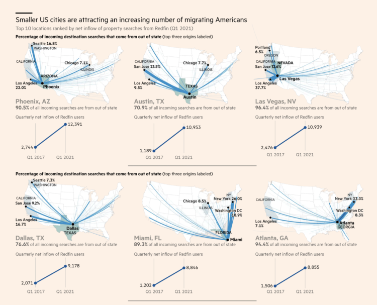
Steven Bernard for Financial Times, in a report by Claire Bushey and Steff Chavez, mapped net inflows (paywalled), based on property searches on home listing site Redfin. This shows a slightly different angle from NYT’s analysis, which showed less change year-over-year.
-
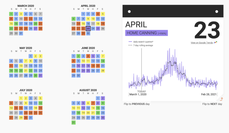
This past year has seen a rising interest in long-lost hobbies due to shelter-in-place, social distancing, and lockdown orders. Google Trends and Polygraph charted the hobbies that saw the biggest spikes each day of the year.
I’m surprised that sourdough or bread-making is on there, but maybe they didn’t fall under the hobby definition they used.





 Visualize This: The FlowingData Guide to Design, Visualization, and Statistics (2nd Edition)


