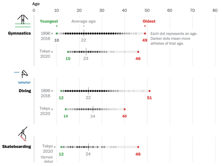
Bonnie Berkowitz and Artur Galocha go with the strip plot to show the distribution of age for different Olympic events. If it’s longevity you’re looking for, go for the equestrian, sailing, shooting, and archery events. There’s still time.
Bonnie Berkowitz and Artur Galocha go with the strip plot to show the distribution of age for different Olympic events. If it’s longevity you’re looking for, go for the equestrian, sailing, shooting, and archery events. There’s still time.
The Wall Street Journal tested out the TikTok algorithm with bots to see how quickly the app converged towards a user’s pre-specified interests. As viewing time of videos as the main signal, and to nobody’s surprise (I think), it only took a couple of hours for TikTok to narrow down interests.
This is how most social services work these days? The concerning part is that almost all TikTok videos are served based on the algorithm, which makes it easy to fall into terrible rabbit holes.

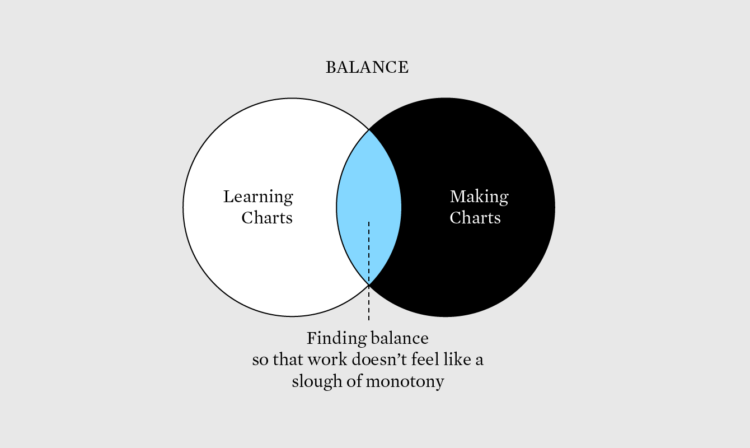
Set a strong base, and build whatever you want after that.
From The New York Times, the combination of video, motion graphics, and charts, packaged tightly in a scrollytelling format, clearly shows the differences.
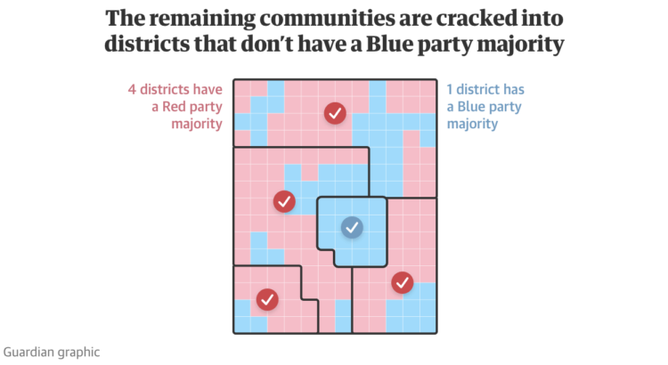
Gerrymandering continues to be an important thread that I think many people still don’t understand, mostly because it’s called gerrymandering. The Guardian provides a visual guide to explain how creative redistricting can lead to favorable votes.
If you’re still not sure, see also the game District by Christopher Walker which walks you through what gerrymandering is and how it works.
Our everyday routines changed over the past year, and with the 2020 American Time Use Survey, we can see by how much.
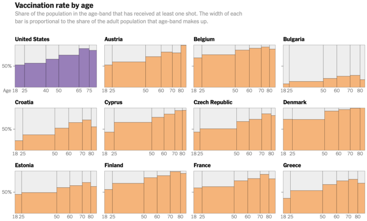
Elian Peltier and Josh Holder for The New York Times highlight the vaccination rates increasing in Europe while the United States rate stalls:
Europe has plenty of people who distrust the shots and their governments, but vaccine resistance in the United States is more widespread and vehement, particularly among conservatives, and falls more sharply along partisan lines. The E.U. vaccination effort has slowed recently, but not like the U.S. drive, which has declined more than 80 percent.
Also of interest: NYT managed to squeeze in a bar chart race, a Marimekko chart, and a beeswarm chart all in the same article. That’s gotta be a record for them.
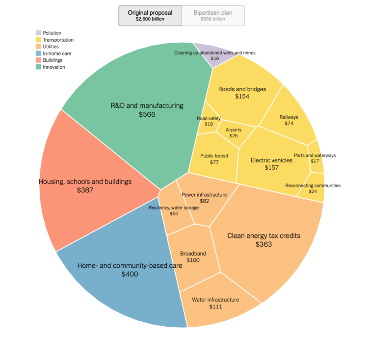
Aatish Bhatia and Quoctrung Bui for NYT’s The Upshot made the comparison using a circular Voronoi treemap. The fills flip between the original plan from March and the recently proposed plan, which is much smaller.
It takes me back to Amanda Cox’s consumer spending graphic from 2008, which no longer works, because Flash.
Here’s the good stuff for July.
Researchers asked 10,000 participants to list ten things that recently made them happy. I counted and connected the dots.
Joshua Barbeau fed an AI chatbot with old texts from his fiancee who had died years before, so that he could talk to her again. Jason Fagone for the San Francisco Chronicle wrote about Barbeau’s experience:
As Joshua continued to experiment, he realized there was no rule preventing him from simulating real people. What would happen, he wondered, if he tried to create a chatbot version of his dead fiancee?
There was nothing strange, he thought, about wanting to reconnect with the dead: People do it all the time, in prayers and in dreams. In the last year and a half, more than 600,000 people in the U.S. and Canada have died of COVID-19, often suddenly, without closure for their loved ones, leaving a raw landscape of grief. How many survivors would gladly experiment with a technology that lets them pretend, for a moment, that their dead loved one is alive again — and able to text?
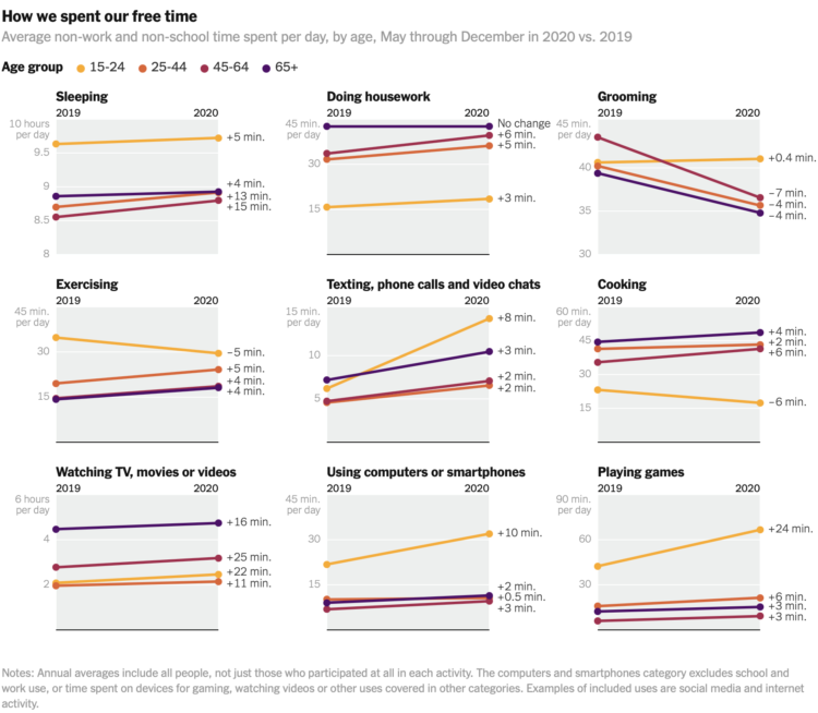
Ben Casselman and Ella Koeze for The New York Times compared time use in 2020 against time use in 2019, among different demographic groups.
As we know, the pandemic affected everyone differently. The slope charts show overall averages, so it would be an interesting next step to look at more granular variations. I suspect you’d see more pronounced shifts.
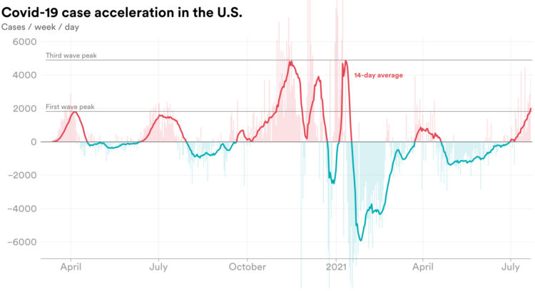
We’re all familiar with the Covid-19 line charts that show cases over time, which highlights absolute counts. There are peaks. There are some valleys. Emory Parker for STAT shifted the focus to how quickly the rate is changing, or acceleration, to emphasize which direction rates are headed.
The Bloomberg medal tracker is fun to look at. I think the graphics desk was instructed to use as many new-ish chart types as they could without alienating readers: the streamgraph, force-directed clusters, an international map grid, line-based isotype, and plenty of bubbles. I’m into it.
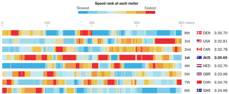
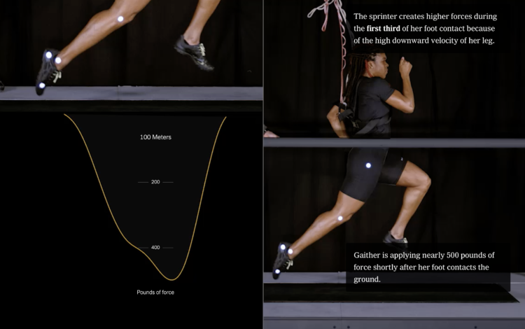
The New York Times charted speed ranks during the women’s 4×100 freestyle relay. My favorite part is how they got the data, which wasn’t available, so they estimated through photos and timestamps:
The Times annotated a sequence of several hundred photographs to determine the speed of each athlete throughout the race. Speeds were calculated by combining the positions of the athletes with timestamp information from the images.
If the data you’re looking for isn’t readily available, it might just be a few steps away.

The 2020 Summer Olympics are here, so ’tis the season for experimental visual explainers. The Washington Post uses a combination of illustration, video, and augmented reality to show off three new Olympic sports: skateboarding, surfing, and sport climbing.
The skateboarding piece with Heimana Reynolds uses a left-right hover to move back and forth through a time-lapse. It lets you see each part of the trick, which can be a challenge to see in real-time. The climbing piece with Brooke Raboutou employs AR so that you can place a 3-D model of the 50-foot wall and Raboutou in your living room for scale. Neat.
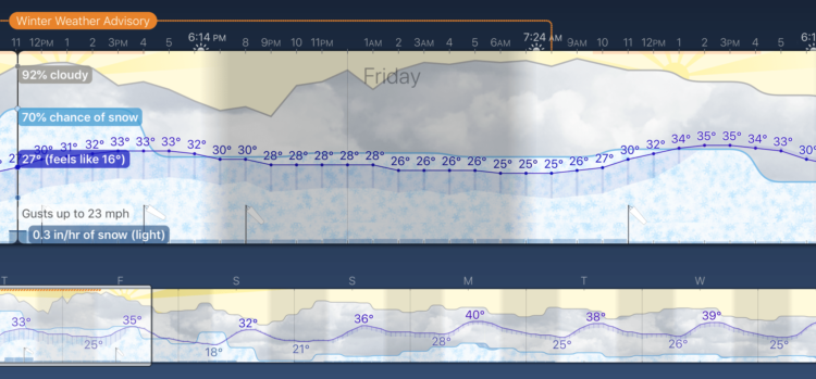
Weather Strip is a new weather app by visualization researcher Robin Stewart. It shows the week’s forecast as a time series chart, aiming to show you details at a glance. The temperature shows as a line chart, and a stacked area chart that represents weather conditions serves as background.
You’d think it’d hit all the right notes for me, but I’m more of a bare minimum type when it comes to weather forecasts. Just a table of highs, lows, and chance of rain is all I need. People seem to be into this view though, so maybe you’ll enjoy this more than me.
Learn about new visualization things, but also get actual work done.

With the Olympics starting on Friday, The New York Times started their coverage of events and athletes to watch. Their visual explainers are always very good in that the topic is entertaining and the results feel like a creative break, which a lot of us could probably use right about now. Check out what NYT has so far for climbing, gymnastics, hurdles, and swimming.
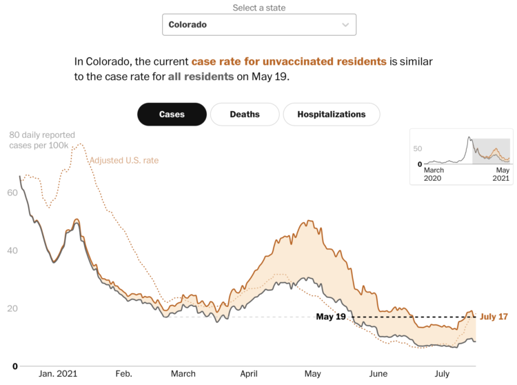
Covid-19 cases in the United States were down, but they’re moving up again, mostly among the unvaccinated. Dan Keating and Leslie Shapiro for The Washington Post break down the comparisons by state.
A difference chart for each state shows the overall rate compared against an adjusted rate for the unvaccinated population. As you might expect, the rate for the latter is always higher.
There are three more points of reference. A dotted line shows the adjusted national rate, a black dashed line shows how the current rate is a step back to a previous time, and a smaller, zoomed out version of the chart in the top right provides context back to March 2020. You can see it for cases, deaths, and hospitalizations.
Getting vaccinated strongly appears to be the way to go any way you cut it.
 Visualize This: The FlowingData Guide to Design, Visualization, and Statistics (2nd Edition)
New tools, refined process.


