Visualization and perception researcher Lace Padilla was on the kid-centric show Mission Unstoppale to talk about visualizing uncertainty:
[arve url=”https://youtu.be/iJrX-_pIQSc” loop=”no” muted=”no” /]
I approve of this message.
Visualization and perception researcher Lace Padilla was on the kid-centric show Mission Unstoppale to talk about visualizing uncertainty:
[arve url=”https://youtu.be/iJrX-_pIQSc” loop=”no” muted=”no” /]
I approve of this message.
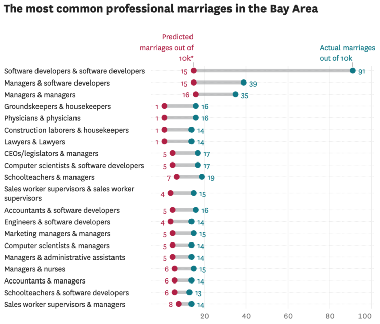
Susie Neilson for the San Francisco Chronicle compared the marriage of professions in San Francisco against the national average. As you might expect, there were a lot of programmers:
Perhaps unsurprisingly, the most common union between two professionals here is between a computer programmer and … another computer programmer. Our estimates show that an estimated 1% of all marriages in the region are between two software developers — specifically developers of applications and systems software. For the U.S. overall, software developer unions make up less than one-tenth of a percent of all marriages.
Back in 2017, I made similar comparisons nationally. I like this local angle. Also, maybe I should look at the most recent numbers.
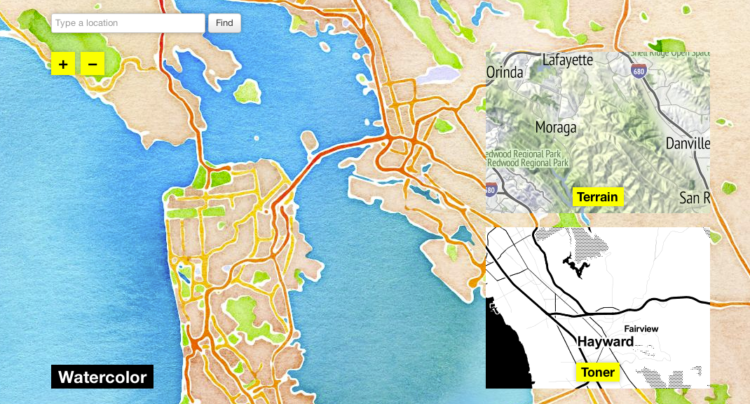
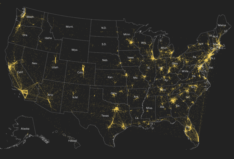
In 2012, Stamen Design released watercolor map tiles based on OpenStreetMap data. It was amazing to see, especially for a time when most online maps looked about the same. Now these watercolor map tiles are part of Cooper Hewitt, the Smithsonian design museum:
“Interactive digital works by their very nature subvert traditional museum collecting practices,” said Andrea Lipps, associate curator of contemporary design at Cooper Hewitt. “Watercolor Maptiles is itself a dynamic, living web-based map that is placeless; it exists on a browser and its assets are distributed across servers. By creating a duplicate version of the Watercolor Maptiles site and hosting it on Smithsonian Institution servers and domain, Cooper Hewitt has established a new acquisition model for the museum sector.”
Amazing.
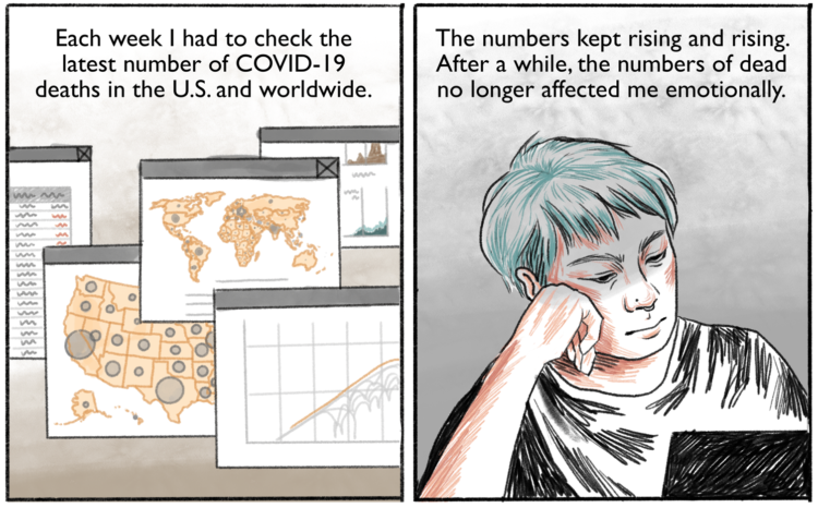
Connie Jin, who works for NPR and updates a Covid-19 dashboard, talks about in comic-form feeling numb to the large numbers and how to deal. It comes back to the individual.
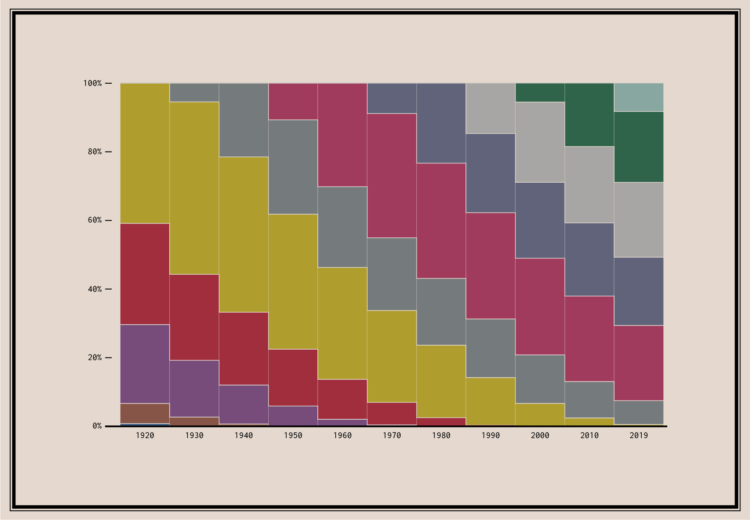
Since no one has figured out how to defeat time, age generations come and go. This chart shows the generational breakdowns since 1920.
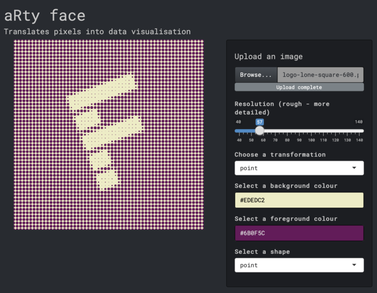
Here’s a fun interactive by Duc-Quang Nguyen. Upload an image and get back a transformed visual that uses dots, lines, or ascii. Use the menu options to easily change resolution, colors, and shapes.
It’s a combination of Georgios Karamanis’s code and Elana Levin Schtulberg’s experiment of the same ilk.
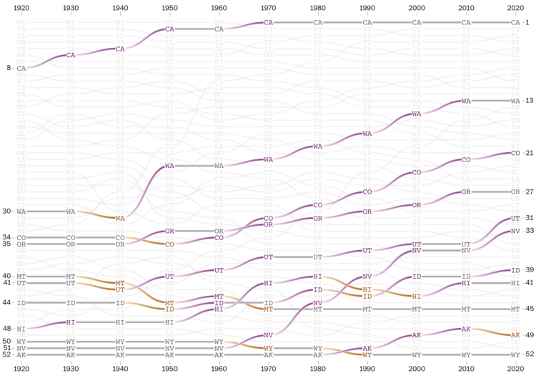
The places in the United States with the highest populations weren’t always like that. There were shifts over decades. With the recent Census release for state populations, Harry Stevens and Nick Kirkpatrick for The Washington Post go all in with a series of bump charts to show the changes in state population rankings since 1920.
They point out historical markers along the way, split it up by region, and provide an explorer at the end to look at your states of interest. In the end, it all comes down to weather and air conditioning.
Still deciding what I think about those gradient connections.
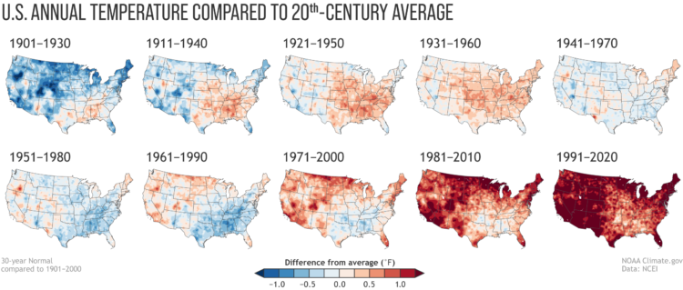
Every decade the National Oceanic and Atmospheric Administration releases climate normals to provide a baseline to compare current weather against. NOAA just released the estimates for 1991 to 2020. As you might expect, and shown in the maps above, it’s getting hotter.
This week I’m describing my process behind a quick map. You can download the code at the end of this issue.
It was only a matter of time before someone showed dots moving across a map to show migration during the pandemic. Again, using USPS change of address data, Yan Wu and Luis Melgar for the Wall Street Journal (paywalled) showed where people moved in the country.
As shown through other views, a lot of the movement wasn’t out of the ordinary, but in some areas — mainly San Francisco and New York — the pandemic appeared to motivate people a little more to move.
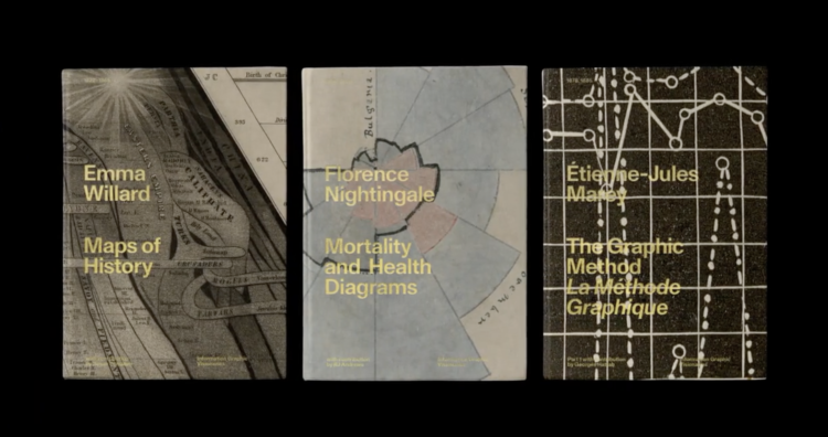
The Information Graphic Visionaries book series just launched on Kickstarter. Emma Willard, Florence Nightingale, and Étienne-Jules Marey are the subjects of three books, each including high-resolution images of the creators’ works and essays that provide historical context.
Whenever I’m feeling uninspired, I like to flip through old works. It always amazes me what past visualization practitioners were able to make without a computer. Oftentimes the detail and creativity surpass what we see these days. So Visionaries should be a fine addition to the library.
Just one day in and the Kickstarter is about halfway to the goal.
The CDC said that “less than 10 percent” of coronavirus cases were from outdoor transmissions. David Leonhardt for The New York Times argues why in all likelihood that number is way too high and leads to public confusion:
If you read the academic research that the C.D.C. has cited in defense of the 10 percent benchmark, you will notice something strange. A very large share of supposed cases of outdoor transmission have occurred in a single setting: construction sites in Singapore.
In one study, 95 of 10,926 worldwide instances of transmission are classified as outdoors; all 95 are from Singapore construction sites. In another study, four of 103 instances are classified as outdoors; again, all four are from Singapore construction sites.
This obviously doesn’t make much sense. It instead appears to be a misunderstanding that resembles the childhood game of telephone, in which a message gets garbled as it passes from one person to the next.
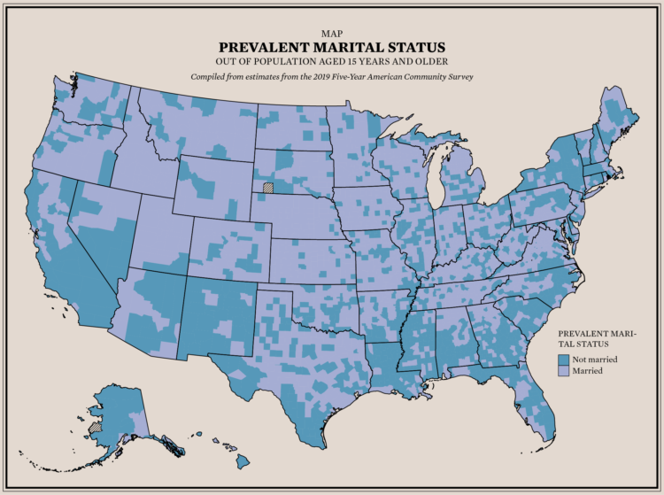
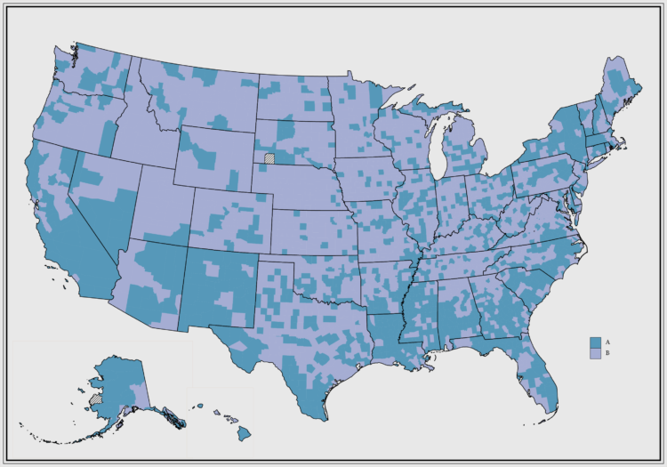
About 48% of the U.S. population aged 15 and older is married. I was curious if there were regional variations, so I mapped it.
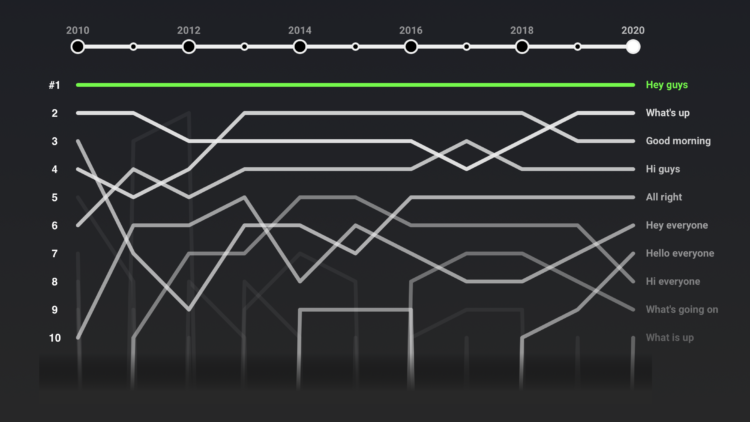
If you’ve watched even just a few videos on YouTube, you probably noticed that many videos, especially those in the vlogging genre, start the same way: “Hey guys.” YouTube Culture & Trends confirms this. “What’s up” and “Good morning” currently take the second and third spots.
They also looked at how it ranks against other greetings and varies with different genres. Sports videos most commonly start with “What is going” (I assume followed by “on”) and tech starts with “Ladies and gentlemen.”
Øystein Moseng for Highcharts provides a brief guide on making your visualizations for accessible. Guideline #4 on not relying completely on color to show the data:
Relying on color as the only means of communicating information is a failure of one of the basic WCAG success criteria. This is because many users may not be able to distinguish between the different colors used.
Data labels, symbols, annotations and tooltips are some common ways to convey additional information in visualizations without relying on color. In addition, alternate presentations – such as an accessible data table – can be helpful. It is still encouraged to use color as a supplement to these techniques, this can make visualizations easier to understand, and in many cases more accessible.
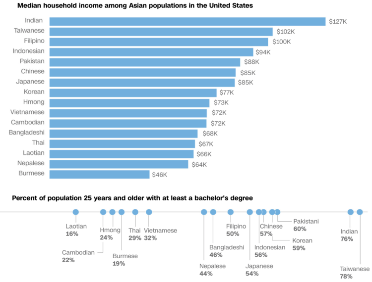
We often hear about the Asian American community as one big group of people, but go one level down and you see a lot of variance within the group. Nicole Chavez and Priya Krishnakumar, reporting for CNN, provide several demographic breakdowns to show the differences.
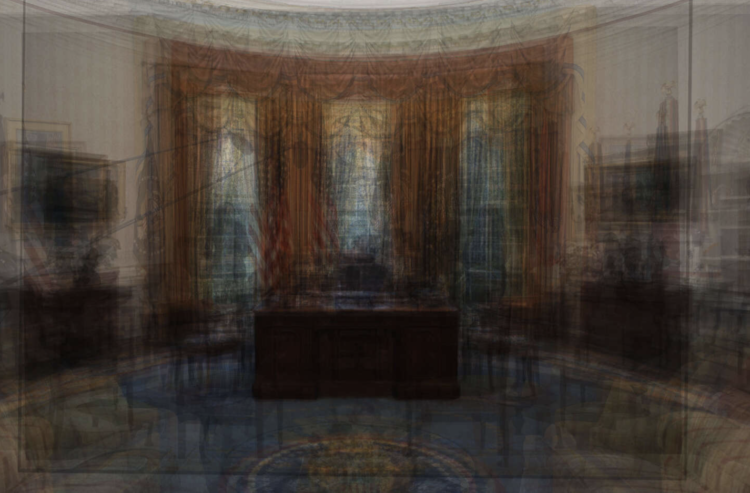
The President of the United States chooses the art for the Oval Office, and the choices show who the president admires or the image they want to project. Larry Buchanan and Matt Stevens for The New York Times take you through all of the choices since the Kennedy administration.
About half way through the piece, an averaged image of the office through several presidencies shows what changes and what stays the same. Usually these averaged images feel gimmicky or don’t show you much, but as a lead in to separate pictures, the blurred image works.
Put in the time to get to know your data and design around that for best results. Usually this part of the process isn’t automated.

These sonographs of bird song, in contrast to the sounds from traditional instruments, show complex patterns on a base frequency.


 Visualize This: The FlowingData Guide to Design, Visualization, and Statistics
Available now.