Anna Flagg, for NYT’s The Upshot, used dots arranged as a stacked area chart to show the difference between two mortality rates. Each dot represents 10 people, and they start as a random cloud. A transition to show rate by age lends focus to both an absolute and relative count.
Black mortality gap
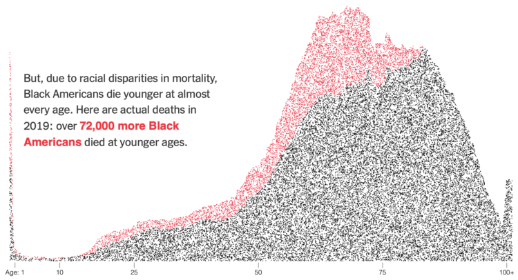
Chart Types Used


Second Edition
 Visualize This: The FlowingData Guide to Design, Visualization, and Statistics (2nd Edition)
 Visualize This: The FlowingData Guide to Design, Visualization, and Statistics (2nd Edition)
New tools, refined process.