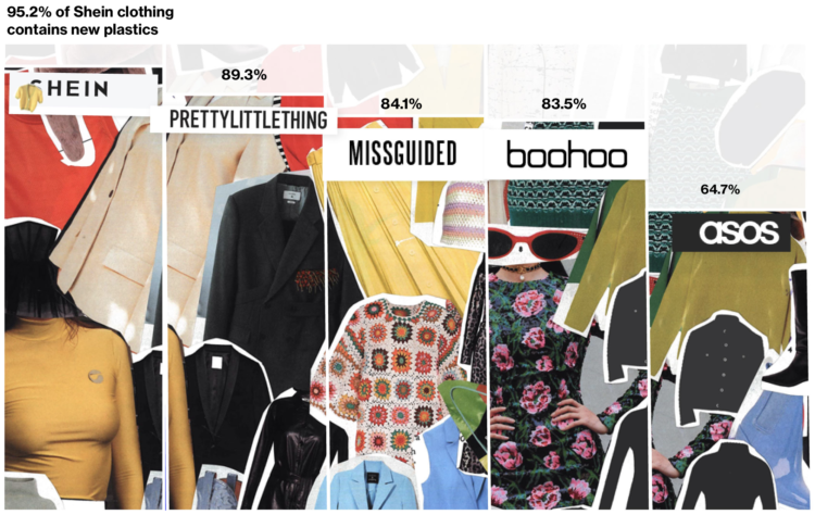
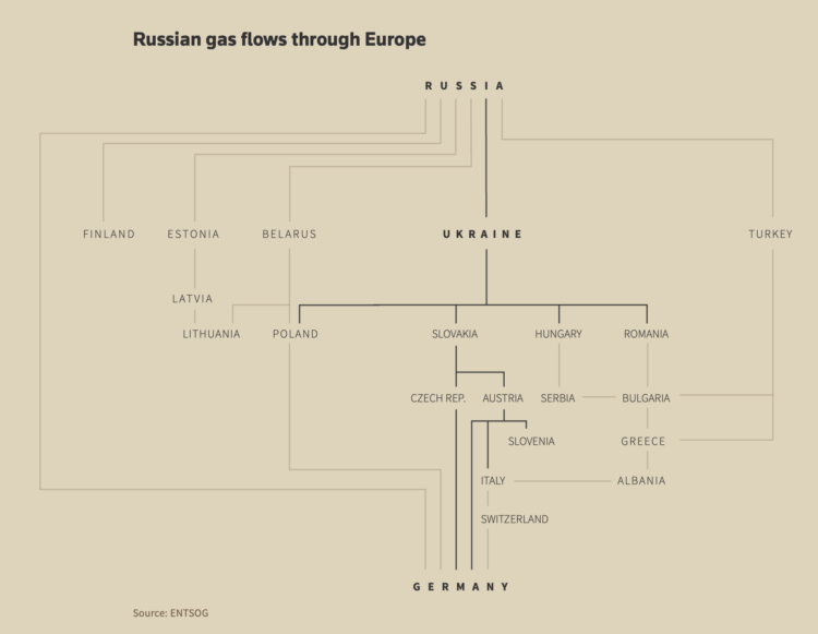
• Membership
  • Newsletter
  • Projects
  • Learning
  • About
  • Member Login
  • Mapping climate change in the Arctic

    September 29, 2021

    Topic

    Maps  /  Arctic, climate change

    UnstableGround is a project from the Woodwell Climate Research Center that focuses on climate change in the Arctic:

    Climate change is transforming the Arctic, impacting people and ecosystems across this vast region. But because our climate system is connected globally, what happens in the Arctic doesn’t stay in the Arctic.

    Discover how Arctic landscapes are changing and learn about the consequences for communities across the globe.

    A stories section uses maps, charts, and photographs to communicate the ongoing research.

  • A Succinct Intro to R

    September 29, 2021

    Topic

    Coding  /  R, Steve Haroz

    Before you get into analysis and visualizing data with R, you need to know the basics. Steve Haroz wrote a guide on getting started:

    This book is a short introduction to the R language. It covers the basics of R that are not covered by analysis and visualization guides like R for Data Science. Consider it a quick way to get up to speed on R before diving into the analysis and visualization aspects.

    This example-focused guide assumes you are familiar with programming concepts but want to learn the R language. It offers more examples than an “R cheat sheet” without the verbosity of a language spec or an introduction to programming.

  • This is a good Venn diagram.

    September 28, 2021

    Topic

    Infographics  /  humor

    [via]

  • Assessment of the Covid-19 dashboards

    September 27, 2021

    Topic

    Statistical Visualization  /  Bloomberg, coronavirus, dashboard

    Researchers evaluated 158 Covid-19 dashboards, assessing design, implementation, and usefulness. Marie Patino for Bloomberg CityLab reports:

    “All of these dashboards were launched very early in the pandemic,” said Damir Ivankovic, a PhD student at the University of Amsterdam. “Some of them were developed literally overnight, or over three sleepless nights in certain countries.” With Ph.D. researcher Erica Barbazza, Ivankovic has been leading a set of studies about Covid-19 dashboards with a network of researchers. For an upcoming paper that’s still unpublished, the pair have talked to more than 30 government dashboard teams across Europe and Asia to better understand their dynamics and the political decisions at stake in their creation.

    In 2020, suddenly governments at all levels required an online dashboard that showed data at least near real-time, but there were constraints with software, design, and data sources, along with people to implement. So groups worked with what they had.

    On the other end, everyone checking these dashboards on the daily were getting their own lessons in interpreting trends, missing data, and variation.

  • Sand mining viewed from above

    September 24, 2021

    Topic

    Infographics  /  mining, Poyang Lake, Reuters, satellite imagery

    Poyang Lake is China’s largest freshwater lake, but sand mining has changed its depth and structure, which messes up the ecosystem. Simon Scarr and Manas Sharma for Reuters used satellite imagery to show the scale and disruption of the mining activities.

    The ships look like little bugs slowly eating away at the coastline.

  • Members Only

    Visualization Tools and Learning Resources, September 2021 Roundup

    September 23, 2021

    Topic

    The Process  /  roundup

    Here’s the good stuff for September.

  • SVG pattern repository

    September 23, 2021

    Topic

    Software  /  patterns, SVG, Thomas Michael Semmler

    For when you want to fill SVG polygons with patterns instead of or in combination with color, Thomas Michael Semmler has a copy-and-paste collection. It’s just the basics, but it’s a convenient reference that could provide a starting point at the least.

  • Americans are dying too much

    September 23, 2021

    Topic

    Statistics  /  Atlantic, Derek Thompson, mortality

    Derek Thompson for The Atlantic highlights recent research comparing mortality in America against rates in Europe:

    According to a new working paper released by the National Bureau of Economic Research, Americans now die earlier than their European counterparts, no matter what age you’re looking at. Compared with Europeans, American babies are more likely to die before they turn 5, American teens are more likely to die before they turn 20, and American adults are more likely to die before they turn 65. At every age, living in the United States carries a higher risk of mortality. This is America’s unsung death penalty, and it adds up. Average life expectancy surged above 80 years old in just about every Western European country in the 2010s, including Portugal, Spain, France, Italy, Germany, the U.K., Denmark, and Switzerland. In the U.S., by contrast, the average life span has never exceeded 79—and now it’s just taken a historic tumble.

    Find the full NBER paper here.

  • How to Make Print-ready Graphics in R, with ggplot2

    You don’t have to use illustration software to polish your graphics. If keeping everything in R is your thing, this tutorial is for you.

  • A flag planted for every Covid-19 death

    September 22, 2021

    Topic

    Data Art  /  coronavirus, flags, physical, Suzanne Brennan Firstenberg

    In fall 2020, Suzanne Brennan Firstenberg planted a flag for each American who died from Covid-19. There were over a quarter of a million flags at the time. The art installation is back at the National Mall, but this time there are over 660,000 flags. The scale is just…a lot.

  • Data Underload  /  time use

    How Men and Women Spend Their Days

    For the employed, unemployed, and those not in the labor force, these charts — using an oldie but goodie visualization layout — show the percentage of people doing an activity over a day in 2020.

    Read More
  • Using rates for more relatable Covid-19 numbers

    September 20, 2021

    Topic

    Statistical Visualization  /  coronavirus, rate, scale, Washington Post

    With millions of Covid-19 deaths worldwide, and hundreds of thousands in the US, the absolute counts have been a challenge to relate to for a while. The Washington Post leaned into rates to communicate scale at the individual level. 1 in 500 Americans died from Covid-19 so far.

  • Data visualization activities for kids

    September 17, 2021

    Topic

    Statistical Visualization  /  kids, Nightingale

    Nightingale has a kid’s section with printable visualization activities. Get the kids started early while they absorb information like a sponge.

  • Members Only

    Dot Patterns – The Process 157

    September 16, 2021

    Topic

    The Process  /  dots

    The only limit is your imagination.

  • Humorous charts to organize thoughts

    September 16, 2021

    Topic

    Infographics  /  book, humor, Michelle Rial

    When I’m feeling confused about what’s going on around me, I gravitate towards making charts, so Michelle Rial’s book of charts, Maybe This Will Help: How to Feel Better When Things Stay the Same, resonates. It’s available for pre-order.

  • Beautiful News, a book charting the good things in the world

    September 16, 2021

    Topic

    Infographics  /  book, David McCandless, news

    From David McCandless and team, who you might know from such books as Information is Beautiful and Knowledge is Beautiful has a new book on Beautiful News:

    Inspired by our ongoing Beautiful News project, the book surfaces and visualises the amazing, beautiful, positive things *still* happening in the world. Things we can’t always see because we’re fixated on the negativity of the news.

    As per our previous books, this one is a welter of beautiful facts & rigorous data, visualised in riotously colourful visualisations, charts & concept maps.

    The subject matter free-ranges across many topic areas. But with one thing in common: it’s all good.

    It’s available for pre-order, available in the UK at the end of this month and in the US in January 2022.

  • Black neighborhoods split by highways

    September 15, 2021

    Topic

    Maps  /  Bloomberg, highway, race, urban

    Rachael Dottle, Laura Bliss and Pablo Robles for Bloomberg on how urban highways often split communities:

    By the 1960s, the neighborhood’s business core was gone, replaced by newly constructed Interstate 94. Homes that had been a short walk to the shops now overlooked a six-lane highway shuttling commuters between the Twin Cities of Minneapolis and St. Paul. Homes and businesses were seized and destroyed under eminent domain. The neighborhood was split in two.

  • Data Underload  /  census, population

    Where Americans Live

    Everyone gets a dot. You get a dot. And you get a dot. And you.

    Read More
  • Cases, hospitalizations, and deaths for vaccinated vs. unvaccinated

    September 13, 2021

    Topic

    Statistical Visualization  /  CDC, coronavirus, unvaccinated, vaccination

    The CDC released a chart that shows case, hospitalization, and death rates for fully vaccinated (blue) against not fully vaccinated (black). As you might expect, the rates for the fully vaccinated are much lower, especially for hospitalizations and deaths.

  • How the demographics of your neighborhood changed

    September 13, 2021

    Topic

    Statistical Visualization  /  census, demographics, San Francisco Chronicle

    The San Francisco Chronicle compares demographics in your neighborhood in 2020 against 2010. It’s a straightforward app that lets you enter an address (not just in California) and it shows you the changes at several geographic levels.

    I like how snappy it is when you enter an address.

  • Page 74 of 392
  • <
  • 1
  • ...
  • 71
  • 72
  • 73
  • 74
  • 75
  • 76
  • ...
  • 392
  • >

Analyze, visualize, and communicate data usefully, beyond the defaults.

Become a member →

Recently for Members

May 8, 2025
When the data is not what it seems

May 1, 2025
Finding the Right Charts

April 24, 2025
Visualization Tools, Datasets, and Resources – April 2025 Roundup

April 17, 2025
Breaking Out of Chart Software Defaults

April 15, 2025
Line Chart with Decorative Neon Accents

Browse by Chart Type See All →

Connected Scatter Plot Horizon Graph Histogram Parallel Sets Timeline Dot Plot Treemap Spiral Chart Dot Density Map Grid Map

Browse By Topic

  • Visualization

    Seeing data

  • Maps

    Seeing geographic data

  • Infographics

    Explaining data

  • Networks

    Connecting data

  • Statistics

    Analyzing data

  • Software

    Working with data

  • Sources

    Getting data

  • Design

    Making data readable

Get the Book

Visualize This: The FlowingData Guide to Design, Visualization, and Statistics

Available now.

Order: Amazon / Bookshop

Made by FlowingData

  • The Process

  • Data Underload

  • Chart Everything

  • Guides

  • Books

  • Shop

  • About
  • Contact
  • Newsletter
  • LinkedIn
  • Instagram
  • Bluesky
  • RSS
Copyright © 2007-Present FlowingData. All rights reserved.