I collect visualization tools and learning resources and then round them up at the end of each month. Here’s the good stuff for March.
I collect visualization tools and learning resources and then round them up at the end of each month. Here’s the good stuff for March.
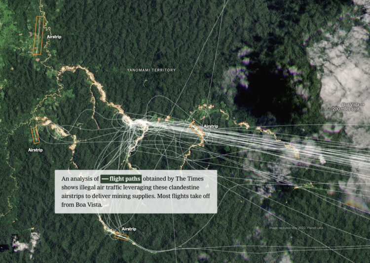
Satellite imagery on its own can be limited in what it can say without context. It’s photos from the sky, which is neat and technical, but then what? For Nightingale, Robert Simmon describes the many ways that journalists use satellite imagery to tell stories and layer meaning.
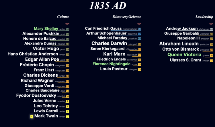
This is a fun project by Jan Willem Tulp. Based on data from a cross-verified database of notable people, Tulp scrolls through history to show when these people enter and leave the world based on their age. Start in 3500 BC and scroll from there.
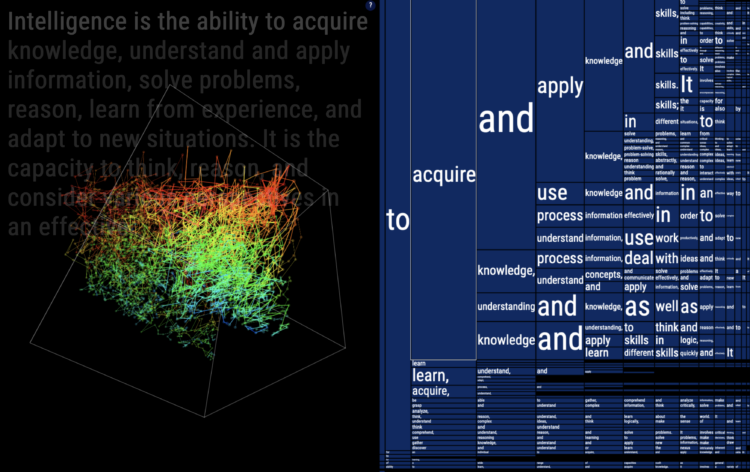
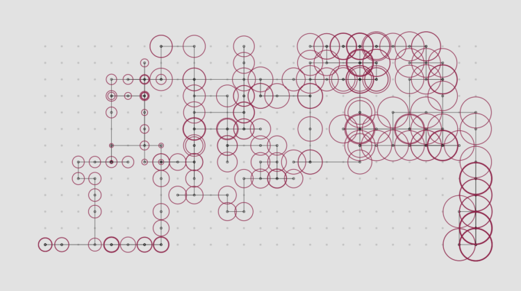
To gain a better understanding of how ChatGPT works under the hood, Santiago Ortiz repeatedly passed the prompt “Intelligence is” to the chatbot. Then he visualized the statistical paths to get to a response using a 3-D network. If you squint, the network kind of looks like a computer’s brain.

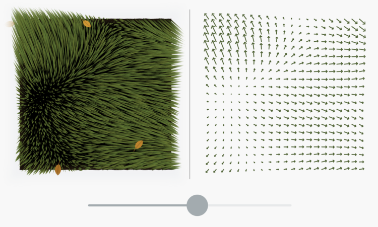
Alec Singh added another dimension to Conway’s Game of Life for a pretty, mesmerizing animation. The z-axis is used to show positions over time.
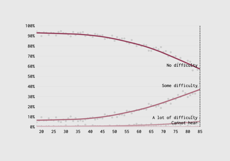
If you want to feel like you’re getting old, visit an optometrist and have them tell you that in 6 to 12 months you won’t be able to read things up close and you’ll need bifocals. Here’s when your senses will decline.
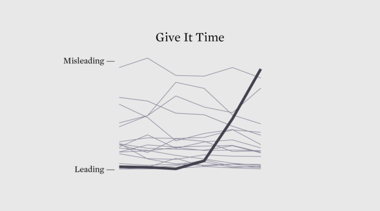
If a chart is seen by enough people, someone will call it misleading. There are no exceptions.
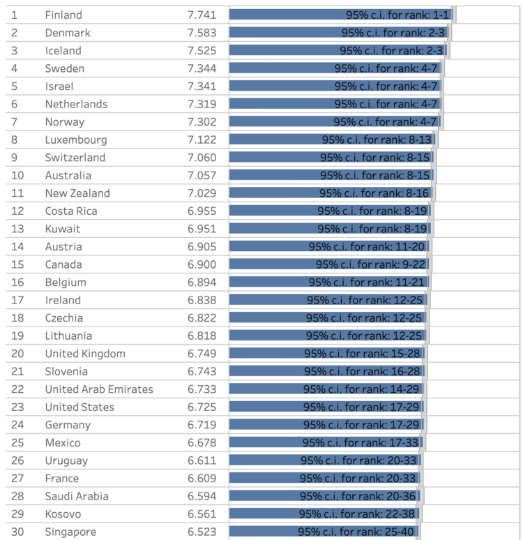
The World Happiness Report, published each year since 2012, just dropped for 2024. They focused on age and happiness this year. Overall, the United States ranked in the range from 17 to 29 among all countries, but was worse for young people. Finland was definitively at the top.
The visualizations are clinical, which is kind of sad given the topic of the report. Someone should collate the data and have some fun with it.
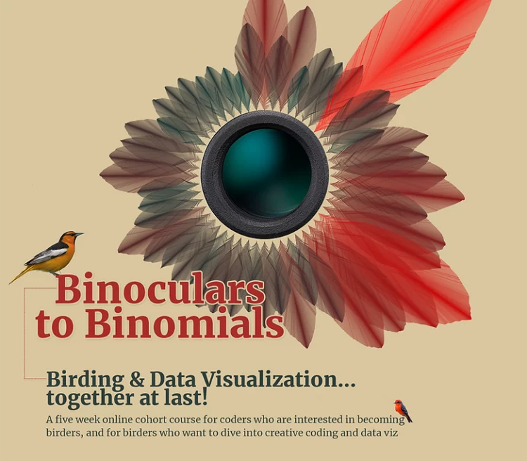
Jer Thorp has combined birding and data visualization into a unique course called Binoculars to Binomials:
I dreamt up Binoculars to Binomials as a hybrid site of learning. It’s for coders who are interested in cultivating an observational practice, and for birders who want to dive into the rich pool of data that comes out of their hobby.
More broadly, it’s for anyone who’s interested in the overlap between nature, data and creativity.
Sounds good to me.
One of the best ways to learn how to visualize data is to apply it to a specific field. You figure out the mechanics and the context behind the data, which makes visualization meaningful and useful. In this case, you get your hands in all parts of the process.
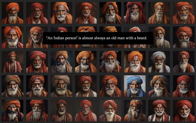
For Rest of World, Victoria Turk breaks down bias in generative AI in the context of national identity.
Bias in AI image generators is a tough problem to fix. After all, the uniformity in their output is largely down to the fundamental way in which these tools work. The AI systems look for patterns in the data on which they’re trained, often discarding outliers in favor of producing a result that stays closer to dominant trends. They’re designed to mimic what has come before, not create diversity.
“These models are purely associative machines,” Pruthi said. He gave the example of a football: An AI system may learn to associate footballs with a green field, and so produce images of footballs on grass.
Between this convergence to stereotypes and the forced diversity from Google’s Gemini, has anyone tried coupling models with demographic data to find a place in between?
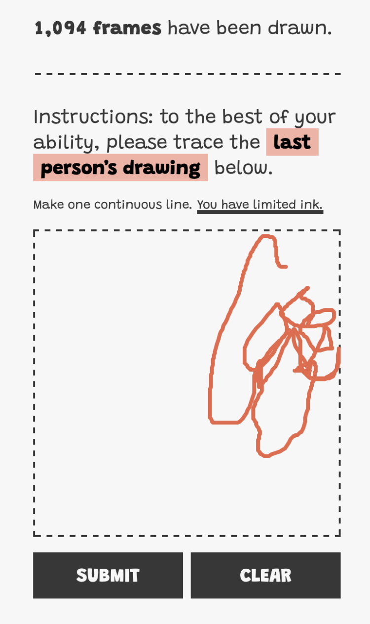
I traced something around frame 200 and the sketch looked like a scribble already. I’m curious where this ends.
Bartosz Ciechanowski is at it again with an in-depth explainer that makes heavy use of slider-driven interactive graphics. This time he simulated the patterns of air flowing over and around the wings of an airplane, also known as airfoil.
The length of each article starts to feel kind of long at times, but there’s something to these simple sliders that are useful in keeping you engaged and helping to understand the physics.
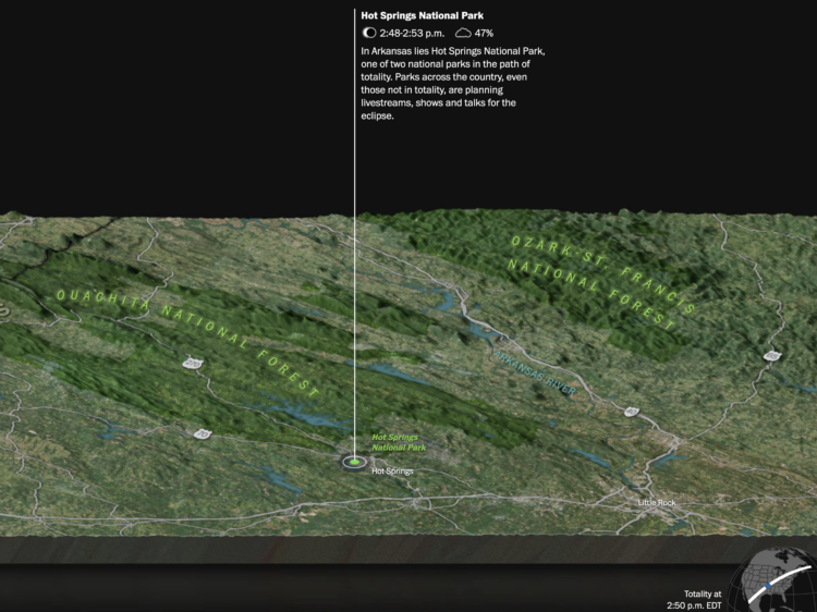
On April 8, 2024, the moon is going to completely block the sun along a designated path. For the Washington Post, Dylan Moriarty and Kevin Schaul use a strip of satellite imagery to show the totality across the United States, with events and time along the way.
For the past few years, Laurie Anderson has been using an AI chatbot to talk her husband who died in 2013. For the Guardian, Walter Marsh reports:
In one experiment, they fed a vast cache of Reed’s writing, songs and interviews into the machine. A decade after his death, the resulting algorithm lets Anderson type in prompts before an AI Reed begins “riffing” written responses back to her, in prose and verse.
“I’m totally 100%, sadly addicted to this,” she laughs. “I still am, after all this time. I kind of literally just can’t stop doing it, and my friends just can’t stand it – ‘You’re not doing that again are you?’
“I mean, I really do not think I’m talking to my dead husband and writing songs with him – I really don’t. But people have styles, and they can be replicated.”
One part of me feels like this isn’t the way to preserve a memory of someone who is gone, but the other part feels that I would do the same thing if I were in her situation and had the opportunity.
See also the man who trained an AI chatbot with old texts from his dead fiancee.
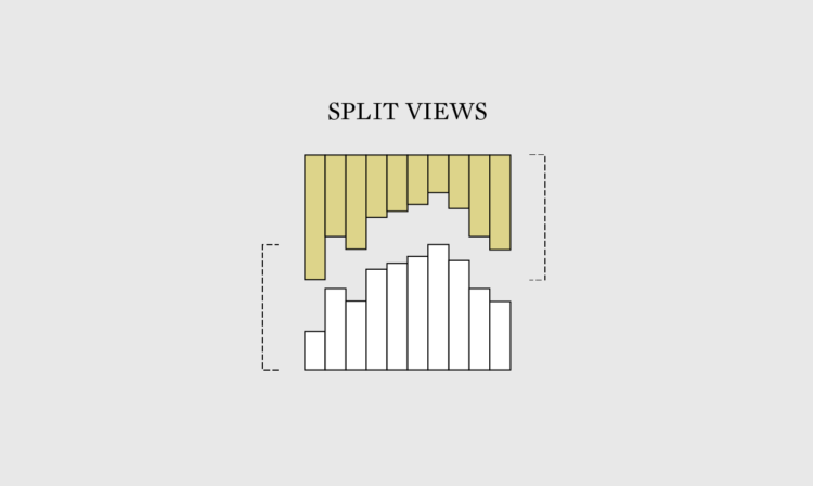
Every chart type has its trade-offs. So instead of trying to show everything at once, use multiple views to show things separate.
For the New York Times, Eve Kahn describes the use of maps outside of looking up directions:
Cartographic décor can help sate fundamental human needs to feel oriented. “Maps are inherently trusted — there’s something about them that makes people feel secure,” said PJ Mode, a map scholar and collector who is donating his holdings to Cornell University. His main focus is “persuasive cartography”: maps meant to sway public opinion, for instance by advocating abolition in the early 1800s, or women’s suffrage or warmongering in the 1910s. Mr. Mode likes to quote what the writer and aviator Beryl Markham imagined that maps wanted to say to their users: “follow me closely, doubt me not. … Without me, you are alone and lost.”
Through pop culture, it sometimes seems like it’s common for there to be a wide age difference between spouses. How common are the age gaps, really? These are the age differences through the lens of the 2022 five-year American Community Survey.
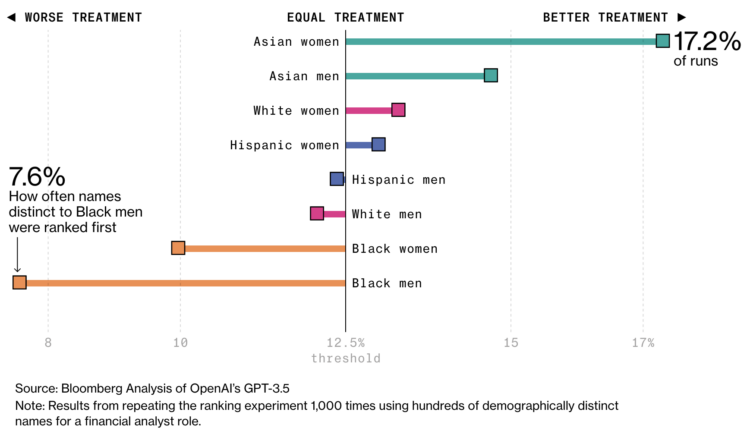
AI is finding its way into the HR workflow to sift through resumes. This seems like a decent idea on the surface, until you realize that the models that the AI is built on lean more towards certain demographics. For Bloomberg, Leon Yin, Davey Alba, and Leonardo Nicoletti experimented with the OpenAI GPT showing a bias:
When asked to rank those resumes 1,000 times, GPT 3.5 — the most broadly-used version of the model — favored names from some demographics more often than others, to an extent that would fail benchmarks used to assess job discrimination against protected groups. While this test is a simplified version of a typical HR workflow, it isolated names as a source of bias in GPT that could affect hiring decisions. The interviews and experiment show that using generative AI for recruiting and hiring poses a serious risk for automated discrimination at scale.
Yeah, that sounds about right.
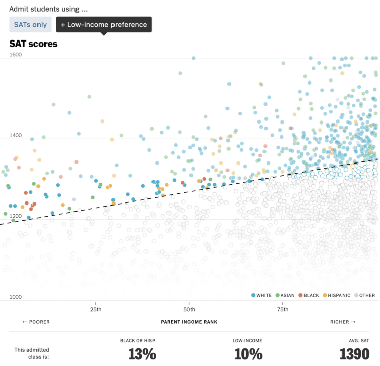
For NYT’s The Upshot, Aatish Bhatia and Emily Badger model how colleges might promote diversity in admissions without (directly) considering race.
A set of scatter plots show a theoretical students plotted by parent income and SAT score. Select between SAT-only admissions or a process that considers factors such as low income or school poverty to see how the percentages change.
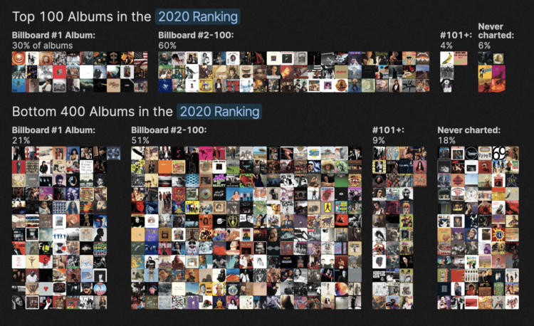
Rolling Stone published a list in 2003 that ranked the 500 greatest albums of all time. The list was updated in 2020, and there was a lot of change. For The Pudding, Chris Dalla Riva and Matthew Daniels delve into the shift and ask what makes an album the greatest.
A lot of the differences appear to stem from who does the ranking, which makes for a good polling and statistical accuracy example.
 Visualize This: The FlowingData Guide to Design, Visualization, and Statistics (2nd Edition)
New tools, refined process.


