• Membership
  • Newsletter
  • Projects
  • Learning
  • About
  • Member Login
  • Caption Contest – Win The Numerati by Stephen Baker

    September 19, 2008

    Topic

    Contests

    As promised, it’s time for a FlowingData contest. To the winner goes The Numerati by Stephen Baker, a book about how data play a huge role in our future. Indeed, it does. Stephen also keeps an interesting blog, and I encourage you to check it out.

    How to Win a Free Book

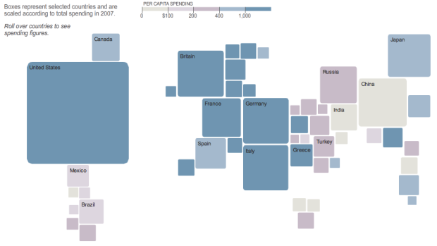
    It’s easy. Write a caption for the above graph and leave it in the comments below. Whoever comes up with the best caption by the end of 11:59pm on Sunday wins. By best, I mean whichever I find the most amusing or clever. For example – “drunkeness vs stupidity” or “The more I eat per day the fatter I will get.” You get the idea. I’m sure you all can come up with something much better.

    I’m making it one entry per person, so make it a good one, and make sure you use a valid email so that I can contact you if you win.

    Good luck! I’m looking forward to what you all come up with.

  • FlowingData Welcomes Tableau Software

    September 18, 2008

    Topic

    Site News

    I’m pleased to welcome Tableau Software as FlowingData’s newest sponsor. I know that a lot of you already use Tableau for your data visualization and analysis needs, but for those of you who haven’t heard of it, Tableau is a tool that aims to make “databases and spreadsheets understandable to ordinary people” with an emphasis on statistical visualization and visual analysis.

    One of the co-founders is actually one of the founding members of Pixar, believe it or not. I don’t know about you, but that has awesome written all over it. Check it out for yourself and sharpen your visualization skills (hint) for the next FlowingData deconstruct/reconstruct project. Thanks, Tableau!

  • Art of Mathematics – Visualization of Dynamical Systems

    September 18, 2008

    Topic

    Data Art

    Dynamical systems are mathematical models used to describe the time-dependent position of a point’s position in ambient space. For example, a dynamical system could be used to describe the movement of a swinging pendulum. The way the pendulum moves is based on the laws of physics, but trajectory, velocity, acceleration, etc changes over time. Over at the University of Liverpool is a series of visualizations by mathematicians around the world that shows such dynamical systems.

    Lasse Rempe, a mathematician, describes the beauty of these visualization in this video on the BBC. Many more beautiful pieces in the video and explanation of the underlying structures.

  • Tree Map to Show Losses by Major Companies

    September 17, 2008

    Topic

    Infographics  /  New York Times

    Taking after Map of the Market, the New York Times uses tree maps to show a year of heavy losses by major companies. It’s a pretty sad state of affairs. Content aside though, this is certainly one of the reasons the Times is so popular among the infographics crowd. Data visualization isn’t just bar graphs and time series plots.
    Read More

  • How Consumers Around the World Spend Their Money

    September 17, 2008

    Topic

    Infographics  /  New York Times

    This pseudo-map graphic from The New York Times shows how consumers in different countries spend their money. Squares represent selected countries and are sized and colored according to spending in 2007. As you might expect, the United States does some heavy spending on clothing and footwear.

    Does the graphic remind you of anything? The Times put up a different pseudo-map in force-directed graph format for the olympic medals. What do you prefer – pseudo-map or traditional?

  • How Eating Ice Cream and Feeling Gross Leads to Alcholism

    September 16, 2008

    Topic

    Infographics

    This stream of consciousness video (below) from Current is complete with animated infographics and some lovely narration. I have no idea why the video was made or if there was a story behind where the video came from. However, I do know that the narrator’s voice is both reassuring and soothing, and I am ten times smarter after watching it.
    Read More

  • Compare Media Coverage of Presidential Candiates with Everymoment Now

    September 15, 2008

    Topic

    Apps

    I keep stumbling on rants about how media coverage of presidential candidates is uneven, biased, etc. Everymoment Now provides a way to see what’s going on with the election from the coverage (and sort of statistical) standpoint. From Craig, the developer of Everymoment:

    In order to limit the scope I’ve decided to keep the focus (for now) on the 2008 US general election. It’s a timely, pertinent and, I believe, quite fascinating topic to study under this sort of data visualization lens. When all is said and done, you’ll be able to use this site to look back over the last 100 days leading up to the election and see how the shifts between candidates played out in the media. I think we all have a sense that things may get pretty nasty in the coming weeks. I feel that having a bird’s eye, hindsight view of how things went down, which stories the media focused on and how that ultimately influenced the final outcome will be an invaluable resource.

    Check out spikes in coverage of the candidates or even events and locations. Lots of sparklines and lots of bar graphs very nicely organized.
    Read More

  • Welcome to FlowingData’s First Sponsor

    September 13, 2008

    Topic

    Site News

    Some of you might have noticed that FlowingData has a new sponsor in the sidebar. It’s Eye-Sys, an impressive visualization tool that aims to make complex data easy to understand. It serves a wide variety of data audiences with capabilities in traditional statistical visualization, GIS, and scientific visualization. Eye-Sys sports a drag and drop user interface that lets you hook visualization into data from both text files or databases. No need for programming. There’s a lot of cool stuff in their galleries, so I urge you check them out, if just to look at pretty pictures.

    On another note, keep an eye out for another FlowingData contest in the near future. Thanks, Eye-Sys!

  • 23 Personal Tools to Learn More About Yourself

    September 12, 2008

    Topic

    Self-surveillance

    Like what you see here? Subscribe to the feed to stay updated on what’s new in data visualization.

    In the not too distant past, the Web was all about sharing, broadcasting, and distribution. The tide is turning. The Web is moving towards the individual. Applications spring up every month that let people track, monitor, and analyze their habits and behaviors in hopes of gaining a better understanding about themselves and their surroundings.

    We saw what data can be recorded in the personal visualization project. Some data lend themselves to easy tracking while others are easier to monitor with the aid of an application. These 23 tools, to track the minutiae of everyday life, try to fill that niche.

    Is it information overflow or are we learning more about ourselves?
    Read More

  • OneGeology Wants to Be Geological Equivalent of Google Maps

    September 11, 2008

    Topic

    Data Sources, Maps

    There’s lots of free geographical data about what’s going on at the surface of our planet. It’s a different story for what going on underneath though. OneGeology aims to be the solution to that problem.

    OneGeology is an international initiative of the geological surveys of the world and a flagship project of the ‘International Year of Planet Earth’. Its aim is to create dynamic geological map data of the world available via the web. This will create a focus for accessing geological information for everyone.

    I’ve never been one for the geology, but if the data (and interactive maps) were easily accessible, there certainly would be a peak in interest.

    [via msnbc | Thanks, Samantha]

  • See the World Through SimCity’s Eyes – One Up On OnionMap

    September 10, 2008

    Topic

    Apps, Maps

    Michael comments, “Onionmap is nothing when compared to this Chinese site…They’ve practically mapped out the entire Shanghai (and quite a few other China cities) in a SimCity-like fashion! Amazing stuff!” He’s completely right. Edushi maps Shanghai with great detail. While OnionMap looks like Google Maps with SimCity sprinkles, Edushi is just straight up SimCity.

    Unfortunately my three years of Chinese classes in high school did me no good, and I don’t understand a thing on the site. Maybe someone can translate and let us know what Edushi is all about. Chinese CitySearch?

    [Thanks, Michael]

  • Winner of the Personal Visualization Project is…

    September 9, 2008

    Topic

    Self-surveillance

    Like what you see here? Subscribe to the feed to stay updated on what’s new in data visualization.

    Last week was the end of our FlowingData personal visualization project. I asked readers to collect data about themselves or their surroundings and then visualize it some way. Thank you to everyone who participated. It put a smile on my face every time I got an email with “summer project” in the subject line :).
    Read More

  • Interactive Graph Visualization System – Skyrails

    September 8, 2008

    Topic

    Network Visualization

    Skyrails is an interactive graph visualization system that looks a lot like a video game. Explore relationships, visit nodes, and immerse yourself in the data. As I watch the demo video on YouTube, I feel like I’m seeing another world.

    You’ve got the standard ball and stick view. Whether it’s useful for analysis or deeper understanding of relationships between whatever is up for debate, but one thing’s for sure – it looks cool. Plus the code is open source.

    [Thanks, Atilla]

  • Flowchart Shows You What to Say During Sex

    September 5, 2008

    Topic

    Misc. Visualization  /  flowchart

    This flowchart shows you what to say during private time with your special friend. Say goodbye to confusion and hello to deep conversations. Start from the middle of the chart and work your way out. Never again will you be at a loss for words.
    Read More

  • How to Create a Real-Time Web Traffic Map for Your Site

    September 3, 2008

    Topic

    Maps, Projects

    I was exchanging email with Rob a few days ago, and he brought up that I might see a slight boost in traffic from Australia because he had spread the word (thanks!) at a statistics conference. I immediately went over to Google Analytics, and indeed, there was an increase in traffic from the land down under.
    Read More

  • Mozilla Labs Ubiquity Plugin Makes Mashups Easy

    September 3, 2008

    Topic

    Software

    Mashups have been around for a while now, but for the most part have required at least a little bit of web development. Maybe it’s a line of javascript or thousands. Mozilla Labs, with the Ubiquity plugin, aims to make mashup-making accessible so that everyone can view data how they want everywhere on the Web. Use natural language like “map this” to stick a map into your email or get Craigslist offerings out of the list and onto a map.

    For version 0.1, the application looks interesting. Check out the demo (or even install the plugin yourself):

    [Thanks Colin and Jodi]

  • Nike+ Human Race 10K – Racing Around the World

    September 2, 2008

    Topic

    Self-surveillance

    Nike+ is a device you hook up to your shoe and iPod Nano to track your running patterns and receive feedback while you’re running. Already a million people around the world have been training with the device, with the U.S. putting up 2.4 million global training miles. This past Sunday was “the day the world stopped to run” in the Nike+ Human Race 10K.
    Read More

  • Best of FlowingData: August 2008

    September 2, 2008

    Topic

    Best of FlowingData

    Last month, FlowingData had a pretty good month moving up to rank 4,130 on Technorati and growing from about 4,000 subscribers to 4,500, so our community has grown a bit. Thank you to all of you who have been spreading the word!

    In case you missed them, here are some of the best posts from August:

    • Watch the Rise of Gasoline Retail Prices, 1993 – 2008
    • It’s Like Google Maps with Sim City 2000 – OnionMap
    • Map of Olympic Medals in Bubble + Geographic Form
    • Britain From Above – Beautiful Use of Satellite Technology
    • Visualize Genomes and Genomic Data – Circos
    • Beginner’s Guide to FlowingData – A Guided Tour
    • Is There a Market for Premium Online Data Visualization?
    • Awesome Olympics Coverage By The New York Times
    • Many Eyes Adds Wordle to its Extensive Visualization Toolbox
    • 3 Worthwhile Alternatives to the Pie Chart
  • Tracking Hurricane Gustav – How Hard is it Going to Hit?

    August 31, 2008

    Topic

    Maps  /  New York Times

    Stamen has taken a step towards the concrete with their recent Hurricane Tracker for MSNBC. From what I can tell, it updates every couple of hours or so. The tracker shows where Hurricane Gustav has been and where it’s headed and provides information on wind speed, ground speed, and location.

    From the map we see a development from tropical depression in the Caribbean Sea, to a big category 4 over Pinar Del Rio, and then something between a category 3 and 2 as it moves over New Orleans. Gustav dwindles to a tropical storm as it moves towards Dallas. With mandatory evacuations of New Orleans starting yesterday, here’s to hoping everyone finds somewhere safe to stay.

  • Google Results for X Girls, Y Cups

    August 30, 2008

    Topic

    Miscellaneous

    Some will find this amusing while others won’t get it at all. If you don’t get it, consider yourself lucky. Have a good weekend, everyone.

    [Thanks, Canna]

  • Page 373 of 392
  • <
  • 1
  • ...
  • 370
  • 371
  • 372
  • 373
  • 374
  • 375
  • ...
  • 392
  • >

Analyze, visualize, and communicate data usefully, beyond the defaults.

Become a member →

Recently for Members

May 15, 2025
Step Chart, Enhanced

May 8, 2025
When the data is not what it seems

May 1, 2025
Finding the Right Charts

April 24, 2025
Visualization Tools, Datasets, and Resources – April 2025 Roundup

April 17, 2025
Breaking Out of Chart Software Defaults

Browse by Chart Type See All →

Radar Chart Alluvial Diagram Baseline Chart Sankey Diagram Small Multiples Difference Chart Voronoi Diagram Network Graph Mosaic Plot Bubble Chart

Browse By Topic

  • Visualization

    Seeing data

  • Maps

    Seeing geographic data

  • Infographics

    Explaining data

  • Networks

    Connecting data

  • Statistics

    Analyzing data

  • Software

    Working with data

  • Sources

    Getting data

  • Design

    Making data readable

Get the Book

Visualize This: The FlowingData Guide to Design, Visualization, and Statistics

Available now.

Order: Amazon / Bookshop

Made by FlowingData

  • The Process

  • Data Underload

  • Chart Everything

  • Guides

  • Books

  • Shop

  • About
  • Contact
  • Newsletter
  • LinkedIn
  • Instagram
  • Bluesky
  • RSS
Copyright © 2007-Present FlowingData. All rights reserved.