Lee Byron, Amanda Cox and Matthew Ericson of the New York Times graphics department map Olympic medals starting from the first one hosted by the International Olympic Committee in 1896 up to the most recent one in Athens. It looks like someone has an affinity for the colliding ball effect. Not that that’s bad or anything.
The Encodings
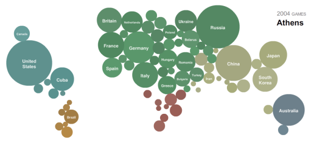
Bubbles for each country are arranged geographically (or by rank) and sized by the number of medals that country won. Each continent has its own color. Shift the timeline to look at a different year, and click on a bubble to get a medal breakdown. The one thing that’s mysteriously missing is a play button to watch the map morph over time. I’m sure there’s a good reason why, but it seems like a natural next step. Although, I guess I can just hold down the arrow keys.
In any case, good stuff.
Is it just me, or is anyone else seeing home court advantage playing a role in medal count?
[Thanks, Max]
 Visualize This: The FlowingData Guide to Design, Visualization, and Statistics (2nd Edition)
Pingback: Neat Olympics Data Visualization | Larry Ferlazzo's Websites of the Day...
Curiously, the color coding in this graph places Israel with the nations of Europe, while placing Lebanon and Syria with the nations of Asia.
Or maybe just there’s some obscure land bridge between Turkey and Israel that I didn’t learn about in school…
Pingback: Doing the NY times Olympic medals by country year visualization in excel | Pointy Haired Dilbert - Chandoo.org
Pingback: interactive timeline/bubble-map of countries’ olympic performance
Bubbles are the new bar.
Pingback: Olympische medailles op de wereldkaart | Verbeelding
[Oops – I had several windows open and commented on the wrong post previously…Sorry about that…]
Another place to look for interactive visualisations of Olympics medal results is on Many Eyes, IBM’s online visualisation toolkit.
For example, I’ve produced a couple of views over the medals won, by discipline, for the top 10 countries by medal tally:
http://ouseful.wordpress.com/2008/08/24/more-olympics-medal-table-visualisations/
tony