• Peter Donnelly talks about the misuse of statistics in his TED talk a couple of years back. The first 2/3 of the talk is an introduction to probability and its role in genetics, which admittedly, didn’t get much of my interest. The last third, however, gets a lot more interesting.

    Donnelly talks about a British woman who was wrongly convicted largely in part because of a misuse of statistics. A so-called expert cited how improbable it would be for two children to die of sudden infant death syndrome, but it turns out that “expert” was making incorrect assumptions about the data. This doesn’t surprise me since it happens all the time.

    Lesson Learned

    People misuse statistics every day (intentionally and unintentionally), and oftentimes it doesn’t hurt much (which doesn’t make it any better), but in this case improper use directly affected someone’s life in a very big way. One of the most common assumptions I see is that every observation is independent, which often is not the case. As a simple example, if it’s raining today, does that change the probability that it will rain tomorrow? What it didn’t rain today?

    In other words, the next time you’re thinking of making up or tweaking data, don’t; and the next time you need to analyze some data but aren’t sure how, ask for some help. Statisticians are nice and oh so awesome.

    Here’s Donnelly’s talk:

  • The National Science Foundation is running their annual Science and Engineering Visualization Challenge.

    Some of science’s most powerful statements are not made in words. From the diagrams of DaVinci to Hooke’s microscopic bestiary, the beaks of Darwin’s finches, Rosalind Franklin’s x-rays or the latest photographic marvels retrieved from the remotest galactic outback, visualization of research has a long and literally illustrious history. To illustrate is, etymologically and actually, to enlighten.

    You can do science without graphics. But it’s very difficult to communicate it in the absence of pictures. Indeed, some insights can only be made widely comprehensible as images. How many people would have heard of fractal geometry or the double helix or solar flares or synaptic morphology or the cosmic microwave background, if they had been described solely in words?

    To the general public, whose support sustains the global research enterprise, these and scores of other indispensable concepts exist chiefly as images. They become part of the essential iconic lexicon. And they serve as a source of excitement and motivation for the next generation of researchers.

    They’ve been accepting submissions since September of last year and will continue to do so until May 31, 2008. The rules are pretty wide open with last year’s winners in the area of photography, illustration, and interactive and non-interactive media. Basically, it’s whatever you want it to be. The winners will be published in the the journal Science, and one of the winning submissions will get to be on the cover of the prestigious journal.

  • Whenever I tell people that I study Statistics, they almost always respond, “So what do you do with that?” After they get over their initial shock, I often get, “If I were in Statistics, I’d study sports statistics.” I usually respond by telling them that while it would probably be a lot of fun, I don’t think there is much money in it (because I gotta eat, right?) and that statisticians usually take that as a part time gig. I’m thinking I might have to change that response though, as the game of sports statistics is showing signs of life with the recent Journal of Quantitative Analysis in Sports.

    Articles in the Journal of Quantitative Analysis in Sports (JQAS) come from a wide variety of sports and perspectives and deal with such subjects as tournament structure, frequency and occurrence of records and the optimal focus of training for decathlons. Additionally, the journal serves as an outlet for professionals in the sports world to raise issues and ask questions that relate to quantitative sports analysis. Edited by economist Benjamin Alamar, articles come from a diverse set of disciplines including statistics, operations research, economics, psychology, sports management and business.

    Maybe I’ll read regularly and take up sports betting as my new hobby.

  • Jared Pool had a chat with Andrew (multimedia) and Steve (graphics) at The New York Times. I’m sure you’re familiar with their work. They chat about the design process of the interactive pieces on The Times site like the transcript analyzer, the home run chart, and plenty of other specific examples. They also go into a bit about where they get inspiration from (e.g. old Fortune magazines, photographs, advertisements) as well as how they go about creating their more innovative pieces.

    Keep in mind it’s on the User Interface Engineering blog, so it’s mostly focused on, well, the user interaction and design and less on where data comes from, the journalistic process, etc, but still, it’s a pretty good listen.

    [via Visual Methods]

  • For the re-launch of the Microsoft Windows Live platform, Firstborn created a generative art installation taking thousands of smiling faces and placing them into a 3-D world. It was an outdoor installation (done in Processing) projected on a seven-story sphere, and I am sure it wowed a whole lot of people. It’s definitely amazing me, and all I’m seeing are screenshots and a demo.

    Read More

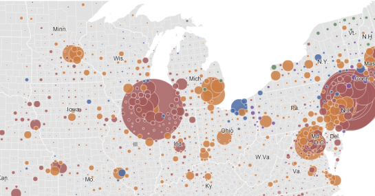
  • Interactive Travel Time and House Price Maps – Tom from Stamen recently announced some really slick mapping. They’re very attractive and very responsive. Sidenote: Look forward to a guest post from Tom in the near future.

    175+ Data and Information Visualization Examples and Resources – Meryl has posted an extensive list of visualization examples and resources available online. Thanks for linking here, Meryl!

    GPSed – A site that takes advantage of the data available from your mobile phone, mainly pictures and your GPS trace.

    Visualizing the History of Living Spaces – Ivanov et al. discuss the challenges of visualizing motion data from 215 motions sensors in a large office building.

  • Virgil Griffith has created a series of graphs called Books that Make You Dumb. He correlates top books on FaceBook by school and the corresponding schools’ average SAT scores. Notice Freakonomics is pretty far to the right. Nice.

    The graphs are of course aren’t really that statistical nor are they especially beautiful, but hey, just take it for what is it, and it’s kind of amusing. Plus, it’s a good example of how you can use data from different sources to find something interesting.

  • The thing about data is that it can be very convincing. Maybe it’s because it’s so hard to argue against numbers, or maybe it’s just that there’s so much of it. In any case, here’s six datasets that undoubtedly changed the way some people behave or showed us something that brought about a different way of thinking about things. Read More

  • Those of you who have been around since the beginning know that I am just obsessed with my pedometer. Albeit, lately, I haven’t felt inclined to go for a winter stroll in the below freezing weather. When I was keeping track of my steps though, one of the difficulties was staying consistent. Sometimes I would forget to wear my pedometer, while other times I would forget to record my steps.

    I imagine Walker Tracker could help a bit in solving that second problem. I know it was always easier to make it to the gym when I knew one of my friends was going to meet me there. Walker Tracker is like that friend at the gym. The site lets you keep track of your steps as well as see how others are doing.

    We’re trying to change the world. We’re trying to get you and us and everyone we know off the elevator and out of the car and onto the sidewalks and trails. We’re doing it one step at a time.
    Get up, stand up and walk.

    OK, maybe it’s a little hoorah, but if you feel like actually accomplishing a new year’s resolution this year, Walker Tracker could be a good place to start.

    [via Web Worker Daily]

  • Warning: Tangent ahead, but I promise, there’s a point.

    About a year ago, I went to my 6-month teeth checkup, and the dentist told me that I had a cavity on the bottom back left and another on the bottom back right. Since I was about two years overdue for a checkup (and didn’t floss every day), I wasn’t surprised.

    One week later, I was back to get my fillings. I sat down in that terrifying chair that looks like something aliens use to probe specimens. The drilling began.

    My teeth are really sensitive, so no matter how many shots of novocaine she injected (3 or 4), I still felt pain. Here’s how it went with the first filling. She drilled. I winced. She stopped. We took a short 1-minute break. She drilled. I winced. We took a break.

    We went on like that for about 20 minutes — all the while she kept telling me it was a tiny cavity and that it shouldn’t hurt. Yeah, OK, whatever. Maybe if she actually stuck the needle in the nerve and not just some random place in my gums, it would have worked.

    Anyways, she finally finished and suggested we put off the second filling until the next visit in six months. I thought to myself, “Uh, won’t my cavity just get worse in 6 months??” I was in enough pain already though (with beads of sweat to prove it) so I agreed despite my concerns.

    I ended up missing that next appointment.
    Read More

  • Google ResearchIn its continued efforts for absolute power over all information ever created in the world, Google will be hosting open-source scientific datasets at its research section. Here are the presentation slides from Google’s Jon Trowbridge.
    Read More

  • There’s a nice real-time (?) map on (suit)men Entertainment. Click the black rectangle on the bottom left-hand corner to see the entire map. Supposedly the map is powered by Google, so I want to say it’s showing search data or something of that sort. To be honest though, I have no clue.

    Whenever a number pops up, there’s a line that connects some country to Japan (the site’s origin), so I’m guessing they’re mapping something like accesses to the (suit)men site from whatever country. Oh well, no matter. Look how pretty. It’s entertainment, and it managed to entertain me for a good few minutes (which says alot with my short attention span :). Does anyone know what they’re showing?

    [via Simple Complexity]

  • Iraq Body CountIraq Body Count keeps track of civilian deaths by cross checking media reports and hospital, morgue, and NGO figures. Along with a widget counter that you can post on your blog or site, IBC also makes their database available for download.

    Systematically extracted details about deadly incidents and the individuals killed in them are stored with every entry in the database. The minimum details always extracted are the number killed, where, and when.

    The data comes in two sets — incident reports and individuals who have lost their lives — in the form of CSV files.

    Albeit, the data is a little depressing, but still very necessary.

  • FlowingData LogoYou’ve probably already noticed (unless you’re subscribed to the feed), but FlowingData now has a brand new look and feel. It started with a tweak, and then I just got carried away. I think it took a turn for the best though. Some of the changes include a new logo, featured articles, and more focus on visualization. Read More

  • Jeffrey Heer et al. writes in Design Considerations for Collaborative Visual Analytics about a couple of models for social visualization — information visualization reference model and the sensemaking model. The former is a simpler, more straightforward model starting with raw data -> processed data -> visual structures -> actual visualization; while the latter is a bit more complicated with similar stages but with feedback loops. My main reflections weren’t so much with the ideas proposed by the paper. Rather, I’m more interested in what was not mentioned — not only in this paper but in other social data analysis papers.

    Read More

  • On We Make Money Not Art is a summary of Jose-Luis’s talk on some of the history of visualizing data and some more modern pieces.

    It begins with Charles Joseph Minard’s march of Napoleon and then onto John Snow’s cholera map, both of which were made ever so popular by Tufte. By now, if you’ve cracked open an infovis book, you’ve seen both.

    Moving on to more modern stuff, there’s The Dumpster, 10×10, Listening Post among some other interesting pieces. If you’re new to visualization, it’s a good “intro to vis” post. If you’ve been around for a while, you’ve probably seen most of the examples, but there might be a couple you haven’t.

    On a semi-related note, there’s also an interview with Miguel on WMMNA discussing our humanflows project. Thanks, Regine!

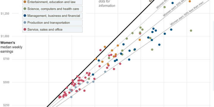
  • This graphic is from The New York Times graphics department. It matches the FlowingData colors. That is all. Oh, and it’s excellent, but that’s a given, right? Note the use of each bar’s two dimensions.

  • Data360 is a social data site similar to Swivel and Many Eyes but without any of the bells and whistles. It markets itself as a site designed for

    • organizational reporting
    • intelligence databases, and
    • collaborative analysis

    Unfortunately, Data360 fails in the above three categories, and here are my 8 reasons why. Read More

  • I’m not a music downloading monster like some, so I personally haven’t had any problems organizing and finding my music. However, for those who are downloading music every day (legally, I hope), I can imagine your music collection is getting quite out of hand. You probably can’t even remember what songs and albums you’ve downloaded over the past two years. What’s that High School Musical album doing there?

    That’s why this tool is in development. I haven’t tried it out, but from the screenshots, it looks like there is potential. Although it looks like the screen can get cluttered very quickly, and with too many songs, you might just end up with a big bubble cloud. If that actually is a problem, it kind of defeats the tool’s purpose since I don’t really care about visualizing only 20 songs. But like I said, I haven’t tried it.

  • In the usual fashion that we’ve come to expect from Stamen Design, Digg Pics shows us what pictures are being dugg as well as provides an opportunity to discover new pictures. As with its Digg Labs siblings, Digg Pics offers three streams — popular, newly submitted, and all activity.

    I always like to read posts that discuss the experimental phases and how a viz came to whatever it is; it’s kind of like when you know the history of a piece of art, you can appreciate it more. Eric goes into the design process at the Stamen blog. There’s screenshots of Stamen’s experimental layouts, and from what I see on Digg, I’d say everything came together quite nicely.

    The picture streams are split up into Digg categories where the number of times a picture is repeated represents the number of times the picture was recently dugg. The display is clean and smooth, and of course the interaction is quite nice (and useful).

    Another good one, Stamen!