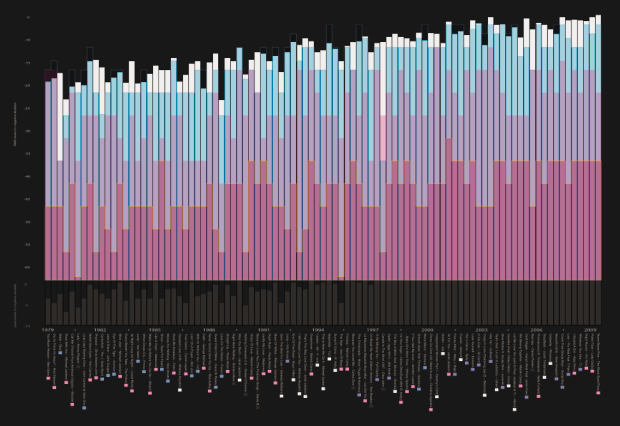
• I just noticed that when you click on “show details” in Google Reader, you get a graph of how frequently posts come from that feed and how often you read those posts. It used to only show subscriber count (via Google Reader) and when the feed was last updated. It’s one of those things where it’s like “so… what” and it won’t influence any of the decisions I make in life in any way, but hopefully when all of you “show details” for FlowingData all the red and blue bars are aligned :).

    P.S. Greetings from Chicago. It is much too early in the morning.

  • It was just a little over a week ago that The New York Times announced their Developer Network i.e. Campaign Finance API. Yesterday, they announced something more – the Visualization Lab. In collaboration with the Many Eyes group, the Times has rolled out a Many Eyes for data used by Times writers. You can visualize, explore, and comment on data posted at the Visualization Lab in the same way that you can at Many Eyes.

    Today, we’re taking the next step in reader involvement with the launch of The New York Times Visualization Lab, which allows readers to create compelling interactive charts, graphs, maps and other types of graphical presentations from data made available by Times editors. NYTimes.com readers can comment on the visualizations, share them with others in the form of widgets and images, and create topic hubs where people can collect visualizations and discuss specific subjects.

    A Few More Steps

    I said the API was a good step forward. The Visualization Lab is more than a step. No doubt The Times heard what I said about their API and decided to roll with it since I am the head authority on everything. Yes, I’m totally kidding, in case that didn’t come across as a joke. Come on now.

    I’m looking forward to seeing how well Times readers take to this new way of interacting.

    [Thanks, William]

  • Uniqlo gathered hundreds of responses from a couple hundred Japanese women about bra size, makeup, and shopping and put it into this sort of 3-d world of short video clips. Questions appear at the top, you get a few random video responses, and then the animation zooms out to show you the rundown. I can’t say I know what exactly is going on since I don’t know Japanese, but I’m guessing… bra commercial? OK, yeah, I have no idea.
    Read More

  • I started the FlowingData forums a few months ago to give others a chance to start their own conversations or to get advice on personal projects that need some attention. I admittedly haven’t done a very good job of promoting the forums, so I thought I’d give them a little bump.

    If you’ve got something interesting to share with the FlowingData community – post it to the forums. If you’ve got a question about the best way to visualize a dataset or want some honest opinions on how to improve an existing chart or graph – post it to the forums. I’ll post the most interesting and useful discussions here on the blog once a month.

    So what’re you waiting for? Sign up for a free account, and share with the rest of us. Stop being so greedy.

  • Terry Pettijohn and Brian Jungeberg of Mercyhurst College took a very close look at the curves, um, measurements of past Playboy Playmates of the Year in relation to the state of the economy.
    Read More

  • I don’t remember when I made this desktop wallpaper, but it was probably during one of those nights when there was nothing good on TV and I had nothing better to do. Anyways, it’s my current desktop wallpaper, and thought I’d make it available to all of you just in case someone wanted to flaunt their love for FlowingData.

    Here it is in the metallic gray variety. Enjoy. Click on the images to get the full-sized versions:

  • I’ve had sleep troubles for as long as I can remember. When I was in grade school, I used to stay up late (well past 10pm) listening to my Sony Walkman. I later got a 10-inch black and white television in my room from my mom’s college years. My sleep schedule only got worse in high school when I made my first big purchase with money that I had earned cutting vegetables and washing dishes in a restaurant – a beautiful 19-inch color television, with a remote! Now that I have to jump across time zones quite a bit, my sleep patterns have a hit an all-time low, so I was of course excited to receive my SleepTracker Pro in the mail a couple of weeks ago. I’ve been using it ever since.

    Tracking Your Sleep Patterns

    The SleepTracker Pro is a watch that measures your movements while you sleep and wakes you up at an optimal time so that you wake up feeling refreshed instead of cranky and incapacitated. The premise is that the SleepTracker wakes you up when you’re in an almost-awake state. When you’re in deep sleep or in one of your REM cycles, your body is paralyzed, which explains why it’s so hard to get up sometimes, so SleepTracker monitors your movements to wake you up when you’re not in a state of complete floppiness. You can later transfer the data to your computer – which is of course a feature I love.

    Pros

    Within the first few days of using my SleepTracker, I noticed an immediate difference. I was waking up feeling refreshed and ready to take on the day. It felt weird getting out of bed right when my eyes opened. I was so used to laying there for an hour not wanting to get up.

    Also – and this is probably obvious – I enjoy transferring my nightly sleep data to my computer and looking at my sleep patterns. Sometimes my wife works nights, so I can see the almost-wake states when she comes in really early in the morning. I also see the times when my cat manages to open the bedroom door and jump on my face.

    Cons

    While advantageous, the SleepTracker could use a few improvements:

    • The SleepTracker looks like something from the 80s. It’s a big watch.
    • It only stores one night’s worth of data, so if I forget to transfer data to my computer on a day, I lose it.
    • The Windows-only user interface is somewhat limited as far as visualization and insight goes.
    • A few times the vibration/alarm wasn’t enough to wake me up.

    Overall Sentiment

    I might never wear the watch during the day, but I will gladly put it on every night when I go to bed. The manual emphasizes changing your habits to get a good night’s sleep, which is a good point – and can probably be said for all types of self-surveillance. It’s not meant as a cure all. You can’t sleep 4 hours or drink a gallon of coffee before going to bed and expect to feel refreshed the next morning. Trust me. I tried. Uh, not the gallon of coffee part. I definitely noticed a difference though when I went to sleep at a decent hour.

    The SleepTracker Pro retails at $179, which might be too much for some, but I guess it just comes down to how much you value a good night’s sleep. Personally, I’m happy with it and the new source of personal data isn’t too shabby either.

    Has anyone else had any experiences with the SleepTracker?

  • Martin Krzywinski, whose previous work includes Circos, digs deep into the presidential debate transcripts with tedious manual (or was it automatic?) annotation of words (noun/verb/adjective/adverb), Wordle, and his custom metric called the Windbag index that measures speech complexity.
    Read More

  • This is a guest post from Michael Drumheller, Dirk Karis, Raif Majeed and Robert Morton of Tableau Software. They use Tableau to explore the relationship between polls and predictive markets.

    Predictive markets such as Intrade and the Iowa Electronic Markets have attracted more attention this year than in past Presidential elections. Some political observers such as ElectoralMap.net look to these markets as indicators of who’s winning or losing.
    Read More

  • It took me three months to do it, but the code to visualize the growth of Walmart is now available under a BSD license (that means free and open like a leaf in the wind):

    Download Walmarts.tar.gz

    I’ve included the Actionscript and the Walmart openings data, which should be all you need to create your own Walmart growth visualization, or if you’re more industrious, some other type of growth in the world. Let me know if you’re able to improve upon my code as there’s definitely a few areas that wouldn’t mind some improvement.

    So go wild, have fun with it, and let me know if you apply the code to another dataset. (I also wouldn’t mind if someone wrote some documentation.)

    UPDATE: I am no longer supporting this code.

  • One of the most frequent questions I get is, “What software do you…

  • I had no idea these comparative views of length of rivers and heights of mountains were so popular – at least in the 1800s. There seemed to be a fascination with placing rivers and mountains next to each other when normally, we’re used to seeing them intertwined in a geographic landscape. The above is actually just river lengths, but here’s one that places rivers and mountains next to each other.
    Read More

  • The New York Times announced the opening of their Developer Network a couple of days ago. It’s their “API clearinghouse and community.” It might seem kind of weird that a newspaper company has an API, but as many FlowingData readers know, the Times prides itself on innovation.

    The Campaign Finance API is currently available:

    With the Campaign Finance API, you can retrieve contribution and expenditure data based on United States Federal Election Commission filings. Campaign finance data is public and is therefore available from a variety of sources, but the developers of the Times API have distilled the data into aggregates that answer most campaign finance questions. Instead of poring over monthly filings or searching a disclosure database, you can use the Times Campaign Finance API to quickly retrieve totals for a particular candidate, see aggregates by ZIP code or state, or get details on a particular donor.

    For anyone who has tried to play with FEC data, myself included, knows that this API is cool. You could get the data directly from the FEC, but it’s a bit of a painstaking process. Now you don’t have to sift through a bunch of reports or an awkward user interface.

    The Movie Review API is next in line. After that, who knows, but it’s a good step forward for The Times.

    [via serial consign]

  • Thousands of bloggers are taking the time to discuss a single topic today – poverty. As we sit in our cozy homes, go out to eat, watch movies, or simply read the news on a computer, it’s easy to forget that there are millions of people around the world who aren’t so well off. Blog Action Day is an opportunity to remember and to perhaps help out in some way.

    Mapping Poverty Rates

    I of course took the visualization route. What better way to get the facts than through data? The US Census Bureau provides lots of poverty estimates, so I took their data and mapped it over the last 27 years. I found it alarming to see that some states had a poverty rate over 20%. I clearly live in a cozy bubble. What does your state look like?

  • From the guys who brought you 6pli and other like-minded network visualization tools, Bestiario takes 6pli to the next level. 6pli lets users explore their del.icio.us bookmarks. This work, in collaboration with Harvard Berkaman, also lets users explore their del.icio.us bookmarks – as well as YouTube videos, Flickr photos, Twitter tweets, and content from Wikipedia, blogs, and other places. Items are clustered by content type and meta information. Yes, it’s a whole lot of stuff in one place.

    The main idea is to take a few steps away from the list and scroll paradigm – sort of like DoodleBuzz, but from a more analytical standpoint. Does it make all those personal streams easier to browse and explore than something like FriendFeed? You be the judge.

    [Thanks, Jose]

  • Memeorandum shows up-to-date posts from leading political bloggers, and it is well-known that political bloggers are often very partisan. It’s not always obvious to new readers though which side of the line a blogger sits on. You certainly can’t always tell just from a headline on Memeorandum. So Andy Baio, with the help of del.icio.us founder, Joshua Schachter, created a Greasemonkey script (and Firefox plugin) to do just that. Simply install the script and browse popular political articles by their bias.

    With the help of del.icio.us founder Joshua Schachter, we used a recommendation algorithm to score every blog on Memeorandum based on their linking activity in the last three months. Then I wrote a Greasemonkey script to pull that information out of Google Spreadsheets, and colorize Memeorandum on-the-fly. Left-leaning blogs are blue and right-leaning blogs are red, with darker colors representing strong biases.

    Just a quick glance at Memeorandum with the plugin installed shows the magic works.

    How it Was Done

    Of course this isn’t just magic. It’s not human-powered. It’s a data-driven algorithm. It’s statistics. The data are the articles that the Memeorandum-listed blogs link to, so just imagine a giant matrix with number of links. They then use singular value decomposition (SVD) to reduce that matrix to one dimension which they use to estimate where on the political spectrum any given blog on Memeorandum sits.

    All you statistics readers (and maybe some of the computer scientists) should be familiar with SVD. I learned about it and played with it quite a bit during my first year in graduate school. Anyways, it’s cool to see statistics at work and how it can be useful in visualization. A lot of the time visualization projects are about getting all the data on the screen, but with a little bit of know-how (or help from someone who has it) you can produce projects that let the computer do a lot of the pattern-finding work and don’t make the user work so hard.

    By the way, Andy’s blog Waxy has become one of my favorite blogs as of late, so if political bias isn’t your thing, I’d still encourage you to go check it out.

  • Think of all the popular data visualization pieces out there – the ones that you always hear in lectures, read about in blogs, and the ones that popped into your head as you were reading this sentence. What do they all have in common? They probably all told a great story. Maybe the story was to convince us of something, compel us to action, enlighten us with new information, or force us to question our own preconceptions. Whatever it is, truly great data visualization reaches us at a very human level and that is why we remember them.

    Let’s face it. Data can be boring if you don’t know what you’re looking for or don’t know that there’s something to look for in the first place. It’s just a mix of numbers and words that mean nothing other than their raw value. The great thing about statistics and data visualization though is that they provide us with the tools to learn that the data are much more than a bucket of numbers. There are stories in that bucket. There’s meaning, truth, and beauty. Sometimes the stories will be simple and other times complex. Some will belong in a textbook; others will come in novel form. It’s up to the statistician, computer scientist, designer, or analyst to make that decision.
    Read More

  • DONE is a sketching project by Jonas Buntenbruch. He takes 30-60 minutes per day and puts his design skills to work. He began at the beginning of this year on January 1 and has produced a sketch/design for every day so far.

    Some of his work is charts and graphs, but most are of the typography, cartoon, and icon variety. Nevertheless, it’s a great way to hone the design skills. You learn what works, what doesn’t work, and skills that need sharpening. Learn by doing has always been my philosophy – mostly because I suck at learning by listening, writing, and reading. Seriously. I took a learning test in fourth grade that told me so.

    Can someone please do a data visualization per day? Don’t forget to make it awesome.

    [Thanks, Adam]

  • This computer simulation (video below) by Zhaw shows worldwide commercial flights over a 24-hour period. It’s been making the blog rounds lately. Watch as flights start in the morning in the western hemisphere, and as the sun starts to come up in the east, more flights begin in the east. I’m not sure if we’re seeing actual GPS traces or just interpolated flight paths from point-to-point data, but my guess is the latter. Does anyone understand the language on Zhaw?
    Read More

  • OPEN N.Y. put together an amusing (and informative) graphic for a New York Times op-chart. It shows the height and weight of presidential candidates dating back to 1896 when William McKinley, weighing in at 5 feet 7 inches, won the election to become 25th president of the United States. The tall lead 17-8 and the heaver lead 18-8. William J. Bryan didn’t stand a chance. Will Barack Obama add to the big and tall’s lead or will John McCain win one for the little guy?

    [Thanks, Tom]