Someone needs to get me a paper copy of Willard Cope Brinton’s Graphic Presentation (1939), because it is awesome.
Brinton discusses various forms of graphic presentation in the 524-page book and what works and what doesn’t. There’s also some good stuff in there about how to make your graphs, charts, maps, etc (by hand).
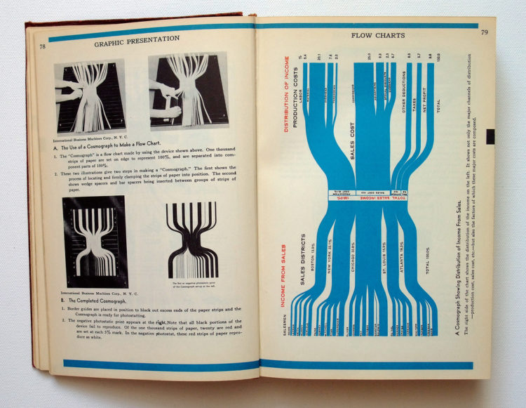
Have we seen these?
The most interesting part is that many of the graphics – despite having no computers in 1939 – look a lot like what we have today. Albeit, they’re a little rougher because they’re made by hand, but that’s just added flavor.
For example, you’ve got the Sankey diagram above, or a “cosmograph” as Brinton calls it. The instructions read:
One thousand strips of paper are set on edge to represent 100% and are separated into component parts of 100%.
What? You want me to arrange 1,000 strips of paper to make my diagram? Brilliant, I say.
Here are your choropleth maps…

network diagram…

and of course some of your usual suspects…

The entire book is freely available in PDF format, but it’s low resolution and takes forever to browse. Michael Stoll has posted some higher quality shots on Flickr.
I still want more though.
Seriously, does anyone know where I can get a copy?
[via Datavisualization.ch]

 Visualize This: The FlowingData Guide to Design, Visualization, and Statistics (2nd Edition)
hi, thx for posting this. the book is awsome, indeed. and it’s really hard to get. a good try maybe to look on abebooks.com.
Abebooks.com doesn’t appear to have it.
I see an earlier work has been reprinted — http://www.amazon.com/gp/product/B002IC0AGC — but that’s not the one you’re looking for. :(
Here you go, one copy only but its in CA
http://www.amazon.com/s/ref=nb_ss?url=search-alias%3Dstripbooks&field-keywords=willard+cope+brinton+graphic+presentation+unknown&x=0&y=0
darn looks like someone bought it already
Alibris http://www.alibris.co.uk/ does not have it.
No, that is it. It is a reprint on demand. If you are looking for a 1939 copy, it looks like you’re out of look.
http://www.worldcat.org/oclc/318932&referer=brief_results
Looks like about 207 libraries own a copy, you can probably ILL it from any University in the US.
You wouldn’t own it, but at least you would get a chance to peruse it in print.
Archive.org has it at http://www.archive.org/details/graphicpresentat00brinrich
And the Archive’s copy comes from the Prelinger Library in San Francisco http://www.prelingerlibrary.org/
Here’s a used one for sale on Amazon.com: http://www.amazon.com/gp/offer-listing/0405135041/ref=ed_oe_h_olp
signed by the author in 1929!
wow, sold already, jeez
big 1939 seller. the more i look for it, the more i want.
Pingback: Moonlit Minds « Moonlit Minds
Nathan – I saw that you live in Buffalo at the moment. I do too, and the public library has a copy at the central branch, which is downtown.
http://web2.buffalolib.org/web2/tramp2.exe/see_record/A1gqfhg6.006?server=1home&item=2&item_source=1home
Check out Worldcat.org and do an advanced search with title and author’s last name. Looks like there are lots of copies floating around in libraries as others have mentioned…
Pingback: Area Scaled Map from 1930 – Markets are People - Visualmotive Blog
there are two copies in Australia…one at the State Library of NSW, should be getting my hands on it soon, will let you know how it is!! =)
Pingback: Data Visualization Without Computers « IASSIST Communiqué
You may also look for / enjoy his Graphic Methods for Presenting Facts (1917). I picked up a copy for less than $20 a few years ago. There appear to be copies available, and Google Books has it:
http://books.google.com/books?id=Vn9xAAAAIAAJ&dq=willard+brinton&printsec=frontcover&source=bl&ots=golhBaZUXG&sig=oZ8hNZNwXlyCY8JOmMyfMHVxPHk&hl=en&ei=p3eyStjkJY7tlAfYl5GNDw&sa=X&oi=book_result&ct=result&resnum=2#v=onepage&q=&f=false
I would be interested to see the works from his other book as well, (Graphic Methods for Presenting Facts (1917). Is there some place I can do it? I didnt find anything in online or in local libraries so far.
thanx
Google Books has it online:
http://books.google.com/books?id=Vn9xAAAAIAAJ&dq=willard+brinton&printsec=frontcover&source=bl&ots=golhBaZUXG&sig=oZ8hNZNwXlyCY8JOmMyfMHVxPHk&hl=en&ei=p3eyStjkJY7tlAfYl5GNDw&sa=X&oi=book_result&ct=result&resnum=2#v=onepage&q=&f=false
Pingback: Four Cool Things I Saw Today « 21dB
Pingback: Bookmarks for 10/05/2009 — MK Anderson
Pingback: Planner Reads » Blog Archive » Vintage Infographics From the 1930s
Just checked it out of my University library. It had to be dug out of the annex stacks (ie. storage) and it is quite nice! The actual content of some of the graphs is often amusing.
@Carlos – lucky you :)
Here you go Nathan: I found a few copies listed on Addall:
http://used.addall.com/SuperRare/RefineRare.fcgi?id=100420111358657457