Matthew Bloch, Ford Fessenden, and Shan Carter continue the New York Times geographic sexiness with their recent interactive, mapping taxi flow across Manhattan over time. The scroll up top lets you move through times of the week, or just press play and watch it go. You can also roll over blocks to see rides per hour.
Read More
-
-

Affording Health Care – Some weirdness going on with the area chart on the curve of the leg, but I like the aesthetic of the graphic overall.
Wolfram Alpha shifts focus to ubiquity – Lowered iPhone app price by 96% and brought back mobile version of website.
State of Twitter Spam – With lots of users comes more bad ones. Luckily Twitter has been making good steps forward.
FollowTheMoney – Updated so you can easily download all contribution records for your state, local officials, or committees. Create an account or sign in via Facebook.
P.S. Happy Easter!
-
Edward Tufte was officially appointed to a White House advisory role a few weeks ago. Tufte, along with other experts like Ben Shneiderman, have been providing input for the last year or so.
Tufte has a short chat (embedded below) with On the Media about what’s been going on with Recovery.gov. The main point: report data like The New York Times.
The first thing I said about a year ago when I met with them for the first time is that their model should be a first-rate news website… Once we got the news metaphor and got the intense mapping, that’s halfway there. I wouldn’t give it an A yet. There’s, you know, still a ways to go, and I know some of them, and I hope to, you know, find a few more.
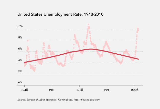
Once Recovery.gov is further along, hopefully other government organizations follow suit, starting with Data.gov…or maybe Census…or the Bureau of Labor Statistics…or Centers for Disease Control and Prevention…
Listen to the six-minute interview below.
Read More -
Location-aware apps are the hot topic nowadays, and with all the tech-oriented people congregating at South by Southwest, there was a whole lot of checking-in to be done, especially with all the parties and get-togethers. Everyone wanted to know where everyone else was at.
SimpleGeo scraped the location stream, which was available on vicarious.ly, and mapped the check-ins over time.
I didn’t spot any particularly interesting patterns other than the occasional bar-hopping, but still fun to watch. Looks like Foursquare leads, with Gowalla taking a big chunk too.
To be honest, I still feel kind of uneasy about the whole location-sharing thing. Anyone care to share their experience?
[Thanks @mrflip]
-
As you know, there’s this big wave of transparency going on right now, and many organizations want to do more than just post a bunch of spreadsheets. They actually want to visualize it and share their data in a way that can be consumed by the general public. InstantAtlas aims to make that easy – without any code.
Read More -
Some people love ’em and others hate ’em. Now you can play with streamgraphs (seen here and here) yourself, whatever side you might be on. Lee Byron has made the code available on Github, under a BSD license.
It’s in Processing, and it’s not plug-n-play like many of you are probably hoping for, but on a quick skim, the code does look very readable and shouldn’t be too hard to grasp for those with a little bit of coding knowledge. I recommend reading Lee and Martin’s streamgraph paper first though.
-
March 22 was World Water Day, and TreeHugger posted this graphic on drinking water that is available in the world. The main point is that a very small percentage of water in the world is actually drinkable. It’s definitely a story worth telling, but the graphic doesn’t work at all. Even as a simple presentation of percentages (from UN-Water Statistics), it’s confusing.
How can we improve this graphic to tell the story more clearly? Discuss.
[Thanks, Donald]
-
GitHub is a large community where coders can collaborate on software development projects. People check code in and out, make edits, etc. Franck Cuny maps this community (with Gephi), based on information in thousands of user profiles.
Read More -
Design student Kenichi Tanaka animates the history of Japan for his final thesis project.
He pokes fun at his culture a little bit there in the beginning, yeah? I feel like something is getting lost in translation.
Update: The English version was taken down, unfortunately. Here’s the original Japanese version. The graphics are still in English, so you can probably understand most of it without the narration.
[Thanks, @pims]
-
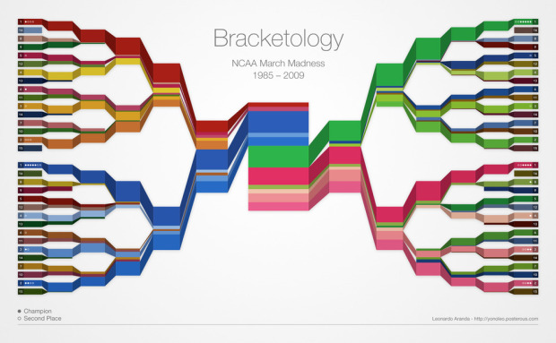
The Final Four is just about here. Who’s going to win it all? It’s anyone’s guess at this point, but what we can do while we wait is examine who’s won in the past. Leonardo Aranda takes a gander at who has won in each round since 1985, by ranking, with a color-coded bracket that resembles a stacked area chart.
I think if he used just two colors per corner (instead of entire palettes) and brightness indicating rank, it might be a bit easier to read in the first rounds. At the very least, you could find the Cinderella stories quicker, which is the most exciting part of the tournament a lot of the time.
I still like the concept though. It reminds me of Stephen’s crayon colors.
See the full-sized version here.
Who’s your money on?
[Thanks, Leonardo]
-
In a follow up to Apps for America, Sunlight Labs just introduced their next contest: Design for America.
This 10 week long design and data visualization extravaganza is focused on connecting the talents of art and design communities throughout the country to the wealth of government data now available through bulk data access and APIs, and to help nurture the field of information visualization. Our goal is simple and straightforward — to make government data more accessible and comprehensible to the American public.
There are three subject areas to appeal to different types of designers too. There’s data visualization, process transparency, and redesigning the government for a total of seven challenges each with a $5,000 top prize. Not bad, eh? Visit Sunlight Labs for more details.
By the way, I’m one of the judges (along with Charles Blow, Andrew Vande Moere, Nicholas Felton, and others). You’ve got about two months to show me what you got. Go on, I dare ya.
-
How to: make a scatterplot with a smooth fitted line
Oftentimes, you’ll want to fit a line to a bunch of data points. This tutorial will show you how to do that quickly and easily using open-source software, R.
-
A few centuries ago, scientists designed the periodic table to organize the elements we knew about in a way that was useful. Elements were grouped by similar properties on the horizontal and vertical. Somewhere down the line, more recently, someone decided to squeeze a different dataset into the same structure. It made very little sense, but it caught on. Maybe because it looked scientific and official. I don’t know.
Now there’s a periodic table of funk, typefaces, candy, and heck, there’s even one for visualization.
So many tables. How do we sort all of them? With another periodic table, of course, and so without further ado, here is the periodic table of periodic tables by Bill Keaggy. Yay?
[via @EagerEyes]
-
IBM has been spreading the whole “smarter planet” spiel for a while now, but in the past few days, they’ve revealed the punchline. It’s data. The key to a smarter planet is learning how to process and extract information from the 15 petabytes of data we generate per day.
Surprising? No, not at all. Data’s the hot thing right now, and that’s where the money’s at. Learn how to process all of it and you’re gold.
Read More -
We all know that data is the new sexy, so it’s only natural for data to find its way into jewelry. This weather bracelet represents a year of temperatures and rain. Peak heights are mapped to minimum and maximum daily temperatures, and the holes in the sides represent weekly rainfall.
Read More -

You know when you’re going through old junk and find something really awesome that you completely forgot about? Well that’s what happened to me the other day, and lucky for you it’s free e-copies of Beginning Python Visualization. Four of them, actually.
Simply leave a comment below by Sunday, March 28, 11:59pm EDT for a chance to win, and then come back to this post on Monday to see the winners. Let’s make it a round of desert island. Name the five movies that you would want to take with you if you were stranded on a desert island.
I’ll get it started:
- Back to the Future
- Forrest Gump
- Billy Elliot
- Shawsank Redemption
- The Sting
Good luck!
P.S. Here’s my review of Beginning Python Visualization, in case you missed it.
Winner Announced
Congratulations to the four following people. You should have received your redemption codes via email by now.
Thanks everyone else for participating, and good luck next time.
-
-
Spam sucks. We all hate it, but no matter how good the filter, something always seems to get through. Want some cheap Vi4gr4? I can tell you where to get it. New Scientist takes a look at the spamdemic. It costs very little to send tens of thousands of emails, but it only takes a tiny percentage of idiots to make it all worth it for spammers.
Seriously – who falls for these things?
- oRo1exWatches $200 Off – Each Free Shipping Watch, 2 Days Left, Snap UP! rkru kp
- USA: ~Percocent~Ritalin best sale !!
- ~~~Good day :~~~Vicodi~ _ P~ercocet~~~
- 100 percent male power
- Heartfelt Plea from Supreme Master Ching Hai: Be Organic Vegan and Loving Kindness for Saving Lives
I have to admit my spam folder does supply brief moments of amusement every now and then, but come on.
[via Data Mining]
-
We use visualization for a lot of different things, and its purpose varies person-to-person. Some use it to report the news. Others use it purely for analysis and decision-making. Some even use it for artistic expression. What do you use visualization for? Select the answer that best fits you below. If you select “other,” let us know what that means in the comments.
{democracy:13}
Recently for Members
Second Edition
 Visualize This: The FlowingData Guide to Design, Visualization, and Statistics (2nd Edition)
 Visualize This: The FlowingData Guide to Design, Visualization, and Statistics (2nd Edition)
New tools, refined process.
Browse by Chart Type See All →


