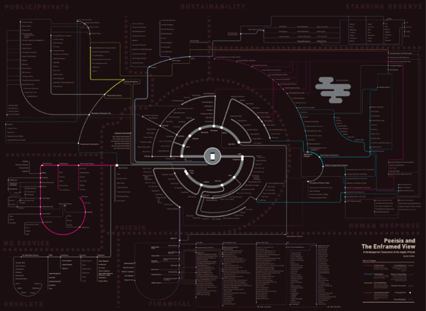
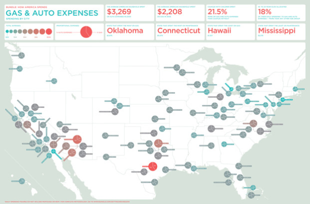
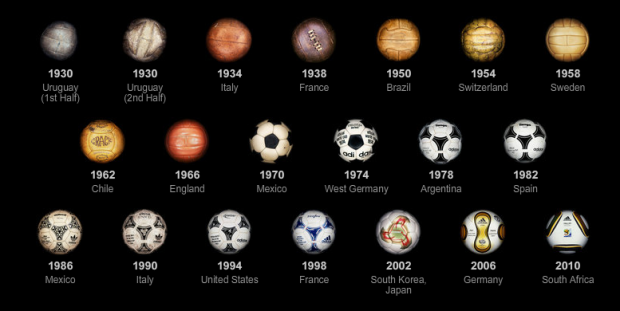
We use visualization for a lot of different things, and its purpose varies person-to-person. Some use it to report the news. Others use it purely for analysis and decision-making. Some even use it for artistic expression. What do you use visualization for? Select the answer that best fits you below. If you select “other,” let us know what that means in the comments.
-
{democracy:13}
-
I didn’t fill out my bracket this year, so it’s not nearly as exciting for me. I don’t think that’s stopped thousands of bars across the country from cleaning house though.
[FastCompany via Good]
-
Add another site to the list of places to find the data you need. Data Marketplace connects people who want data to people who can find, scrape, and cull data.
Here’s how it works. If you want data, you put in a request and optionally, a deadline and budget. A provider can then go find that data for you, maybe through scraping a difficult-to-parse website, and then post it online. You then have the option to purchase the tabular data.
There are three big humps to get over though for Data Marketplace to work.
Read More -
As corny as the Ronco infomercials are, you can’t help but stop and…
-
The strange science of Francis Galton – Inspired by his cousin Charles Darwin’s work, he created the statistical concept of regression and correlation, but he was one crazy dude. Also invented the term eugenics and coined the phrase nature versus nurture.
Flickr Flow – Wattenberg and Viegas explore the colors of the seasons through Flickr pics. [thx, abigail]
Wild Bill Bunge – A look at the pioneering work of influential cartographer, William Wheeler Bunge, Jr., the anti-academic. [thx, chris]
C-SPAN Video Library – 160,000 hours of unadulterated C-SPAN video, “like being able to Google political history.” [thx, jesse]
-
Before you dive into the advanced stuff – like just about everything in your life – you have to learn the fundamentals before you know when you can break the rules.
-
I’m 96% sure this isn’t true. [Mark Goetz via dataviz]
-
A big thank you to FlowingData sponsors. They keep the virtual lights on around here and allow FlowingData to keep growing.
I can also tell you that all of them show up in the sidebar because I know they’ll be useful to many of you. Check out the data tools these fine groups have to offer:
InstantAtlas – Create and present compelling data reports on geographic maps.
Tableau Software – Data exploration and visual analytics in an easy-to-use analysis tool.
Xcelsius Engage – Create insightful and engaging dashboards from any data source with point-and-click ease.
Business Intelligence – Visual data analysis made easy. Try 30 days for free.
RWW Graph Contest – ReadWriteWeb Interactive Graph Contest
Create an interactive graph and enter to win a trip to Web 2.0!Xcelsius Present – Transform spreadsheets into professional, interactive presentations.
-
You should have received your Census survey by now. Did you fill it out and mail it yet? If not, get to it. Tim Meadows can only do so many door-to-doors.
Read More -
We’re inventors – we’re creators. And that’s the most important thing about what we do. And I think we should welcome failure every once in a while.
Hannah Fairfield – NYT Graphics Editor, Malofiej 18, March 2010Last year at Malofiej, one of the major awards ceremonies for infographics in journalism, The New York Times took home ‘Best in Show’ for their work on box office receipts from 1986 to 2008. I’m sure most of you saw it. It was non-traditional. It was an adaptation of Lee Byron’s streamgraph, which he had previously applied to last.fm music listening habits – a smoothed stacked area chart at the core.
Read More -
With his usual cleverness, Christoph Niemann illustrates the everyday as Google maps. My favorite is the omelet highway. Oh what a twisty and confusing highway this GPS-less life is.
Read More -
Yesterday was the Interactive Infographics panel at South by Southwest, and if Twitter is any indication of how it went, I’d say the panel had a captivated audience. I wouldn’t expect anything less from the four panelists, Ben Fry (Processing), Shan Carter (NYT), Casey Caplowe (Good), and Eric Rodenbeck (Stamen)
Unfortunately, I didn’t get to attend, but luckily I was able to follow the play-by-play on Livefyre (sort of a cross between chat and forum) along with some excellent notes from @jpmarcum and @bryanconnor. Here are the important bits I was able to glean.
The bulk of the time was spent showcasing the work from the four groups. I think you can find most of the projects through FlowingData. Just use the search form on the bottom right of this page. The good stuff came towards the end during the Q&A.
Read More -
Designer Christopher Harrell talks about, with a dose of various embedded graphics, pointing your skills toward something good. Harrell’s video was one of the winners in the What Matters to You scholarship competition for Vancouver Film School. It looks like home video, but that just adds to the charm.
Read More -
In 1870, Francis Walker oversaw publication of the United States’ first Statistical Atlas, based on data from the ninth Census. It was a big moment for statistics in the United States as the atlas provided a way to compare data on a national level using maps and statistical graphics.
What continues to amaze me about these old illustrations is the detail – all done by hand. That’s ridiculous. The kicker is that a lot of this stuff looks way better than a lot of what we see nowadays. Here are some selections from the 1870 atlas.
Read More -
If people put data on the Web – government data, scientific data, community data – whatever it is, it will be used by other people to do wonderful things in ways they never could have imagined.
— Tim Berners-Lee, TED, February 2010Tim Berners-Lee, credited with inventing the World Wide Web, comes back to TED a year after his call for open, structured data with a quick update. Spoiler alert: things are looking good – and they’re only going to get a lot better. But you already knew that, right?
Read More -
For as far back as I can remember, I’ve always had corned beef and cabbage on St. Patrick’s Day, or at least on the week of.
-
How to split up the US – Geographic clusters based on social network connections on Facebook. [thx, przemek]
Rise of the Infogeeks – Lots of graphic designers have taken a liking to information graphics.
Bay Area Rapid Transit (BART) gives augmented reality a go – Point your iPhone at the station and get info on when the next train is coming.
Google Public Data Explorer – Trying to get more mileage out of the Trendalyzer acquisition. [thx, eric]
-
Here’s the idea. The government recommends a diet for healthy living (right pyramid), but at the same time there are billions of dollars of lopsided subsidies (left pyramid) whose distribution doesn’t look anything like the former. The Physicians Committee for Responsible Medicine (PCRM) used the above 3-d pyramids to present this information.
Interesting point. Funky presentation. Discuss (remakes highly recommended).
[via The Consumerist]
-
The opening page of We Feel Fine: An Almanac of Human Emotion
reads a quote from “a woman in Maine.” It sets the stage for the rest of the book.
I have a problem I’m sure many other bloggers face: I am perfectly comfortable sharing intimate details about my emotions with complete strangers I meet online but shy away from expressing my true feelings to anyone I know in real life.
For those unfamiliar, We Feel Fine is a project from Jonathan Harris and Sep Kamvar that’s been online since 2006. At its core, the goal is to show the emotions of the authors behind millions of blog posts on the Web by looking for sentences that start with “I feel” or “I am feeling.” It’s an interactive artwork “authored by everyone.”
Read More -
In a follow up to his McDonald’s map, Stephen Von Worley of Weather Sealed maps the dominating burger chains across the United States. McDonald’s obviously has a stronghold in a lot of areas but not all of them. Most noticeable is Sonic Drive-in with over 900 restaurants in Texas alone. Personally, I’m rooting for Carl’s Jr. and In-n-Out.
[via We Love Datavis]