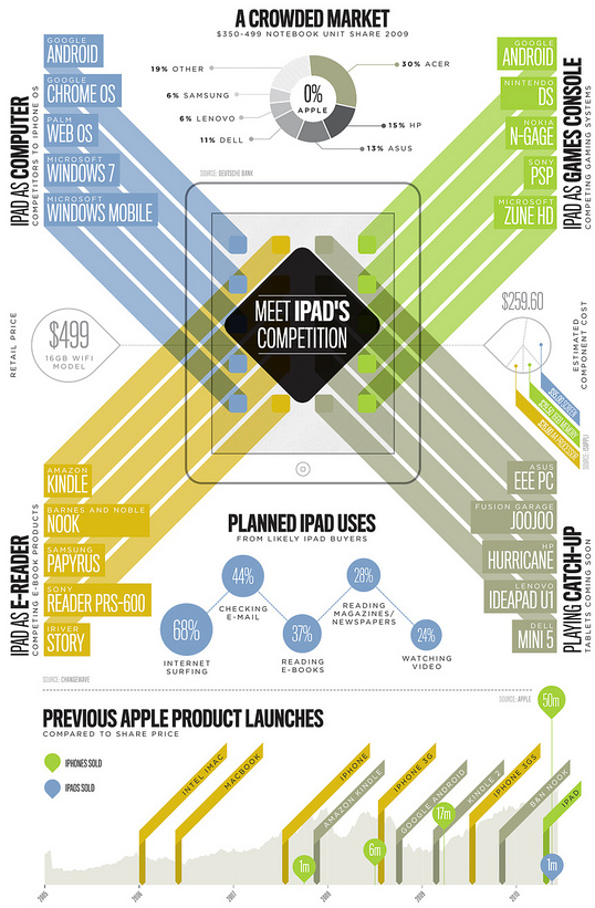
Light on the data, heavy on the aesthetics. Super pretty by Section Design. [via]
Meet iPad’s competition
FlowingData Delivered to Your Inbox
5 Comments
Second Edition
 Visualize This: The FlowingData Guide to Design, Visualization, and Statistics (2nd Edition)
 Visualize This: The FlowingData Guide to Design, Visualization, and Statistics (2nd Edition)
New tools, refined process.
Pingback: Morning Take-Out - DealBook Blog - NYTimes.com
Pingback: (Infographic) Meet iPad’s Competition - PSFK
Pingback: - b2bweb.fr – Work Wild Web @ BornToBeWeb
Pingback: Take 2: the iPad's competition | Laura O'Grady, PhD