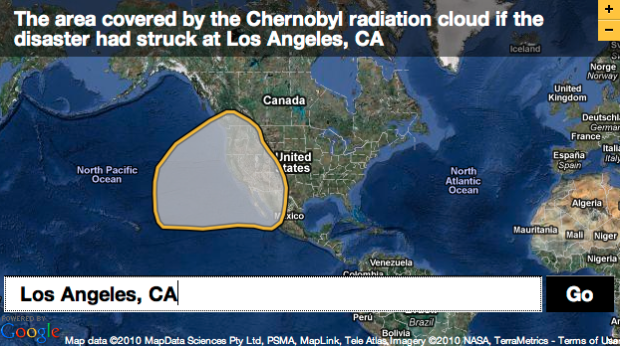
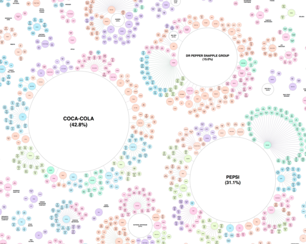
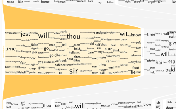
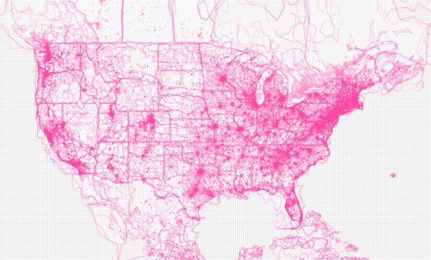
• Zum Kuckuck, a design group in Germany, visualizes data interchange and network traffic with Processing in this beautifully executed installation.
    Read More

  • It’s July 4 this weekend. You know what that means, right? It’s Independence Day, and really, there’s no better way to celebrate than to stuff down as many hot dogs down your throat as you can in ten minutes. Or if that doesn’t sound appetizing, you can just enjoy watching the annual Nathan’s hot dog eating contest on Coney Island.
    Read More

  • Contrary to what a lot people might think they know from the movies, the X-Men universe stretches out quite a ways with lots of characters and lots of relationships. This super detailed relationship map for all X-Men characters from UncannyXmen shows just that.

    Connections are color-coded to show the type of relationship between a pair of characters. For example, green is a one-sided infatuation, pink is a flirtation by both parties, and a dashed line signifies one of the characters is from an alternative reality. Wolverine sure gets around.

    [via VizWorld]

  • Manolith, in collaboration with InfoShots, tells the story of Twitter. The graphic starts at Twitter’s humble beginnings and ends at present day where you pretty much can’t go a day without hearing about that little bird. I wonder what this Twitter tree will look like next year.

    [via Techcrunch]

  • Visualization on the Web is growing, but a lot of the really good stuff is just sitting around on someone’s computer. So to get a discussion going about how we can get more visualization out there – theory and application – Robert Kosara of Eager Eyes, Andrew Vande Moere from information aesthetics, and myself are heading up a workshop at VisWeek in October. It’s in Atlantic City.

    We’ll share some of our experiences, but mainly we want to know what’s on your mind. Submit your one-page position statement and tell us about your experiences, propose discussion topics, or ask questions that you’re wondering about. We’ll review the topics and you’ll hear from us by the end of July. Get your submissions in by July 17.

    Find more details here.

  • RoamBiThis is a guest review by Peter Robinet of Bubble Foundry, a web design company that specializes in building websites for Web startups.

    What It Is

    RoamBi is a free data visualization application for the iPhone by MeLLmo. You download datasets to the app and it creates visualizations so you can drill down into the data. The app is pitched as a mobile business tool for viewing sales reports and the like, but the sample visualizations included with the app suggest another possibility: RoamBi could easily be a killer app for statistics-minded sports fans, such as sabermetrics devotees!
    Read More

  • Say what you want about Michael Jackson, but there’s no denying the great effect he had on the music world. In honor of the pop king’s passing, practically half of The New York Times graphics department stayed up late last night building this graphic. It takes a look at his majesty’s Billboard rankings over his career compared to other popular music artists.

    Decade after decade Jackson produced numerous hit albums. Click through time to see the mountains of each. Timeless.

    To the man, to the legend, who no one will ever be able to replace:

    [Thanks, Amanda]

  • abc-logoThe folks over at AllBusinessCards have generously donated 1,000 business cards to three lucky FlowingData readers. Uh, read that as three FlowingData readers will each win a set of 1,000 business cards. Design your own or pick from a template.

    How Do I Enter?

    All you have to do is pay me one thousand dollars. No, I’m totally kidding. Ten thousand. A million?

    Okay, okay, nevermind. I’ll make it easy on all of you. Simply leave a comment at the bottom of this post. If you’re too lazy, just copy someone else’s comment (and let it weigh on your conscious for the rest of your life :).

    Do this by today at 11:59pm EST. I’ll randomly pick three winners. One entry per person, and as always, make sure you leave a valid email address so I can contact you if you win. Winners in the continental United States get free shipping and internationals just have to cover shipping. Good luck!

  • Tufte’s Invisible Yet Ubiquitous Influence – Edward Tufte combines a policy wonk’s love of data with an artist’s eye for beauty and a PR maestro’s knack for promotion.

    Look at these &$(*@^@# Statistics – It’s heavy on the swear words and light on the actual data, but I guess it’s amusing. Just don’t click if you’re offended by potty mouth. [Thanks, j2]

    Why Making Maps Guides Us to Be Greener – A picture is worth a thousand words, and that’s the case for maps too. Turns out, using some visual mapping helps groups show people their purpose and get the support they need to accomplish their goals.

    Financial Responsibility in the United States – In the growing trend of financial applications posting infographics to drive traffic, here’s another one.

    Is Information Visualization the Next Frontier for Design? – I don’t know. What do you think?

  • Two years ago on June 25, 2007, I wrote the first post for FlowingData. It was rambling gibberish, and I really had no idea what I was doing. I was just randomly gibbering to no one in particular. It’s a little different now. Still random at times, but a little less so.

    Somewhat surprisingly, I’ve only missed a handful of days over the past two years. This will be the 675th post on FlowingData, plus 5,271 comments and another 644 posts in the FlowingData forums. Oh and let’s not forget the 26,400 caught spam comments. Thanks, Akismet.

    Here are the most popular posts over the past year:

    1. 27 Visualizations and Infographics to Understand the Financial Crisis
    2. 5 Best Data Visualization Projects of the Year
    3. Visual Guide to the Financial Crisis
    4. Pixel City: Computer-generated City
    5. Watching the Growth of Walmart Across America, Interactive Edition
    6. Little Red Riding Hood, the Animated Infographic Story
    7. Maps of the Seven Deadly Sins
    8. 17 Ways to Visualize the Twitter Universe
    9. 40 Essential Tools and Resources to Visualize Data
    10. 37 Data-ish Blogs You Should Know About

    We also just passed We’re also up to almost 18,000 subscribers today, which continues to amaze me. FlowingData had 2,600 subscribers at the one-year mark. I can only imagine what FlowingData will be in another year. As you might remember, I had to transfer FlowingData to a better server to keep up with the increase in traffic. This of course wouldn’t have been possible without the sponsors. Thanks for the support, sponsors.

    Finally, a big thank you to all of you who send me suggestions and share links with others via social media sites like Twitter, Digg, and del.icio.us. You’ve all helped shape FlowingData into what it is today.

    Here’s to another year of data.

  • How long does it take to burn off the calories from a Big Mac and medium fries or a chocolate chip cookie? Petra Axlund of 5W Infographics shows with this infographic how long you have to exercise, after eating a certain item, to burn it all off.

    The red outside track shows the number of calories from the food item, while the inside tracks represent how long it takes for a male or female to burn off those calories with different exercises.

    Percentage Problem

    While creative, and as they say, visually appealing, it doesn’t quite work technically speaking. The primary purpose of this graphic is to compare how long it takes to burn off the calories of a food item with different exercises. However, arc lengths are formed by percentage of an undefined whole, as opposed to count (in this case, calories on the outside and minutes out the outside).

    Okay, that last paragraph probably made no sense. Let’s look at an example. This issue is most evident in pizza section. According to the graphic, it takes the average male 352 minutes to burn off a pepperoni pizza while it takes just 234 minutes to run it off. Therefore, the running arc for male should be about 2/3 the size of the walking arc if it were a bar chart.

    Instead we’re comparing percentages, and the running arc sorta looks like it’s about 3/4 the size of the walking arc. It’d probably look different if you were to roll out the arcs into bars, but that’s too much brain power for me. I’m lazy like that.

    How it Could’ve Worked

    I think there’s another way to make this graphic work other than making a bunch of bar charts. Instead of graphing minutes to burn off x amount of calories, show number of calories burned after x hours of exercise. It’d still be a little weird and less colorful, but it’d be more informative and easier to compare. It’s mostly eye candy and a one-way reference as it is now.

    Gosh, I hate to be so critical, but it just doesn’t work for me. What do you think?

    [via metrobest]

  • fingerprintThere’s a lot of crime data. For almost every reported crime, there’s a paper or digital record of it somewhere, which means hundreds of thousands of data points – number of thefts, break-ins, assaults, and homicides as well as where and when the incidents occurred.

    With all this data it’s no surprise that the NYPD (and more recently, the LAPD) took a liking to COMPSTAT, an accountability management system driven by data.

    While a lot of this crime data is kept confidential to respect people’s privacy, there’s still plenty of publicly available records. Here we take a look at twenty visualization examples that explore this data. Read More

  • digits
    Photo by Leo Reynolds

    Undoubtedly you’ve been seeing a lot of headlines about the stuff going on in Iran. If you haven’t, you must be living under a rock.

    One of the huge issues right now is whether or not fraud was involved in the election of Mahmoud Ahmadinejad.

    Wait a minute. Voting? Results? Numbers?

    Oh, we have to look at the data for this one. Bernd Beber and Alexandra Scacco, Ph.D. candidates in political science at Columbia University, discuss in their Op-ed for the Washington Post:

    The numbers look suspicious. We find too many 7s and not enough 5s in the last digit. We expect each digit (0, 1, 2, and so on) to appear at the end of 10 percent of the vote counts. But in Iran’s provincial results, the digit 7 appears 17 percent of the time, and only 4 percent of the results end in the number 5. Two such departures from the average — a spike of 17 percent or more in one digit and a drop to 4 percent or less in another — are extremely unlikely. Fewer than four in a hundred non-fraudulent elections would produce such numbers.

    Why does this matter? Well humans are bad at making up sequences of numbers. Made-up number sequences look different from real random sequences (e.g. numbers from McCain/Obama). Beber and Scacco go on to describe the details of why the data look fishy. For those of us who’ve read Freakonomics will recognize the discussion.

    The result?

    The probability that a fair election would produce both too few non-adjacent digits and the suspicious deviations in last-digit frequencies described earlier is less than .005. In other words, a bet that the numbers are clean is a one in two-hundred long shot.

    Now what?

    [via Statistical Modeling]

  • Oh why not, it’s Friday. Have a good weekend, everyone. Go have yourself a slice of beautiful chocolate Belgian tart… or some other beautiful treat. You deserve it.

    [Thanks, Ian]

  • Python is a powerful programming language that’s good for a lot of things. I mainly use it for data scraping, parsing, munging, etc, and more recently, for the Web, and I’ve left visualization up to other languages.

    But why not use Python for visualization too? That way you can have everything in one language and all the gears can fit together a little easier. Beginning Python Visualization (BPV) by Shai Vaingast is a guide to help you do this.

    While you might need a little bit of programming experience to fully make use of this book, Vaingast provides plenty of examples and explanations for you to easily learn how to use Python’s visualization options.
    Read More

  • Inc.com just released their annual valuation guide for 2009, which allows business owners to gauge the value of their, uh, business. At the center of this guide is an interactive “business valuation calculator” by Tommy McCall. I guess the best way to describe the graphic is Trendalyzer with some style and added functionality.

    Each dot represents an industry and the position on the chart indicates whether the companies in that industry are priced high or low. Press the play button and watch how prices change between 2002 and now.

    Finally, if you’ve got a business of your own, enter your own values to for a custom value estimate.

    [Thanks, Sarah]

  • Visualize This (and win)

    This round of Visualize This is a fun one. We’ve got the Rambo kill chart, which shows well, a breakdown of kills in each of the four Rambo movies. It’s surprisingly detailed with several cuts of the dataset like number of bad guys killed by Rambo with his shirt on and off, number of good guys killed by bad guys, number of people killed per minute, and several others.

    The problem is that the data is just in a table. Surely we can do better than that. Can you visualize this?

    Person with the best viz gets a copy of Darrell Huff’s classic How to Lie with Statistics. Get your entry in by July 1. One entry per person.

    Cool Threads

    • Visual Ideological History of the US Supreme Court: Alex Lundry visualizes the last seven decades of ideologies of US Supreme Court judges. Interact through the years and split the data in several ways.
    • Visualizing Biological Data: VisualMOA is an information browser for the Microbial Online Analysis database. Is it useful without subject knowledge?
    • Processing vs. Flash: Both are heavily used for visualization on the Web, but both have their pros and cons. Processing is good for coding beginners. Flash loads quicker using vectors. Which one should you use?
    • Mapping SPAM and Sensornet Attackers: Using some heat mapping and Circos, Ben, a visualization beginner, is looking for some input.
  • A big thank you to our FlowingData sponsors who help keep the servers running. This blog would be running at a snail’s pace otherwise. Check out their sites to see the useful visualization tools they have to offer.

    Tableau Software — Data exploration and visual analytics for understanding databases and spreadsheets that makes data analysis easy and fun.

    NetCharts — Build business dashboards that turn data into actionable information with dynamic charts and graphs.

    IDV Solutions — Create interactive, map-based, enterprise mashups in SharePoint.

    InstantAtlas — Enables information analysts to create interactive maps to improve data visualization and enhance communication.

    East-West Center — The non-profit is looking for an information designer to put together a series of graphics for their online and print publication.

    Want to be a FlowingData sponsor? Email me, and I’ll get back to you with the details.

  • Check out my guest post on The Guardian’s Data Blog on the current state of social data applications. There are what seems like a ton of them but none of them have really taken off (yet).

    While the post is more of an overview of what’s available, I’d like to start a little discussion here on why these data apps haven’t gained more popularlity. There always seems be a lot of buzz around launch time, but then it fizzles.

    Are people just not interested in interacting with data or do we need to approach the whole social data puzzle from a different angle?

  • We spend so much time trying to make our graphs accurate, simple, understandable, etc that we forget the lost art of making graphs that are inaccurate, unreadable, make absolutely no sense, and make your eyes want to vomit. I’m so tired of understanding data. I want to experience it, and I know you want to also.

    So this one’s for you, crappy graph.
    Read More