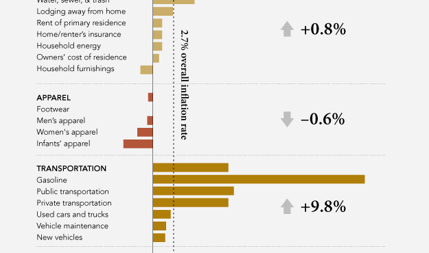
Women’s clothing sizes have always confused me. My wife always has to try on an array of sizes, and it seems to vary by store. For me, on the other hand, when I’m looking for pants, I just look for waist, length, and maybe cut. As we’ve seen, men’s actual sizes can change by brand, but it looks a lot more confusing for women, as shown in this graphic from The New York Times.
Read More
-
-
 R can be confusing when you’re first starting out, especially when you don’t have any experience in programming. There’s a lot of documentation online, and package developers do a decent job at providing examples on how to use their work in your code, but that stuff is not always easy to find. It’s easy if you know the name of the package or function you’re looking for. However, most of the time you just know what you want to do—like sort a data frame or test a regression model—and not the name of a package.
 The R Cookbook by developer Paul Teetor might be your answer.
Read More -
Recommendation site Hunch is another one of those applications that knows a ton of random stuff about its users. In case you’ve never signed up, you start by answering a bunch of seemingly unrelated questions, and based on your answers, Hunch offers recommendations by correlating your answers with preferences for you and others. This graphic, in collaboration with Column Five Media, shows differences between Mac and PC people within the Hunch community.
Among the findings: Mac people are 95 percent more likely to prefer indie films; PC people are 26 percent more likely to prefer fitting in with others; and as for cable TV networks, Mac people prefer Bravo, HBO, and Showtime, whereas PC people prefer Syfy, History, and USA.
-
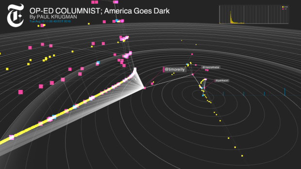
For online publications, it’s useful to know how people share links to articles and news via outlets such as Twitter. How does an article go from publication to viral? Does one person with a lot of Twitter followers share a link, or is getting lots of individuals to tweet the key? You have retweet counts, but that doesn’t tell you anything within the sharing timeline—just the final result.
Project Cascade, by Jer Thorp, Mark Hansen, and Jake Porway as parts of the New York Times R&D Lab, helps you see how news spreads.
Read More -
On January 11, 2002 the first detainees arrived at Guantánamo. On January 22, 2009, President Obama ordered Guantánamo to close in a year. The Guantánamo Docket is an interactive database compiled by The New York Times and NPR that shows the detainment and transfer of 792 men.
The Times and NPR have reviewed thousands of pages of government documents released in recent years, as well as court records and news media reports from around the world.
Visually explore changes over the past few years. Each row represents country of citizenship, with detainees on the left and transfers on the right. As you can see, according to a variety of documents, there are currently 172 detained and 600 who have been transferred.
[New York Times via @mericson]
-
Sunlight Foundation displays some key government numbers with Easter candy, because as you know, data is ten times more interesting when it’s represented with Peeps and chocolate eggs. Happy Easter, all.
[Sunlight Foundation | Thanks, Nicko]
-
In the most recent media push for Charity: Water, a video of motion graphics explains the importance of clean water and what millions have to go through every day just to get something questionable to drink. Twenty dollars can buy one person access to a safe water source. Kristen Bell narrates.
[Video Link via @JonathanJarvis]
-
Similar discussions going on in the cartography branch among UW Madison geography folks. Start with the post by Tim Wallace (where the above Venn came from). Then read the responses of Andy Woodruff and Daniel Huffman.
-
Nice piece from NYT on seeing your life in data:
“There’s going to continue to be innovation with new, powerful data around the plumbing of the human body,” [Jason] Jacobs said. “What everyone is starting to realize is that it’s great to collect data, but somebody needs to make sense of all of this data.”
Personal data collection is still a geek activity, but soon it won’t be. Either that, or more people will become geeks. It’s like, you know, so in vogue right now.
[New York Times via @feltron]
-
Shopping for a house? Sometimes it can be advantageous to wait a while, and the price of the house you’ve had your eye on might drop. It’s all about getting the most for your money, right? The Trulia Price Reductions Map can help with that. It shows the average number of days until house prices tend to drop for the first.
Read More -
OkCupid adds another report to their growing list of analyses on relationships. This time around, they look at sex and how ideas vary by demographic. The above graph shows per capita GDP versus portion of people looking for casual sex.
We were amazed at this result—money seems to be a more powerful influence on sex drive than culture or even religion.
You have, for example, Portugal, Oman, Slovenia, and Taiwan within a few pixels of each other on the right side of the graph, and Syria, Sri Lanka, and Guatemala almost stacked on the left, and all of them sit along the trend line.
Interesting as usual. What amazes me more is that so many people answer such private questions. Have any of you tried OkCupid? Are these questions part of the matching process?
See OkCupid for more findings on sex such as drive and body type and Twitter usage and commitment.
[OkCupid]
-
Researchers Alasdair Allan and Pete Warden have found that the iPhone records cell tower access, and hence your location, in an easy-to-read file that is transferred as you switch devices. And they do this whether you like it or not.
The more fundamental problem is that Apple are collecting this information at all. Cell-phone providers collect similar data almost inevitably as part of their operations, but it’s kept behind their firewall. It normally requires a court order to gain access to it, whereas this is available to anyone who can get their hands on your phone or computer.
Allan and Warden provide an open-source application, iPhone Tracker, that maps that data. The good news is that the data doesn’t seem go to be anywhere other than your own backups and devices. Privacy concerns aside, this kind of makes me wish I had an iPhone; although I suspect my map would be painfully boring.
[iPhone Tracker via Marco]
-
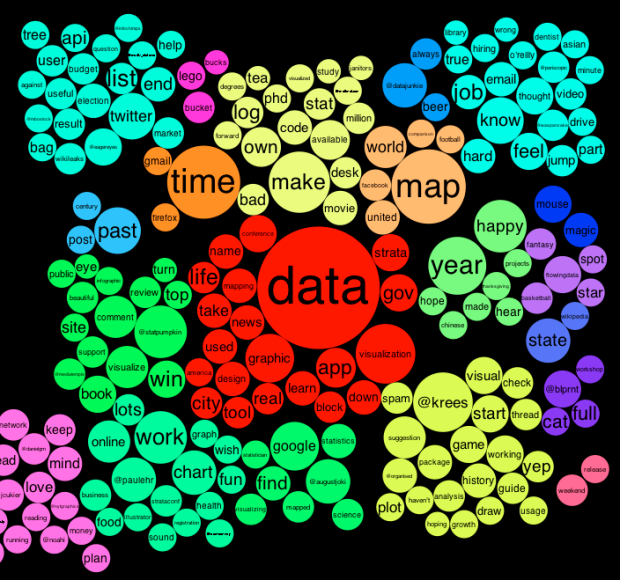
When you first come across a Twitter account it can be hard to know if you want to follow that person or organization, based on the most recent tweets. Jeff Clark’s Tweet Topic Explorer gives you a quick view of that. Enter a username, and you get a clustered cloud of bubbles. Larger bubbles indicate topics that are tweeted more often and topics that are closely correlated (that is, appear together often) are colored the same.
Above is the view for @flowingdata. As you’d expect, data is in the center, and it branches out from there.
Read More -
In an op-ed for CNN and perhaps adding fuel to the fire, Martin Wattenberg and Fernanda Viegas, leaders of Google’s Big Picture project, talk visualization and its future.
In reference to rules of simplicity and the data-to-ink ratio derived from works such as that of William Cleveland and Robert McGill:
The single-minded pursuit of clarity and precision led to designs that were, sure enough, clear and precise. Grid lines receded discreetly into the background; Tufte’s beloved beiges and tans became standard recommendations.
However, is there something more? Using Hans Rosling’s widely-viewed TED talk as an example:
Was animation really the most precise way to show the data? Probably not, but the motion, color, and energy helped capture the imagination of millions of viewers across the world.
Finally, Viegas and Wattenberg end with:
Emotions and a strong voice aren’t necessarily sins in other media, and they shouldn’t be in visualization, either. By recognizing that being expressive and engaging doesn’t mean giving up clarity, we will have fulfilled the promise of visualization.
It’s common to look at data through a factual lens, where all meaning and insight is quantitative. This fits well in many settings, but there are other stories to tell that are personal and even moving.
[CNN via @infosthetics]
-
Dorothy Gambrell of very small array charts median Tomatometer ratings of the top 10 grossing films, since 1950. From the graph it looks like movies are getting worse, but are they really? This goes back to a similar argument from a couple of months ago. The decline is probably more of an indicator of reviewers, viewers, movie types, and ease of watching than it is of a drop in quality.
-
DisplayCabinet is a clever use of a projected display and RFID tags to take data away from the computer screen an into the physical world.
Read More -
Business intelligence expert Stephen Few goes on another rant about information graphics — mainly about the work of David McCandless, designer of The Visual Miscellaneum. Few’s post is in response to another from Teradata marketing director Mario Bonardo, praising innovation and new ideas, etc for business intelligence.
Read More -
Don’t you just hate it when you’re pleasantly driving around in the city and you’re suddenly enveloped by a giant pie chart in the road? Such a downer.
Read More -
Designer Patrick Smith has a minimalist look at mental disorders:
I was doing some research about mental health and I came across a list of mental disorders. I chose a few, starting with OCD, and set myself the challenge of defining each in a minimal style.
The OCD graphic is definitely the best one of the bunch. Others include agoraphobia, anorexia nervosa, and depression.
[Adapt & Graphic Patrick]


 Visualize This: The FlowingData Guide to Design, Visualization, and Statistics (2nd Edition)


