• I always know when something exciting happens in the World Cup when my Facebook stream is flooded with announcements of a goooooooaaaal. On any given day, certain players are more talked about than others. The New York Times explores the day-to-day fluctuations of player mentions in Facebook status updates. Read More

  • I’m in the fifth year of my statistics PhD, and the time has finally come where I need to lock myself in my office and write a thesis. It’s going to be amazing fun, I assure you. I’m hoping I’ll reach true nirvana somewhere along the way.

    Since I’ve all but finalized my thesis defense date for the end of this summer, it’s going to be a hectic three months. This month, I’ll be working hard to roll out a usable and useful application that some of you will be able to use. There will be more details, but it has to do with memories, calendars, and it’s in the same spirit of your.flowingdata.

    After that, I’ll write.

    I’m telling you this, because my brain is going to be in another place for the next few months. I fully intend to regularly update FlowingData. I’m too OCD not to, but if I happen to miss a day, you’ll know why.

    Email responses will also slow to a snail’s pace. But please do keep sending in suggestions to [email protected]. Your post ideas will help the flow coming since I won’t be able to stay on top of things as well as I’d like to.

    Finally, if you have any visualization-related questions, you should definitely post it to the forums before emailing me. There are nice people who hang out there sometimes, so you’re more likely to get a response through there than through my neglected inbox.

    Alright. Here we go. Let the fun begin.

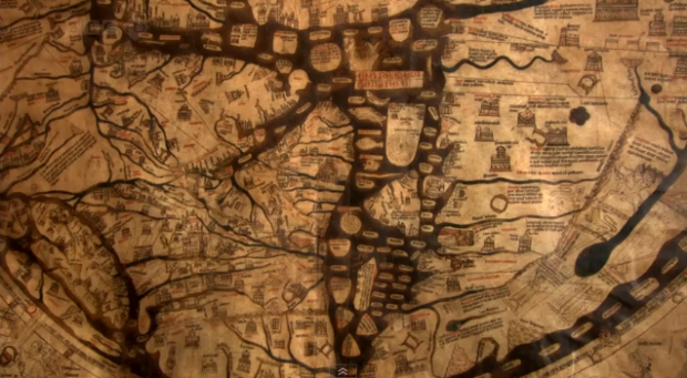
  • GIS guy Jonah Adkins maps the geography of Lost (the tv series). It looks like I missed out on quite a bit. Unfortunately, I only got up to the point in the first season where they saw a dead person hanging in a tree. I could not deal with all the insane cliffhangers.

    I’m sure many of you were fans though, so you can stare at the maps for a while to temporarily fill the gaping hole in your life since the show ended.

    [via We Love Datavis]

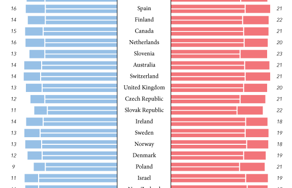
  • I really want to like this graphic on the “worth” of FIFA players. The colors pop and the topic is potentially interesting. There are some graphics 101 pitfalls going on here though. How can you make this display better? Leave your two cents in the comments below.

    [via We Love Datavis]

  • In part of their initiative to get young and old people to hang out, We Are What We Do, in collaboration with Google, built Historypin. The map application invites people to upload their pictures and pin them in street view. The effort creates something of a digital time machine where old and young can find common ground.

    Obviously, the more people who use it, the more useful it becomes. There doesn’t seem to be ton of pictures yet, so all you get is Google street view in a lot of places.

    It’s easy to see the potential though. Just imagine being able to watch the evolution of your city, town, or neighborhood, like a block-specific museum with people’s personal stories and old photos with modern context.

    [via infosthetics]

  • My many thanks to the FlowingData sponsors who help keep the gears turning and let me do what I do. FlowingData wouldn’t be around without them. Check ’em out. They do data right.

    Tableau Software – Combines data exploration and visual analytics in an easy-to-use data analysis tool you can quickly master. It makes data analysis easy and fun. Customers are working 5 to 20 times faster using Tableau.

    InstantAtlas – Enables information analysts and researchers to create highly-interactive online reporting solutions that combine statistics and map data to improve data visualization, enhance communication, and engage people in more informed decision making.

    Want to sponsor FlowingData? Email me for details.

  • Arno Ghelfi for Businessweek reports on who’s doing what online, separated by age. The grid aesthetic totally works for the Internet theme, which can feel robotic and bit-wise at times.

    From top to bottom are the more active users to the more passive. Age groups run left to right. So as we sweep top left to bottom right, we see the younger generation who is more likely to write blogs and upload videos to YouTube, to an older crowd who are more likely to be content consumers.

    Update: Doh, this is from 2007. This cross-country move is throwing me out of wack. Oh well, it’s still an interesting piece of Internet history.

  • With the announcement of Google Voice for everyone, the big G describes the history of human communication in the graphic above – and consequently, how Voice is the next step in the evolution. We begin with the tin cans in 1810, to the telephone in 1876, then the first email in 1971, and tada, we arrive at Google Voice in the present. Average international call cost per minute serves as the backdrop.

    I gotta get me one of those vintage mobile phones of 1979.

    [via]

  • Field Design takes a look at a day in London:

    LDN24 is a new public art installation for the Museum of London. It draws filmic impressions and the facts and figures of London life into a picture of 24 hours in the life of the city. Statistics and statements from the web and a huge database are printed along the LED screen by the seconds’ hand of a 24 hours clock. Weather, traffic and news updates, the Thames’ tides, Tube updates and recent fire incidents are pulled live from numerous RSS feeds, Twitter and news portals.

    I can easily see myself standing there entranced by the display for a long while – if I were from London. What I really want is a big circular display like for a day in the life of Nathan.
    Read More

  • The World Cup is an event where countries from all over the world compete, but what about the teams themselves? Players may play for a single country, but many are ‘imported’ from elsewhere in the world as their day jobs are actually elsewhere. This isn’t a new thing, but teams have certainly become more multicultural over the years. Read More

  • I love how major sporting events can captivate an entire country or region, especially when there’s the data to show the collective pulse. We saw it during the Canada-United States hockey gold medal match. Everyone flushed together. Similarly, O2, a UK mobile service provider, shows us texting volume during the World Cup and highlights the points of interest. England scores a goal and there’s a flood of text messages. Goooal. Read More

  • Buck, in collaboration with TakePart and An Inconvenient Truth director, Davis Guggenheim, describe the education crisis in America in motion graphics for upcoming documentary, Waiting for “Superman”. Watch the video below. It’s a more or less a run of education vitals, but it flows well and has a nice look and feel.

    Plus, it’s an important subject we should know about. Maybe a new movement will get going once education gets the “inconvenient” treatment.
    Read More

  • The third installment of Pixar’s Toy Story is making a killing at the…

  • Can you believe it? FlowingData is three years old today. I’m in the middle of a cross-country move, so I can’t get into the number rundown like I usually do, but I just wanted to take this chance to thank all of you for reading. Thanks for sharing links with your friends and sending in suggestions. Every retweet, like, digg, and stumble helps FlowingData reach a wider audience.

    It seems so long ago when I was just rambling to myself around here. Now there are 40k of you. Next year, 100k?

    Thanks to all the sponsors too, past and present, who help keep the gears turning around here. I couldn’t have done it without you.

    Happy birthday, FlowingData!

    Grab a sticker and show your undying love for FD for everyone to see :).

  • Anyone can listen to music, but how can you see it? The Music Animation Machine plays music (ancient MIDI files) and displays it in real-time. On the vertical are notes and time runs on the horizontal. Here’s Debussy’s classic Clair de lune, otherwise known as that song from the Ocean’s 11 through 13 soundtrack, where they all gather at the fountain and give a nod of recognition to each other. Read More

  • For the most part, you go about your day-to-day with little knowledge of all the bits and networks you walk past or intersect with. Designer Timo Arnall visualizes these wireless networks of WiFi, bluetooth, etc. in the physical world (video below). It’s a simple idea. As we move through the landscapes, white dashed circles move around buildings with WiFi and people carrying mobile gadgets. Read More

  • After a few years of fighting the good fight, charting and data site Verifiable closes shop in August. The idea spawned during an Edward Tufte workshop and developed into an effort to provide a tool that people could come to for facts by the numbers. Read More

  • I think it took me a few months to beat Super Mario Brothers 3 on Nintendo. Follow the directions in this graphic, and you should be able to beat it in 11 minutes. It’d probably still take me a few months. My video game talents tapped out at Kaboom on Atari. [via]

  • Ben Millen diagrams the reach of the iPhone in our everyday lives:

    These are not maps in any conventional sense, but rather diagramatic representations of the interconnected space of technology, capital, instrumental value, exchange value, social and environmental impact that surround the device.

    The tube map metaphor is a little worn, but this is subtle, so it’s not so bad. There are two maps. One covers the mechanics of the phone while the second is more about how consumers use the phone. The former is the more interesting one.

    So who’s going to do the map for my 2004 Samsung flip? It takes a lickin’ but keeps on tickin’.

  • In a follow-up to their graphic on what America spends on food and drink, personal finance site Bundle, with the help of Nicholas Felton, looks at money spent on gas and auto expenses in major US cities:

    The average household spent $5,477 on gas and auto expenses last year, according to Bundle data, an amount which accounts for about 14.5 percent of daily spending.* That’s more than we spend on groceries or utilities, and more than we spend on travel, entertainment, clothes and shoes, and hobbies — combined.

    The sticking-out label thing doesn’t really do it for me. The coloring makes the graphic worthwhile though, and the scaled two-section pie charts are pretty good too. What’s going on down there in Austin?