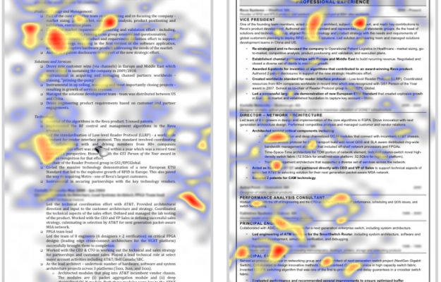
• It’s been one year since my rambling post on creating effective visualization. It seems so long ago. What was I thinking? Since then, FlowingData has grown to 313 posts, 801 comments (plus tens of thousands of spam), and 2,600+ subscribers, and continues to slowly climb the ranks on Technorati.

    It was exciting when FlowingData hit the 1,000-subscriber mark back in March and even more so when some really big blogs linked here and FlowingData was on the front page of del.icio.us. Who would have thought data visualization and statistics was so popular? I certainly didn’t know – which was why I started FlowingData in the first place.

    Most Popular FlowingData Posts

    I’ve featured a lot of great data visualization and statistics over the past year by some very intelligent and talented people. Here are the 10 most popular posts over FlowingData’s short one-year history.

    1. 17 Ways to Visualize the Twitter Universe
    2. Showing the Obama-Clinton Divide in Decision Tree Infographic
    3. 10 Largest Data Breaches Since 2000 – Millions Affected
    4. Ebb and Flow of Box Office Receipts Over Past 20 Years
    5. 21 Ways to Visualize and Explore Your Email Inbox
    6. Chart of the Day: A Breakdown of Facebook Applications
    7. Love, Hate, Think, Believe, Feel and Wish on Twitter
    8. 6 Influential Datasets That Changed the Way We Think
    9. Area Codes in Which Ludacris Claims to Have Hoes
    10. How to Learn Actionscript (Flash) for Data Visualization

    Thank You

    Thank you everyone for reading, linking, and suggesting topics. The blog wouldn’t be the same without you. We’re well on our way to reaching 5,000 subscribers. If you know someone else who’d be interested in FlowingData, please do pass the word along. I’ll super appreciate it.

    Happy birthday, FlowingData!

  • For the next few days, I’m in Bremen, Germany for a conference on statistical graphics. The official name is Statistical Graphics: Data and Information Visualization in Today’s Multimedia Society.

    While unsure about some conferences, I’m about 100% sure that I will enjoy this one. The schedule looks very promising with speakers whose papers I’ve read, but have never had the chance to meet. I’ll be speaking on data visualization for self-surveillance and personal discovery, but mostly I’m interested in what I’m going to learn the next few days.

    EuroCup 2008 is also on the schedule. It’ll be my first European soccer viewing experience. Very exciting – especially since Germany is in the semi-finals.

    Live Blogging the Conference

    I’m going to try to live blog the event (the conference, not the soccer). There are 35 talks over the four days, so I imagine I’ll be note-taking like a fiend. However, a fare warning – there is a chance the jet lag will get the best of me. Just a slight chance.

  • Mark Coleran has hands down one of the best jobs in the world. He makes infographics for feature films. His résumé includes Mr. and Mrs. Smith, Lara Croft Tomb Raider, The Island, Harry Potter and Blade 2. The infographics don’t have to show real data; they just have to look cool. Well, I’m sure that’s not all there is to it, but I bet awesomeness is a leading requirement. Coleran fills it well.
    Read More

  • FlowingData on Alltop – Alltop describes itself as the digital magazine rack of the Internet collecting stories from “all the top” places on the Web. You’ll now find FlowingData on both the Design and Science racks. While you’re there, check out all the other cool sites.

    Excel Contest for Science and Engineering – Jon Peltier, a frequent FlowingData commenter, is running a contest on modeling science and engineering. The key phrase is – A winner will be drawn at random.

    Video Game Addicts Not Shy Nerds – A study “showed” that only 1% of problem gamers (in their sample) had poor social skills. What a load off my back.

    Surveying the Family Feud Surveys – The WSJ Numbers Guy takes a look at the 100-person surveys on the long-running game show. Survey says?!?

  • As intelligence goes up, happiness goes down. See, I made a graph. I make lots of graphs.

    Lisa Simpson. The Simpsons. Episode 257. January 7, 2001.
  • This organic visualization, code_swarm by Michael Ogawa from UC Davis, has been making the rounds on the Web lately, and rightfully so. The data: history of commits to a software project. However, instead of focusing on the actual code, the spotlight is on the relationships between developers and their code.

    Watch as developers commit code to the repository, the types of files they commit, and watch the life-like organism grow. Below is a video demo of code_swarm that shows the development of the Eclipse IDE:

    The way code swarms, flashing and zooming towards its developer, provides a very human aspect to something that can often feel cold, mechanical, and lifeless. Just one of the many reasons why I love data visualization.

    [Thanks, Simon]

  • Last month I asked FlowingData readers, “What are your favorite data visualizations in recent memory?” I’d heard of some while others were brand new to me. Here are some of your responses.

    Richard said, “Hans Rosling, no question.” Of course referring to the famed Gapminder.

    Tom said, “I’m really liking [Akamai] right now.” Srikanth replied, “That one is pure awesome.”

    Srikanth also liked Lee Byron’s Daylight.

    Tony said, “Definitely this one about Manny’s quest for 500 homers!”

    Chris provided two of his favorites, Flickr Galaxy and Life of a Cell. “The Flickr galaxy awesome, showing a great user interface and a glimpse of 3d on the web… and I’m also a big fan of the ‘Life of the Cell’ video.”

    “I’m a big fan of the Baby Name Voyager… simple, attractive, interactive, informative, elegant” says CTV.

    Nice use of Google Chart API,” says Clint.

    Tim said, “The best I’ve seen in recent years.” I agree.

    Thanks to everyone who responded to provide us all with some eye candy (and a bit of humor).

  • 43 Things is a goal-setting community where people set goals, cheer each other on, and connect with others who are trying to achieve the same thing. Even if you’re not setting goals yourself, it’s still interesting and often amusing to see what others have set out to do e.g. go skinny dipping, have a one night stand, and be myself.
    Read More

  • A few months ago, I started monitoring how I spent time on my computer to procrastinate less. One month later, I found that the way I kept track of what I was doing wasn’t detailed enough to be useful. I knew that I was spending a lot of time online, but I had no idea what I was doing that time. Was I working and researching or was I wasting a lot of time on YouTube and Facebook? So I switched to RescueTime to get the breakdown and my goal to stop procrastinating started over.

    It’s been two months now, and here are the results.
    Read More

  • With gas prices going crazy high lately, here’s this weekend’s question:

    How much and where from did you pay for your latest gallon of gas?

    I just paid $4.11 for my last gallon and live in Buffalo, New York. That was a +$40 tank fill up – for a Honda Civic. Blech.

    P.S. Happy early Father’s Day to all you dads out there!

  • Freebase is one of my two new favorite toys, the other being my Xbox 360. Freebase is a free database of the world’s knowledge, licensed under Creative Commons and provides an API to enable mashups and applications. That means a powerful driving force for data visualization.

    Attend the User Group Meeting

    On June 17, Freebase is holding their bimonthly user group meeting in San Francisco. They’ll be presenting Freebase’s new features as well as discuss some interesting mashups and visualizations. So if you’re in San Francisco, RSVP now, and go get some free pizza, beer, and a t-shirt.

  • There’s reading a book, and then there’s looking at, exploring, and experiencing a book. That’s what these 12 book visualizations are for.
    Read More

  • Ash Spurr, in a project to try to understand Obsessive Compulsive Disorder, took inventory of and categorized every distinguishable object in his bedroom – books, DVDs, CDs, documents, storage bins… It’s a simple idea yet really interesting. OCD – yet another example for you to take part and enjoy our summer project. What does your room look like in data?

    [Thanks, Tim]

  • With the unveiling of the brand new iPhone 3G, Twitter has been buzzing with excitement. One of the more interesting new iPhone features is built-in GPS. Your iPhone will know when and where it is, opening up tons of possibilities for location-based applications – one of them being personal sensing, or rather, participatory sensing.

    Seeing the World in Data

    This is what I’ve been heavily involved with lately, working with the UCLA Center for Embedded Networked Sensing. Instead of iPhones, we use Nokia N80s. It’s the idea that individuals can use existing mobile technologies to gather and analyze data about the world around them.

    On With the Show

    Here’s our super cool, unbelievably awesome video taking a look at the near future of personal data collection with everyday mobile phones:

    A little corny, yes, but informative.

    How can non-experts make use of such huge amounts of data? I’m glad you asked! Visualization of course. More on this later.

  • The most recent FlowingData poll asked what you use to analyze and/or visualize data. Thanks to all 347 of you who participated.

    I was surprised by the percentage of you who mainly use Microsoft Excel, mostly because last month’s poll showed a near majority of you in computer science, design, and statistics. Although, R did have a strong showing too. Maybe it’s the information scientists and business folks representing for Excel?

  • Data visualization means different things to many people. To some it’s an analytical tool while to others it’s a way to make a statement. In my experience, those interested in data visualization fall into these five categories.

    The Technician

    WrenchTechnicians are all about implementation. They have a strong programming background with experience in Processing, Actionscript, or some other similar language and probably have worked with large databases at one point or another. To technicians, aesthetics is not as important as getting things to work. After everything – database, hardware, code – is hooked together, it is then the technician tries to spruce things up. Show them a visualization and they’ll want to know to know how it was made.

    The Analyzer

    Chalk BoardData is priority to analyzers. Like technicians, aesthetics are not the greatest concern; rather, analyzers want to know the relationships between variables, find positive and negative trends, and are most likely to tell you that you should have used a different type of graph or chart for that dataset. Tools like R, Microsoft Excel, and SAS are analyzers’ weapon of choice. Many will have programming experience but don’t code as well as technicians. Show an analyzer a visualization and they’ll most likely comment on the (complex) patterns they see.

    The Artist

    Paint brushArtists are obsessed with the final product – what the visualization will finally look like. They are the designers who are most likely to think long and hard about colors, visual indicators, and whether or not that square box should be moved up 2 pixels to the left. Programming is not a strong point, but if it is, it’s most likely in Processing. The weapon of choice though is the Adobe Creative Suite, namely Illustrator and Photoshop. Artists are most likely to tell you that something is ugly.

    The Outsider

    The OutsiderThe outsider is the one with a complex data set but not quite sure what to do with it. Outsiders are the field experts who want to visualize their data but might not have the know-how to follow through. They can, however, provide plenty of context and usually have a sense for what their data is about. You’ll most often see the outsider with a pen and paper explaining things to the technician, analyzer, and artist.

    The Light Bulb

    Light BulbLight bulbs are the idea people. They’ve got some programming, design, and analytical experience, but they’re not necessarily experts in all three areas. Because of all the experience, the brighter bulbs can usually handle a large data visualization project on their own (if they had the time). Knowing what’s possible and not possible, light bulbs lead projects and can delegate work across a team. It’s all about the big picture for the bulbs while the brightest are like the zen masters of data visualization.

    I consider myself some combination of the analyzer and technician. I’m still searching for the artist in me. I’ve got some design experience, but there’s still a lot to learn – always more to learn.

    What data visualizer type are you?

  • The above New York Times graphic shows where each candidate got his or her support from. The x-axis (horizontal) represents strength of support and the y-axis shows the number of states.

    On the surface, it’s a stacked bar chart, but the animation as you browse the groups (e.g. under age 30, whites, blacks), makes things interesting. Highlight a state and watch it move left to right and right to left or just click on “blacks” and watch all the states shoot to the right in support of Obama. FlowingData readers will recognize the names of the skilled graphics editors who made the graphic – Shan Carter and Amanda Cox.

    [Thanks, Chris]

  • The DiceCory Doctorow from The Guardian writes about our inability to understand the statistics of rare events. We obsess so much over the near-impossible probability that something could happen that it clouds our vision of more probable events.

    The rare – and the lurid – loom large in our imagination, and it’s to our great detriment when it comes to our safety and security. As a new father, I’m understandably worried about the idea of my child falling victim to some nefarious predator Out There, waiting to break in and take my child away. There’s a part of me who understands the panicked parent who rings 999 when he sees some street photographer aiming a lens at a kids’ playground.

    But the fact is that attacks by strangers are so rare as to be practically nonexistent. If your child is assaulted, the perpetrator is almost certainly a relative (most likely a parent). If not a relative, then a close family friend. If not a close family friend, then a trusted authority figure.

    Says Doctorow, such misunderstanding is why we gamble in casinos and why we have to wait in long security lines at the airport. We see piles of money and terrorist attacks when ultimately, the chances that you’ll win a jackpot or pass over violence is much less likely – near impossible – compared to losing all of your money and losing valuables to a curious luggage handler.

    If there’s one thing the government and our educational institutions could do to keep us safer, it’s this: teach us how statistics works.

    Amen to that.

    [Thanks, Jan]

  • Want to have some fun and win an Amazon gift certificate in the process? Read on.

    Personal data visualization has a huge advantage over other types of visualization. Personal visualization is about you, for you, and the data is from you. That’s a ton of background information with very little effort. As Jeffrey Heer noted in Socializing Visualization, people tend to spend more time exploring data when they connect personally to what they are seeing.

    This Project’s For You

    Running off this idea, this summer project is all about you – literally.

    Take a moment and think about the data “flowing” off of you. How much did you spend on coffee over the past month? How much sleep did you get yesterday or the past week? Did you gain or lose weight this year? Look through your past billing statements, your iTunes listening history, or your car’s odometer.

    Do you have a certain number (or series of numbers) in your head now? What do you see?
    Read More

  • The Bestiario design group seems to have been busy lately. Their latest project, TEDSphere, unsurprisingly, places the ever-so-popular TED talks series in a spherical space. You can watch TED talks from both inside and outside of the sphere, which is pretty cool.

    inside tedsphere

    Talks are connected with lines to show relationships between lectures. Originally, I thought relationships were talks with similar tags, but I clicked around, and that doesn’t seem to be case, so I’m not immediately sure.

    Similar Look and Feel

    TEDSphere has a similar look and feel to Bestiario’s previous works with the 3D browsing and connections, which is nice and often provides smooth browsing experience. Although I wish the 3D environment could be rendered a bit more smoothly. Edges and connecting lines always look so coarse. It’s probably a limitation of the Flash environment, but if that could be accomplished, these 3D projects could look that much better and feel less alpha.