 Note from Nathan: Last week, visualization researchers from all over gathered in Providence, Rhode Island for VisWeek 2011. One of the workshops, Telling Stories with Data, focused on data as narrative and what that means for visualization. This is a guest post by the organizers: Nick Diakopoulos, Joan DiMicco, Jessica Hullman, Karrie Karahalios, and Adam Perer.
“Data storytelling” is all the rage on websites ranging from international news outlets, to political and economic organizations, to personal blogs. Indeed, this trend has captured the attention of those who research and work in information visualization. Scores of both aspiring and seasoned visual storytellers descended on the Telling Stories with Data workshop that we organized this year (the 2nd installment of the workshop) to discuss and learn about visualization storytelling tools, issues, and contexts. The workshop took place in Providence, Rhode Island on October 23rd and was part of the yearly international VisWeek conference which itself drew about 1,000 attendees.
As in many technological fields, those interested in “narrative visualization” face the challenge of connecting with like-minded others across the oft un-negotiated boundary between academic research and practical applications or designs. Yet these groups have much to learn from one another. To bring visualization research in contact with visualization practice, we structured the workshop line-up of speakers to include both academicians (e.g. from Harvard, UC Berkeley, UIUC) and people from industry (e.g. New York Times, Microsoft Research, OECD, Workbook Project). The talks were organized into three blocks: (1) tools for structuring and sharing, (2) communicating with visualization, and (3) storytelling in context.
Read More
 R, the favorite computing language of a growing number of statisticians, is friendly enough that you can get a lot done without being an expert programmer, because there are a lot of packages and built-in functions that can take care a lot of the grunt work for you. Learn how to use a function, prepare your data, and you get some output. However, as you use R more, whether it’s for analysis or just for graphics, there comes a point when there isn’t a package or function that does exactly what you want.
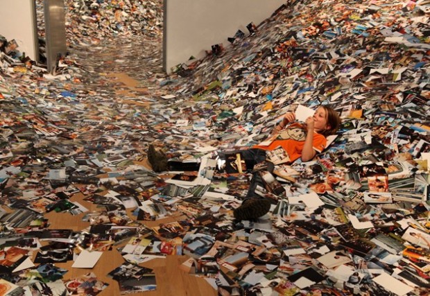
 The
The 
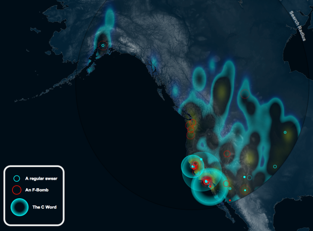
 Another month, another
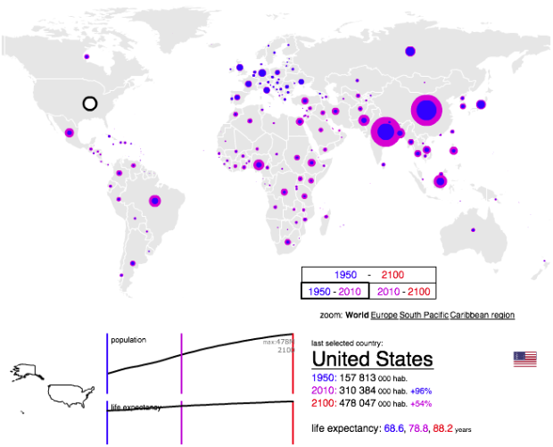
 Visualize This: The FlowingData Guide to Design, Visualization, and Statistics (2nd Edition)


