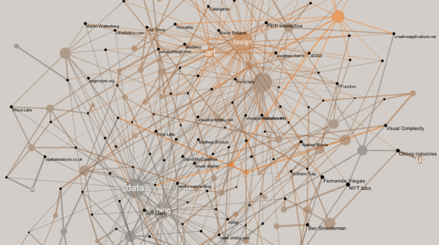
Developer Santiago Ortiz explores visualization references through Delicious tags and puts them in a discovery context. There are two views. The first is a network with tags and resources as nodes. At first it looks like a giant hairball, but mouseover and you get a fisheye effect to zoom in on nodes, which makes them more readable. Mouse over a tag, and the labels for related resources get bigger, and likewise, mouse over a resource, and the related tags get bigger.
Read More
-
-
-
-
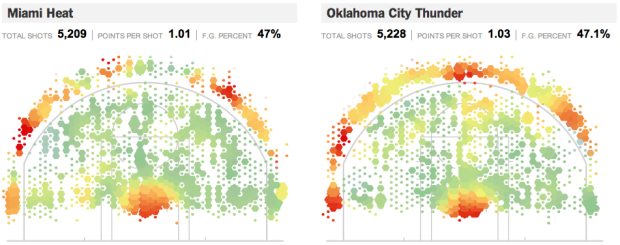
Remember geographer Kirk Goldsberry’s analysis of shot efficiency on the basketball court? Jeremy White, Joe Ward, and Matthew Ericson give it the New York Times treatment in this interactive version for this season’s finals teams, the Miami Heat and Oklahoma City Thunder. Like Goldsberry’s maps, the shooting area of the basketball court is treated as the region of interest where bin size represents shot frequency and color represents efficiency. Roll over the regions to see the exact numbers.
Read More -
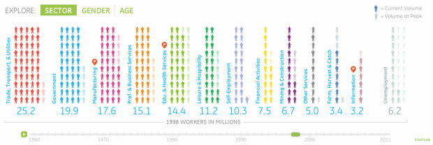
Information visualization firm Periscopic, in collaboration with GE, explores the makeup of the American workforce, from 1960 to present.
Jobs are definitely a top of mind subject. Did you know that manufacturing jobs were the largest sector of employment in 1960, yet today the category has fallen to 6th place? In this interactive visualization, browse who has been working in America over the past 50 years by sector, gender or age.
As in other Periscopic projects, the interactive provides multiple views that let you see the data from different angles. The initial view is a current breakdown of sectors, and when you press play, the visual rewinds to 1960, animating forward in time. Faded people icons represent the peak of each sector for context. Then as you might guess, the people rearrange themselves accordingly when you select breakdowns by age or gender.
Read More -
-
-
-
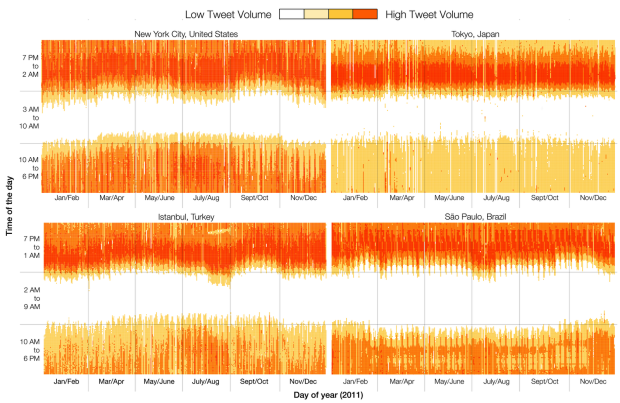
Twitter engineers Miguel Rios and Jimmy Lin explored tweet volumes in different cities and found some interesting tidbits about how people use the service.
We see different patterns of activity between the four cities. For example, waking/sleeping times are relatively constant throughout the year in Tokyo, but the other cities exhibit seasonal variations. We see that Japanese users’ activities are concentrated in the evening, whereas in the other cities there is more usage during the day. In Istanbul, nights get shorter during August; Sao Paulo shows a time interval during the afternoon when Tweet volume goes down, and also longer nights during the entire year compared to the other three cities.
Notice the break during Ramadan in Istanbul?
-
Many want to get rid of the American Community Survey, a Census program which releases region-specific data annually. University of Michigan professor William Frey explains why cutting the survey would be a mistake.
-
-
-
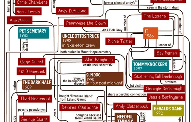
There are various connections between Stephen King novels. Gillian James puts them in a flowchart.
-
-
You would think that fat content and calorie counts would be straightforward by now, but serving size mucks it all up. It’s like, “Great, this ice cream is only 200 calories!” Then you come to the sad conclusion that you just ate a bowl worth half a million calories, because the serving size is that of a rice grain. Fat or Fiction tries to clarify some of these fat counts, for items like cheese and cake, by placing food servings next to each other.
Some of the labeling is confusing, because it’s off to the left and in small print. For example, the 14 percent above is the percentage of fat in that wedge of blue stilton cheese against the rest of the wheel. Each wedge is 100 grams of cheese, so you get a sense of fat and calorie density.
But hey, I’m a sucker for anything food-related and these pictures are making me hungry. That’s the goal of the site, right?
-
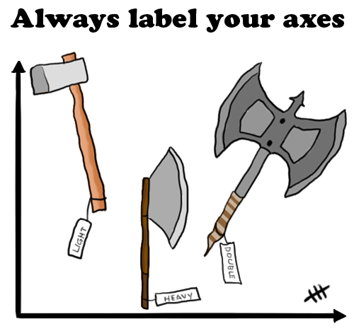
From Fluffware, here’s a fine reminder to always label your axes. See, it’s funny because usually when we talk about labeling axes, we’re talking about axes on plots for context, but here axes is used as the plural of axe, so there are labels on several axes. It’s a play on words. More specifically, it works because axes on a plot and axes the wood-cutting tool are homographs. They’re two words with the same spelling but are pronounced differently. So the joke works with the written word, but it would not work if I were to tell it to you in person. Just to be clear, you should always label both types of axes. Tool and plot, that is. I mean, let’s say you asked someone who only knew about axes (the plot kind) to fetch a certain type of axe (the tool) from your woodshed. If you didn’t label your axes (the tools), that person wouldn’t have a clue. That’d be embarrassing for both parties. And don’t even get me started with the spray.
-
-
-
-
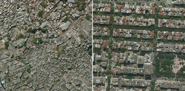
Researchers Pengyu Zhua and Yaoqi Zhang noted in their 2008 paper that “the demand for urban forests is elastic with respect to price and highly responsive to changes in income.” Poor neighborhoods tend to have fewer trees and the rate of forestry growth is slower than that of richer neighborhoods.
Tim De Chant of Per Square Mile wondered if this difference could be seen through satellite images in Google Earth. It turns out that you can see the distinct difference in a lot of places. Above, for example, shows two areas in Rio de Janeiro: Rocinha on the left and Zona Sul on the right. Notice the tree-lined streets versus the not so green.
De Chant notes:
It’s easy to see trees as a luxury when a city can barely keep its roads and sewers in working order, but that glosses over the many benefits urban trees provide. They shade houses in the summer, reducing cooling bills. They scrub the air of pollution, especially of the particulate variety, which in many poor neighborhoods is responsible for increased asthma rates and other health problems. They also reduce stress, which has its own health benefits. Large, established trees can even fight crime.
Okay, I don’t now about that last part about fighting crime. Without seeing the data, I think that sounds like a correlation more than anything else, but still. Trees. Good.
[via Boing Boing]


 Visualize This: The FlowingData Guide to Design, Visualization, and Statistics (2nd Edition)


