Researchers Pengyu Zhua and Yaoqi Zhang noted in their 2008 paper that “the demand for urban forests is elastic with respect to price and highly responsive to changes in income.” Poor neighborhoods tend to have fewer trees and the rate of forestry growth is slower than that of richer neighborhoods.
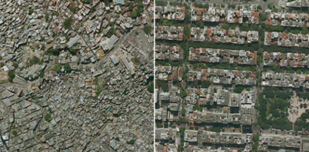
Tim De Chant of Per Square Mile wondered if this difference could be seen through satellite images in Google Earth. It turns out that you can see the distinct difference in a lot of places. Above, for example, shows two areas in Rio de Janeiro: Rocinha on the left and Zona Sul on the right. Notice the tree-lined streets versus the not so green.
De Chant notes:
It’s easy to see trees as a luxury when a city can barely keep its roads and sewers in working order, but that glosses over the many benefits urban trees provide. They shade houses in the summer, reducing cooling bills. They scrub the air of pollution, especially of the particulate variety, which in many poor neighborhoods is responsible for increased asthma rates and other health problems. They also reduce stress, which has its own health benefits. Large, established trees can even fight crime.
Okay, I don’t now about that last part about fighting crime. Without seeing the data, I think that sounds like a correlation more than anything else, but still. Trees. Good.
[via Boing Boing]
 Visualize This: The FlowingData Guide to Design, Visualization, and Statistics (2nd Edition)
Not sure I totally follow the generalization. For example, in the rare remaining hutongs in China, there are more trees than in the big high rise buildings which are built on top of them. Tabula Rasa and dust. :/ The study could also balance the social ties in between the crowded streets of poor areas versus the anonymity of suburbs square streets. And I’m pretty sure the energetic balance, spending is in favor of crowded streets… As you said data would be better than just correlation.
Here in the UK, the main measure we use as an approximation of what’s a poor neighbourhood and what’s a better off neighbourhood is an index called ‘multiple deprivation’ – an amalgamation of lots of objective characteristics which, alongside income levels, crime, available facilties etc, also includes access to and amount of green space.
Lots of research has been done into it, and it’s been found to be a strong enough indicator of other, harder to measure elements of deprivation that it improves the quality of the index. I don’t know of a good place to start with the research but if you can find one, it’s an interesting area.
This is old news to everyone who grew up on SimCity
Interesting point. Could you explain what you mean. I do not play Sim City. I teach and I am interested in how it could be used in classrooms. You suggest there is a relationship between quality of life and urban landscape in Sim City. Could lead to a good project.