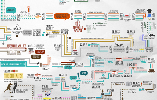
Smith hopes to put it print. Currently in Kickstarter mode.
-
-
-
As part of their campaign to prioritize education and get presidential candidates talking about it, the College Board setup 857 empty desks on the National Mall to represent the estimated number of high school drop-outs per hour. Although a simple physical installation, it carries a lot of weight.
[via @Periscopic]
-
-
-
-
In Pierre Bourdieu’s Distinction: A Social Critique of the Judgement of Taste from 1979 is a chart that shows the taste of food against economic capital and cultural capital. Gastronomica updated the chart. Mmmmm, underground super club food truck. [Thanks, Jonathan]
-
The flood. The avalanche. The tsunami. Drowning in data. For the past few years, a couple of times a week, there’s an article about all the data we have access to and how we’re struggling to stay afloat in the growing sea of data. Big data is getting too big they say.
The water metaphor is fine, but the fear of the data flow is irrational, so let’s
runswim with the former.
Read More -
-
-
-
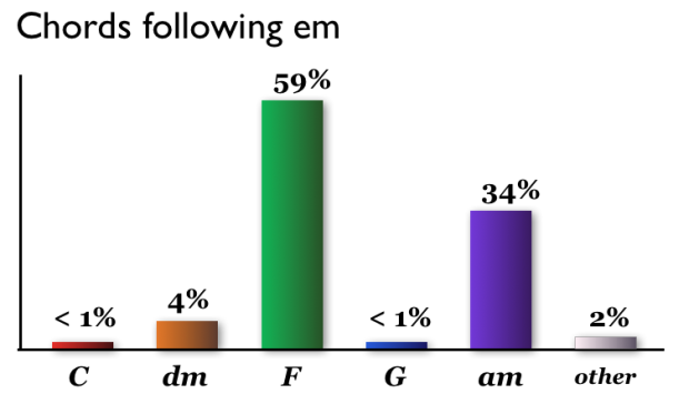
Hooktheory, a system for learning to write music, analyzed 1,300 popular songs for how chords were used. The above shows chords that followed an E minor chord.
This result is striking. If you write a song in C with an E minor in it, you should probably think very hard if you want to put a chord that is anything other than an A minor chord or an F major chord. For the songs in the database, 93% of the time one of these two chords came next.
The most common chords used overall were G, F, and C.
[via Waxy]
Update: See also this great musical sketch by Axis of Awesome in which they sing some 40 songs that use the same four chords. [Thanks, Jan]
-
Kalev H. Leetaru animated world sentiment over time, based on Wikipedia entries.
See the positive or negative sentiments unfold through Wikipedia through space and time. Each location is plotted against the date referenced and cross referenced when mentioned with other locations. The sentiment of the reference is expressed from red to green to reflect negative to positive.
Sentiment stays green for the most part, with the exception of major wars, and I’m not so sure that a world map is a good way to show the relationships. For example, when the animation hits 2000, the map is basically a green blob. It’s a good start though and touches on maybe the next step of the coverage maps we’ve seen lately.
-
-
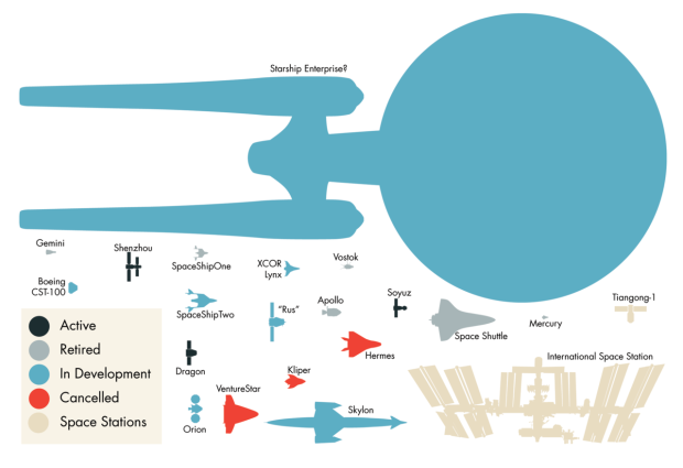
Molecular astrophysicist Invader Xan drew spaceships, real and fictional, to scale.
This, my friends, is an image showing several of the most notable spacecraft we plucky human beings have created (and are busily creating) to date. The past, the present, and the ones that never quite made it. All spacecraft shown are to scale (assuming my sources were accurate). Because I felt I needed to exercise my graphic design muscles. And because, well, let’s face it — space ships are just inherently cool, aren’t they?
Dibs on the Starship Enterprise.
[via Boing Boing]
-
Online maps have made it easy to find directions from point A to point B, but when you’re going on a long road trip, you want to know more about where you’re going. What will the weather be like? What is there to do at each stopped? Design and technology studio Stamen made a travel planner in work for the Weather Channel that tells you. Put in your origin and destination and when you will leave, and you get a map with weather icons along the way.
So let’s say you’re driving from New York to San Francisco, and you’re trying to decide whether to go straight across or loop up or down a bit; this will give you a sense for whether it’s going to be rainy or sunny when you plan to be in the middle of Nebraska. You can drag around the rainy bits if you like, and also along the way maybe you’d like to stop for a bite to eat, so we’re hitting the Yelp API to give you a sense of where to go and what to see.
Give it a try here. It’s kind of awesome.
-
-
-


 Visualize This: The FlowingData Guide to Design, Visualization, and Statistics (2nd Edition)


